
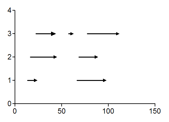
Using Prism to make an X/Y vector chart.
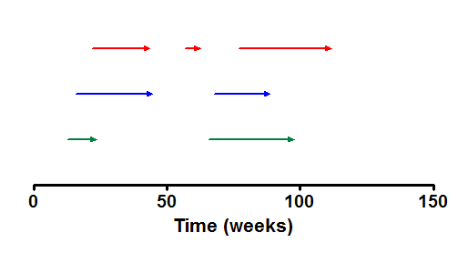
This example shows how to enter data and make an X/Y vector chart with multiple X values showing results for individual subjects (Y).
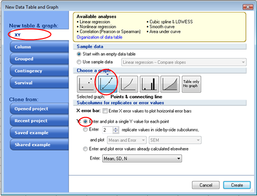
Start by making an XY graph. From the Prism Welcome dialog tell Prism to make a graph with connecting lines and just one value for each data point.
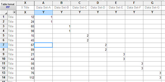
On the data table enter the beginning and ending X values for each line on your graph. Enter the Y value to represent the subject to plot. Use a separate data set for each line.
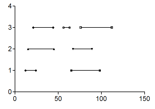
The default graph created will have symbols and connecting lines.
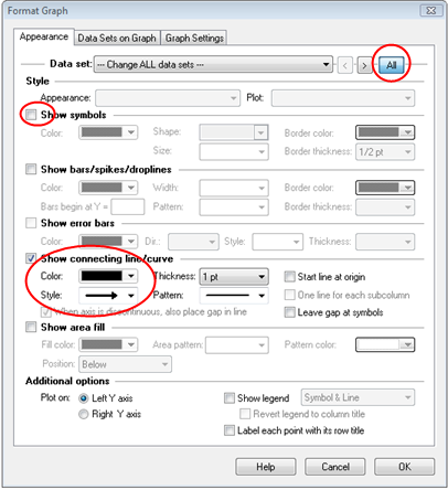
Double-click on any data symbol on the graph to open the Format Graph dialog. Click the All button to select all data sets and choose to not show symbols and to format your connecting lines as arrow.
Now all you have to do is format your graph to customize colors etc.
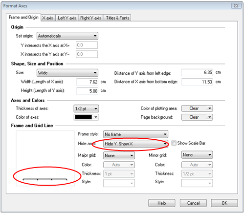
Double-click on either axis to open the Format Axis dialog. In this case, we'll show X but hide the Y axis.
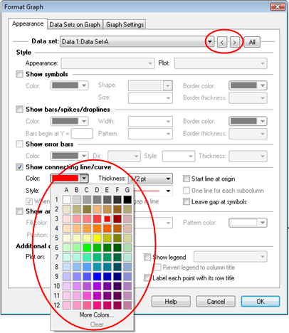
To change the color of your graph arrows double-click on any arrow to open the Format Graph dialog where you can change the color. Use the Data set arrows to move from one data set to the next.
Download this file to see how this graph was made.