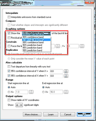
Plotting confidence or prediction bands
If you check the option box on the top of the Simple linear regression parameters dialog, Prism will calculate and graph either the 95% confidence band or 95% prediction band of the regression line.
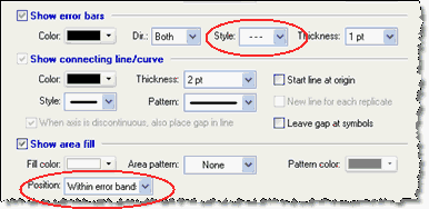
To adjust the appearance of the confidence or prediction bands, go to the Format Graph dialog, select the dataset that represents the regression line, and adjust the error bars and area fill settings. You can also choose to fill the area enclosed by the confidence or prediction bands.
Plotting both confidence and prediction bands on the same graph
Prism lets you choose either a confidence band or a prediction band as part of the linear regression dialog. But not both. To plot both on one graph, you need to analyze your data twice, choosing a confidence band the first time and a prediction band the second time.
The regression lines (and bands) are data sets that you can add to any graph by drag-n-drop or using the Change menu from the graph. So go to the graph with the first regression line, and drag the second regression analysis onto that graph. Or double click on the graph, and use the middle tab of Format Graph to add the other regression data set.
Meaning of confidence bands
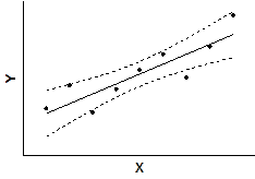
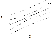
Two confidence bands surrounding the best-fit line define the confidence interval of the best-fit line.
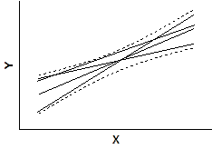
The dashed confidence bands are curved. This does not mean that the confidence band includes the possibility of curves as well as straight lines. Rather, the curved lines are the boundaries of all possible straight lines. The figure below shows four possible linear regression lines (solid) that lie within the confidence band (dashed).
Given the assumptions of linear regression, you can be 95% confident that the two curved confidence bands enclose the true best-fit linear regression line, leaving a 5% chance that the true line is outside those boundaries.
Many data points will be outside the 95% confidence bands. The confidence bands are 95% sure to contain the best-fit regression line. This is not the same as saying it will contain 95% of the data points.
Meaning of the prediction bands
Prism can also plot the 95% prediction bands. The prediction bands are further from the best-fit line than the confidence bands, a lot further if you have many data points. The 95% prediction band is the area in which you expect 95% of all data points to fall. In contrast, the 95% confidence band is the area that has a 95% chance of containing the true regression line. This graph shows both prediction and confidence intervals (the curves defining the prediction intervals are further from the regression line).
When to plot confidence and prediction bands
The confidence bands sort of combine the confidence intervals of the slope and intercept in a visual way. Use confidence bands to learn how precisely your data define the best-fit line.
Prediction bands are wider, to also include the scatter of the data. Use prediction bands when your main goal is show the variation in your data.