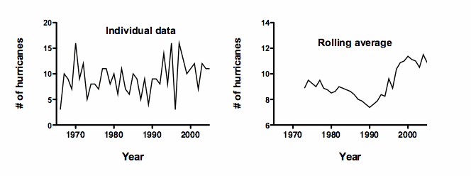
The figure shows the number of hurricanes over time. The left panel shows the number of hurricanes in each year, which jumps around a lot. To make it easier to spot trends, the right panel shows a rolling average. The value plotted for each year is the average of the number of hurricanes for that year plus the prior eight years. This smoothing lets you see a clear trend.
But there is a problem. These are not real data. Instead, the values plotted in the left panel were chosen randomly (from a Poisson distribution, with a mean of 10). There is no pattern. Each value was randomly generated without regard to the previous (or later) values.
Creating the running average creates the impression of trends by ensuring that any large random swing to a high or low value is amplified, while the year-to-year variability is muted.
You should not fit a model to the rolling average data with linear or nonlinear regression, or compute a correlation coefficient. Any such results would would be invalid and misleading. The problem is that regression assumes that each value is independent of the others, but the rolling average are not at all independent of each other. Rather each value is included as part of the neighboring values.
This example is adapted from Briggs (2008).