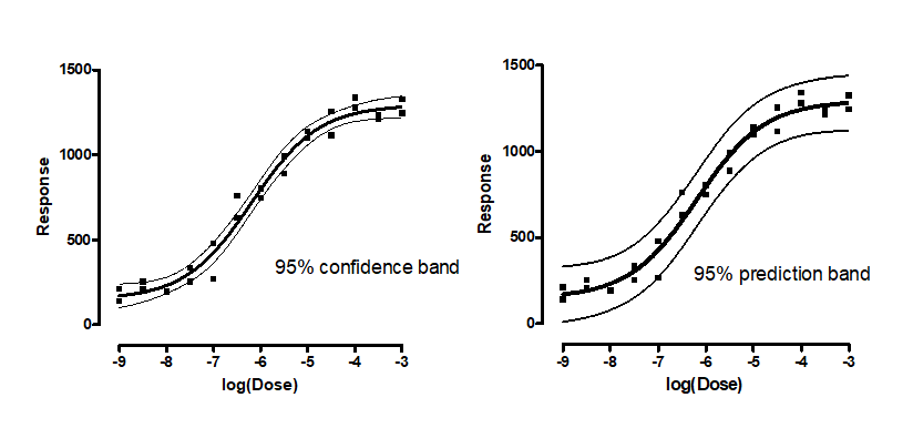
The difference between confidence and prediction bands
The 95% confidence bands enclose the area that you can be 95% sure contains the true curve. It gives you a visual sense of how well your data define the best-fit curve.
The 95% prediction bands enclose the area that you expect to enclose 95% of future data points. This includes both the uncertainty in the true position of the curve (enclosed by the confidence bands), and also accounts for scatter of data around the curve.
Choose in the Confidence tab of the Nonlinear regression parameters dialog. Learn how they are calculated.
Prediction bands are always wider than confidence bands. When you have lots of data points, the discrepancy is huge.
Plotting confidence or prediction bands
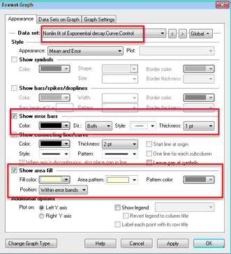
After you choose to create a confidence or prediction band in the diagnostics tab, it should just appear on the graph. You can fine tune its appearance on the graph. Note the following:
•The fit curve is seen by the Format Graph dialog as one more data set to plot. be sure to select one of those nonlinear fits first (top of dialog) before adjusting its properties.
•To plot the confidence bands, choose to show error bars, and set the style to ------ or _____.
•You can also choose to show an area fill within the error bands.
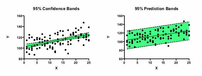
Why do so many points lie outside the confidence bands?
Confidence bands show you how well you know the location of the best fit line or curve. Given all the assumptions of the analysis, you can be 95% sure that the true curve (nonlinear regression) or line (linear regression) lies within the bands.
Prediction bands show you where you can expect the data to lie. You expect 95% of all data points to lie within the prediction bands.
With many data points, you expect a large fraction of the data points to lie outside the confidence band, but 95% to lie within the prediction bands. The confidence bands aren't supposed to show you the scatter of the data, but rather the uncertainty in the position of the line or curve. With lots of data, the line or curve is known fairly precisely, so only a small fraction of data lie within the bands. The figure below demonstrates this with linear regression.
Plotting both confidence and prediction bands
Prism lets you choose either a confidence band or a prediction band as part on the Confidence tab. But not both. To plot both on one graph, analyze your data twice, choosing a confidence band the first time and a prediction band the second time. The curves are data sets that you can add to any graph by drag-n-drop or using the Change menu from the graph.
One-sided confidence (or prediction) bands
Confidence and prediction bands are usually two-sided. But you can get Prism to show the band on only one side.
One use for a one-sided confidence band would be on a graph that plots purity of a substance over time. You want to know, with a certain confidence, how low the purity could be at a certain time. You don't really care about quantifying how high the purity could be.
To plot a one-sided 95% confidence (or prediction) band:
1.Choose "90%" confidence bands in the Diagnostics tab of the nonlinear regression dialog. With 90% bands, there is a 5% chance that the true value is larger than the upper band, and 5% it is lower than the lower band. When you plot only one of these bands, therefore, it is really a 95% confidence band, which is probably what you want.
2.On the Format Symbols dialog, choose the best-fit line or curve and make sure that error bars are turned on with the "---" style. Then choose either Up or Down (but not Both) in the Direction drop-down menu.
Viewing the XY coordinates of confidence or prediction bands
1.Go to the Diagnostics tab and check the option to plot confidence or prediction bands.
2.Go to the Range tab of the nonlinear regression dialog.
3.Check the option to create a table of XY coordinates. This table will include the confidence or prediction bands.
4.When viewing the results, expand the results sheet in the navigator and go to the page labeled 'Curve'. For each X value, you'll see the y value and the distance the confidence or prediction curve is above and below that value.
Situations where Prism can't plot confidence or prediction bands
Prism will not plot confidence or prediction bands in several situations:
•If the best-fit value of a parameter hit a constraint, the fit is unlikely to be useful. Prism does not plot confidence or prediction bands, because they would almost certainly be misleading.
•If the results of nonlinear regression are ambiguous, the confidence or prediction bands would be super wide, maybe infinitely wide. They would not be useful, so Prism does not plot them.
•If you choose robust nonlinear regression, Prism does not compute confidence or prediction bands, as it cannot compute standard errors or confidence intervals of the parameters.
•The fit is perfect. If the sum-of-squares is 0.0 and R2 is 1.0, it is not possible to compute or interpret confidence or prediction bands.
•If the fit is interrupted, confidence and prediction bands are not computed.
•If you chose to weight the fit by 1/SD2. To plot confidence and prediction bands, Prism needs to know the weighting factor at every X value in the range it plots the curve. Not a problem with most weighting schemes. But if you weight by the values you enter in the SD column, then Prism only knows those weights, and not the weights for X values between the points, so can't plot confidence or prediction bands.