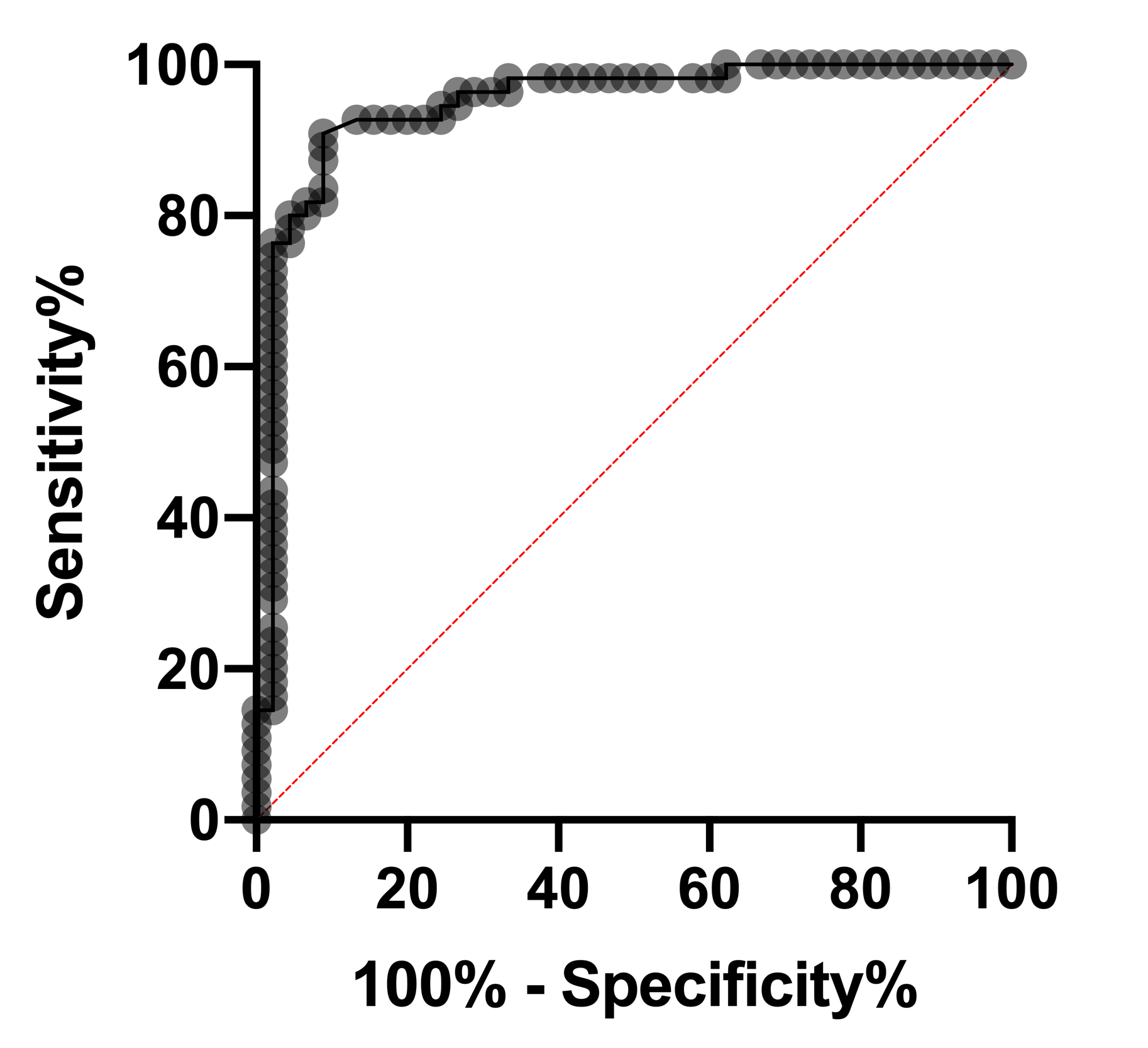
ROC curves in logistic regression are used for determining the best cutoff value for predicting whether a new observation is a "failure" (0) or a "success" (1). If you're not familiar with ROC curves, they can take some effort to understand. An example of an ROC curve from logistic regression is shown below.

First, let’s cover what a classification cutoff is actually doing. When you choose a classification cutoff (let’s say you choose 0.5), you’re saying that you would like to classify every observation with a predicted probability from the model equal to or greater than 0.5 as a “success”. Note that you will classify observations meeting this criteria as a success regardless if that outcome was actually observed to be a success. Confused? Don’t worry, it’s less complicated than it sounds. Your observed outcome in logistic regression can ONLY be 0 or 1. The predicted probabilities from the model can take on all possible values between 0 and 1. So, for a given observation, the predicted probability from the model may have been 0.51 (51% probability of success), but your observation was actually a 0 (not a success). We’ll discuss the importance of correctly or incorrectly classifying your observations in a minute. For now, let’s focus back on the ROC curve.
Each dot on the curve represents a different possible cutoff value for classifying predicted values. You could feasibly pick any value between 0 and 1 as the cutoff, but doing this manually for every possible meaningful cutoff value would be exhausting. So what an ROC curve does is looks at every possible cutoff value that results in a change of classification of any observation in your data set (if stepping the classification cutoff up from 0.5 to 0.6 doesn’t result in a change in how the observations are classified, well then it’s not an interesting step to consider). For every classification cutoff that results in a change of classification, a dot is placed on the plot. But where does that dot go? To answer that, let’s go back to the outcome of classifications to understand a bit more about what classification is doing and the classification table.
Whatever cutoff you choose, a certain number of the rows of data will be correctly classified (you predicted the correct value for that row), and a certain number will be misclassified. Sensitivity and specificity are two metrics for evaluating the proportion of true positives and true negatives, respectively. In other words, sensitivity is the proportion of 1s that you correctly identified as 1s using that particular cutoff value, or the true positive rate. Conversely, specificity is the proportion of 0s that you correctly identified as 0s, or the true negative rate.
Mathematically these are represented as:
•Sensitivity = (number correctly identified 1s)/(total number observed 1s)
•Specificity = (number correctly identified 0s)/(total number observed 0s)
Given this information, we can put everything together to understand ROC curves. First, we identify the axes of an ROC curve: the Y axis is just sensitivity (or true positive rate), while the X axis is 1-specificity. Although it takes a little extra math (and brainpower) to prove, it can be shown that 1-specificity is equivalent to the false positive rate.
For every point on the ROC curve (representing a different cutoff value), the location of that point is plotted as the sensitivity at that cutoff value on the Y axis, and 1 – specificity at that cutoff value on the X axis. As such, the ROC curve shows graphically the tradeoff that occurs between trying to maximize the true positive rate vs. trying to minimize the false positive rate. In an ideal situation, you would have sensitivity and specificity near 100% at all cutoffs, meaning you predict perfectly in all cases. If you have that, you don't need statistics, because your "success" and "failures" are very easy to tell apart. In fact, with logistic regression, it wouldn’t even be possible to fit this model.
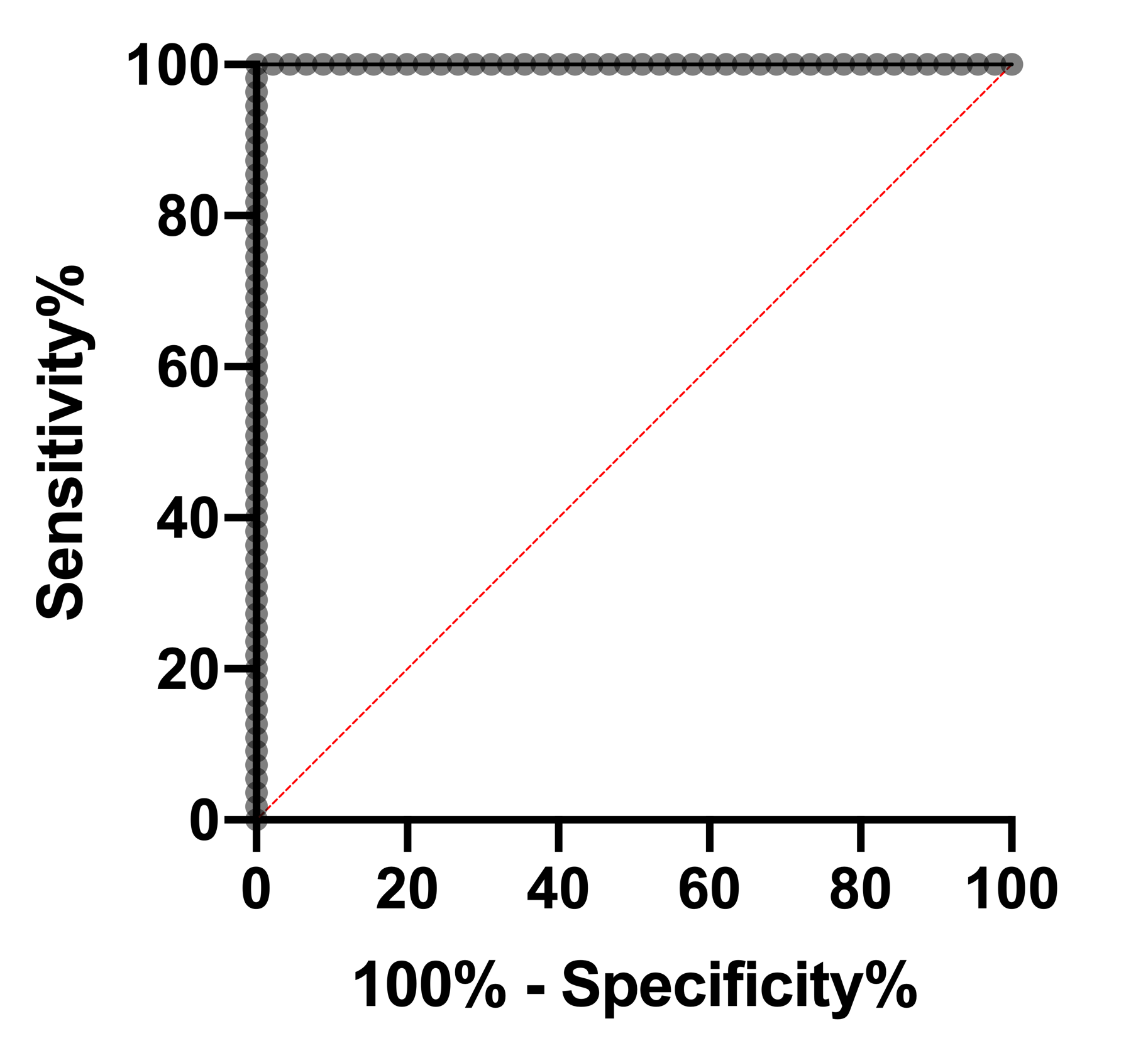
Best-case ROC curve
A best-case ROC would look like a 90 degree angle. If you have this curve, then you probably don't need statistics, since it is trivial to discriminate between the 0s and 1s. Note that at every point, either sensitivity or specificity are at 100% (meaning 1-specificity is at 0%). In fact, this curve shows that there is a cutoff for which both sensitivity and specificity are at 100%. Another way to state this is that there are no false positives and no false negatives. The AUC of this ROC curve is 1.

ROC curve with no predictive power:
Alternatively, the worst possible ROC curve (in Prism) predicts no better than by chance, which shows up in an ROC curve as a straight line at 45 degrees. The fit model predicts outcome no better than flipping a coin. Another way to think about this is that the only way to increase the true positive rate (sensitivity) is to also increase the false positive rate (1 – specificity) by the same amount: not a great method at all. The AUC of this ROC curve is 0.5.

Worst-case ROC curve:
Note that there is an additional situation in which a model could (in theory) perform worse than random chance. Recall that the ROC curve plots the sensitivity and specificity of a model, and that both of these values are based on the classification of subjects. You could probably imagine a model in which “successes” (or 1s) were more commonly predicted to be “failures” (or 0s) than what would be expected by random chance. In this case, the model would still be able to identify different groups of outcomes, but would classify them incorrectly (1s would be classified as 0s and vice versa). In the most extreme case, a model could perfectly predict all of your observed 1s to be 0s, and all of your observed 0s to be 1s. In contrast to the “best-case ROC curve”, the graph below shows that for every cutoff value, either sensitivity or specificity (or both) are at 0%. The AUC of this ROC curve is 0!

Area Under the ROC curve
The Area Under the ROC curve (AUC) is an aggregated metric that evaluates how well a logistic regression model classifies positive and negative outcomes at all possible cutoffs. It can range from 0.5 to 1, and the larger it is the better. People will sometimes use the AUC as a means for evaluating predictive performance of a model, although because it represents all possible cutoff values, which isn’t feasible in practice, the interpretation is difficult. We recommend interpreting the ROC curve directly as a way to choose a cutoff value.
Choosing a cutoff value
In reality, you will only be able to pick one cutoff value for your model. How do you determine which cutoff to use? It depends on your specific scenario. If false negatives are worse than false positives, then choose a cutoff with high sensitivity (a value higher on the Y axis ofthe ROC graph). Alternatively, if false positives are worse, then pick a cutoff with high specificity (values to the left in the ROC graph).