Visualizing results of analyses in the form of a graph is one of the best ways to understand the results that the analysis generates. For Cox regression, it’s often of interest to investigate the estimated survival probability over time for different groups of individuals. These groups are defined by their values of the predictor variables in the regression model (for example, “women” vs. “men”, or “smokers” vs “non-smokers”). More importantly, these groups don’t have to be defined by a single variable (for example “45 year old men”, “45 year old women”, “50 year old men” and “50 year old women”).
The Graphs tab of Cox proportional hazards regression can be used to automatically build estimated survival curves for any group that you specify. All that’s required is to:
1.Define the number of separate graphs you’d like to create
2.Use the variables in the model to specify which groups you’d like to create estimated survival curves for on each graph
An example of how these controls work is given below, but it’s extremely important to realize that the survival curves displayed on these graphs are estimated survival curves based on the MODEL and not the same as the survival curves that would be generated using a selection of the data to perform Kaplan-Meier survival analysis. Remember that Cox regression relies on the assumption of proportional hazards. As a result of this assumption, all of the estimated survival curves will possess the same basic shape, with the specific values of any individual curve being proportional to the baseline survival curve. Mathematically speaking, the estimated survival values at any time point for a given group are determined using this equation:
Finally, it’s important to note that if a variable is not specified when generating an estimated survival curve, then the survival curve generated assumes that the value for that variable is zero (for continuous variables) or the reference value (for categorical variables).
An example of how the controls are used
To understand how to use the controls on this tab, consider an example analysis in which the model included three predictor variables:
•Treatment_Group - a categorical variable with two levels (“Control” and “Treatment”)
•Sex - a categorical variable with two levels (“Female” and “Male”)
•Age - a continuous variable
Let’s assume that we were interested in a few different comparisons. Specifically, we wanted to examine differences in estimated survival over time for:
•All members of the Control population vs all members in the Treatment population
•All members of the population aged 30 vs all members of the population aged 50
•The Control and Treatment populations, separated by sex (i.e. Women in the Control population, Women in the Treatment population, Men in the Control population, and Men in the Treatment population)
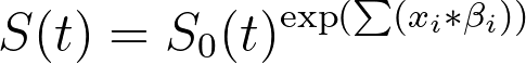
To keep the comparisons of the survival curves easy to see, we’ll create a separate graph for each set of comparisons listed above. Thus, on the Graphs tab, we’ll want to set the “Number of graphs to generate” to 3:
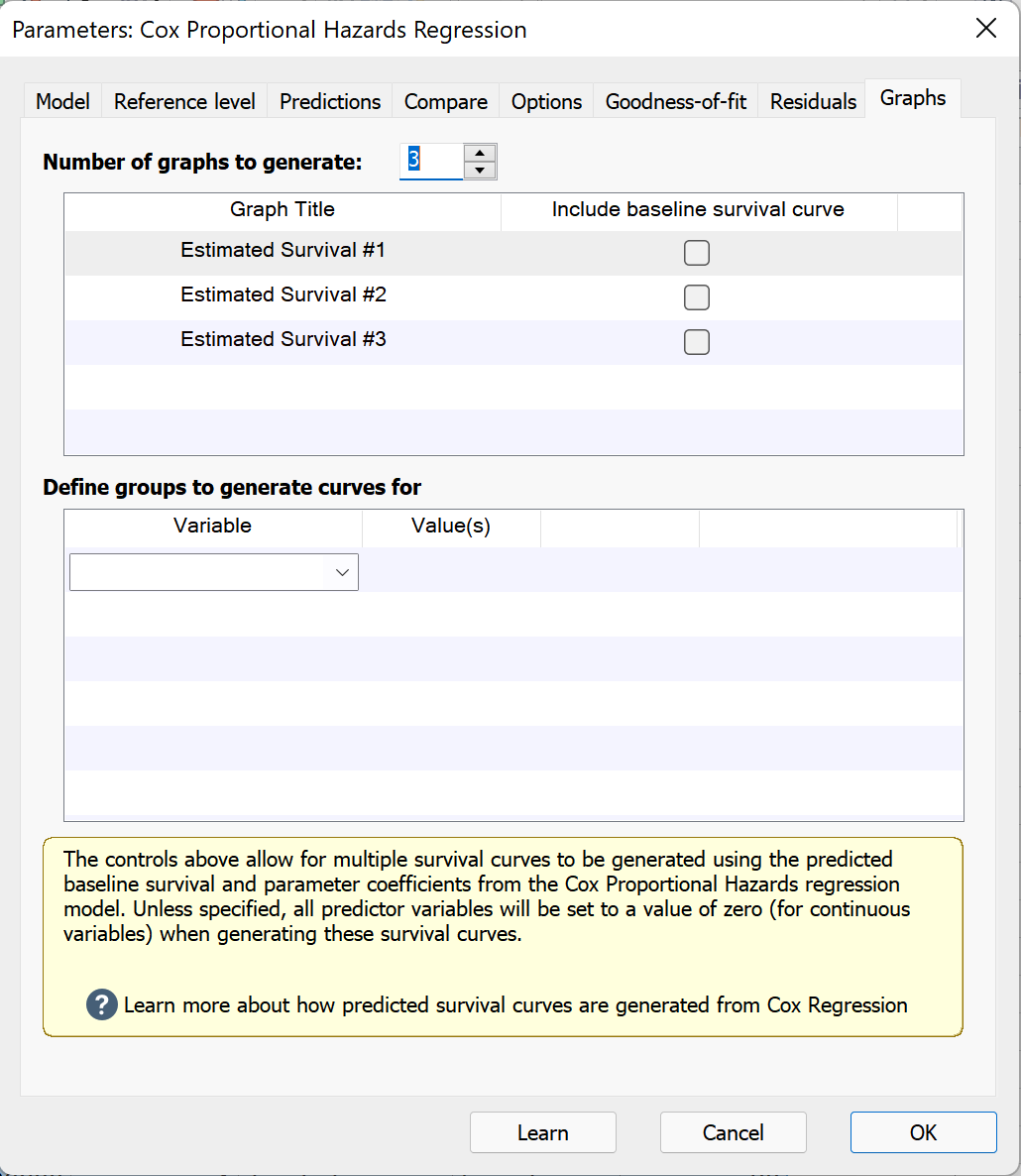
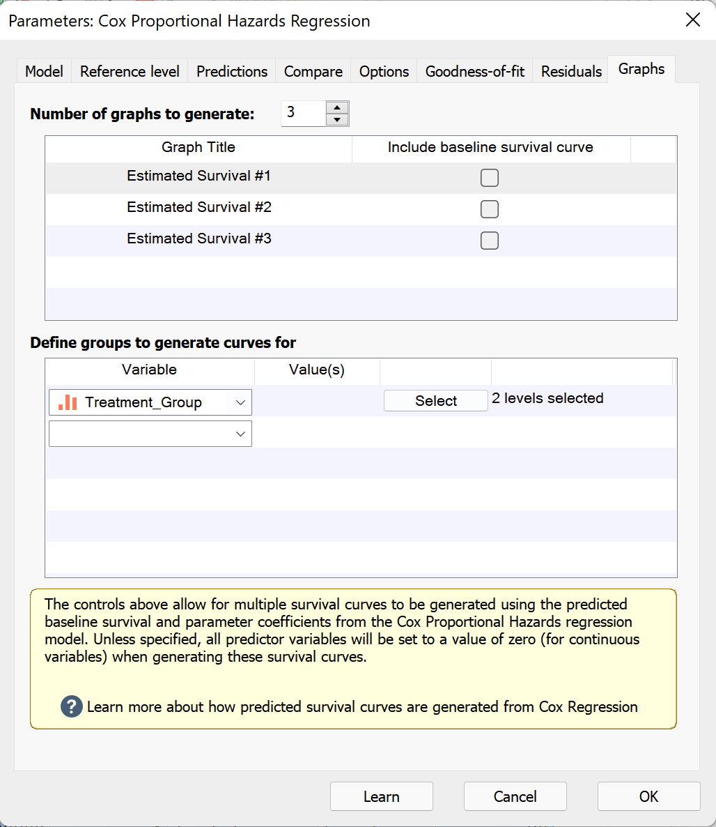
When a graph is added, there is an option to include the baseline survival curve on each graph. This is the same curve that is reported on the “Baseline functions” results sheet. We won’t enable this option for this example. Selecting each of the graphs in the upper box, we can then specify the variables that we’d like to include on each in the “Define groups to generate curves for” section below. With “Estimated Survival #1” selected in the upper box of the dialog, we’ll use the dropdown menu in the lower box of the dialog to select the “Treatment_Group” variable. By default, all levels of a categorical variable are included when the variable is selected. To confirm that we have both the “Control” and “Treatment” levels selected, we can click the “Select” button to see a list of all levels available for the specified variable.
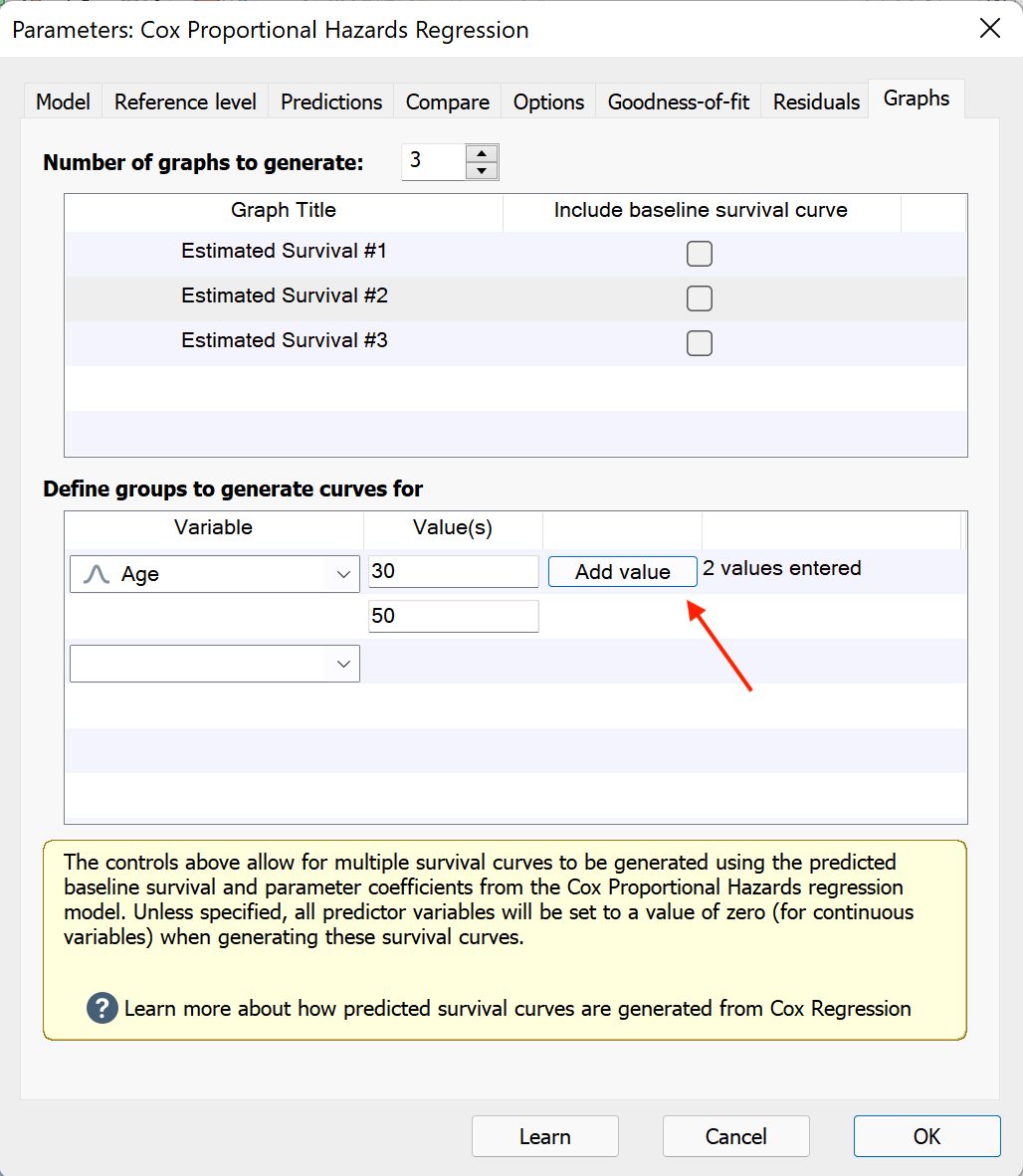
For the second graph, we’ll select “Estimated Survival #2” in the upper box, and then use the dropdown menu to select the variable “Age” in the lower box. Because Age is a continuous variable, we’ll need to enter a value that Prism will use to generate the estimated survival curve. For this graph, we’ll first enter a value of 30. Then, we can use the “Add value” button to create a new input box where we can enter our second value of 50.
For the third graph, we’ll select “Estimated Survival #3” in the upper box, and then use the dropdown menu to select the variable “Treatment”. We can then add our second variable “Sex”, and ensure that both levels are selected for both variables.
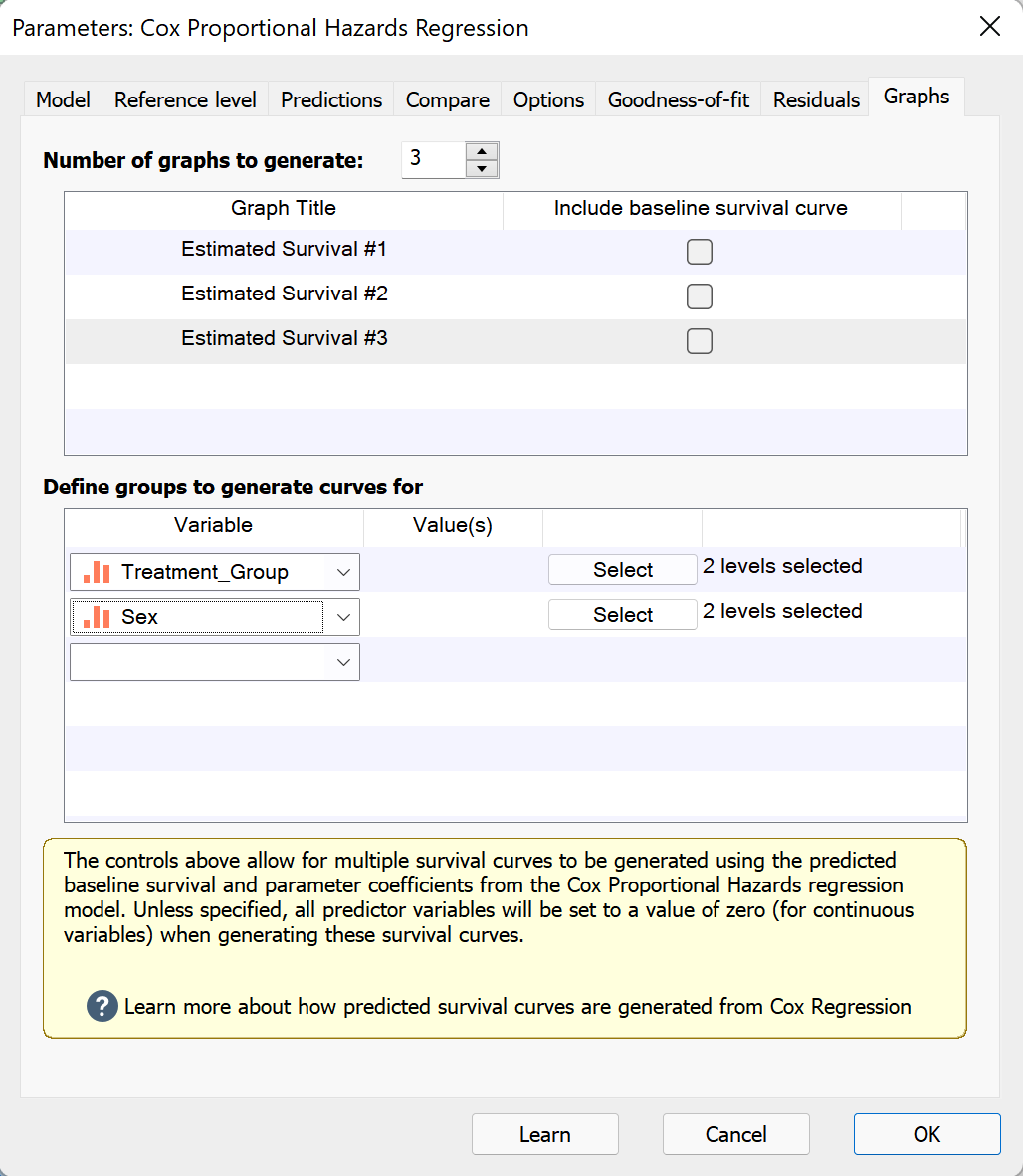
Note that even though we’ve only selected two variables, Prism will automatically create all of the estimated survival curves on this graph that we want. When multiple variables are selected for a single graph, Prism automatically determines all possible combinations of the values (or levels) for each variable specified, and generates a separate estimated survival curve for each combination.
Thus, when we click the “OK” button, we’ll have three new graphs in the Navigator that we can investigate:
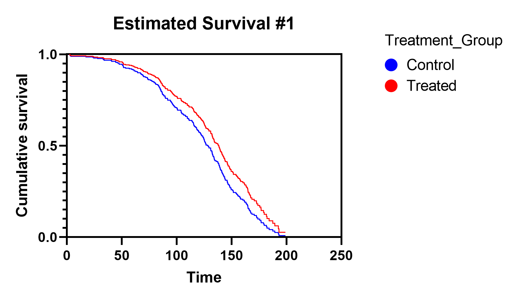
Estimated survival for Control vs Treated
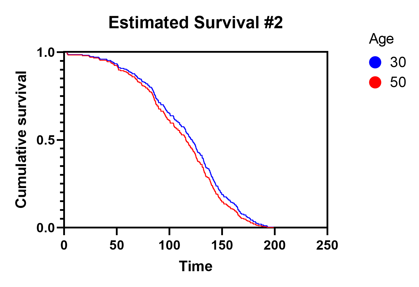
Estimated survival for Age 30 vs Age 50
Estimated survival for Control Women, Control Men, Treated Women, and Treated Men
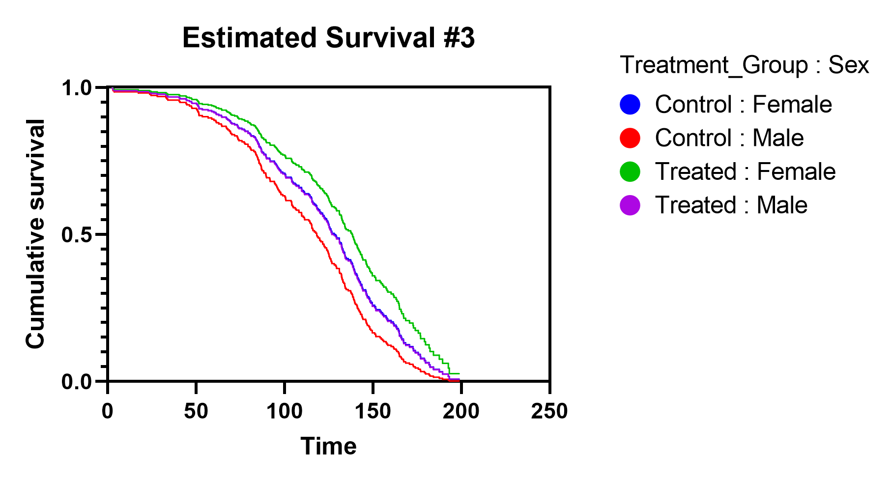
From these graphs we can see that the "Treatment_Group" and "Sex" variables both seem to have a fairly substantial impact on estimated survival, while the effect of "Age" is rather small. For example, the difference between the survival curves in Graph 1 (Treatment_Group) are much more separated than the survival curves in Graph 2 (Age). And in the third graph, we see that there is a notable difference between the curves for "Control : Female" and "Treated : Female", between "Control : Male" and "Treated : Male", between "Control : Female" and "Control : Male", and between "Treated : Female" and "Treated : Male" (Note that on this graph, the curves for "Control : Female" and "Treated : Male" are nearly overlapping so that at first glance it may appear that there are only three curves on this graph).