Estimation plots (and in a more general sense, estimation statistics) are used to present the magnitude of an effect, along with a visual representation of its precision (confidence interval). Estimation plots were introduced with Prism 9, and are currently only available for t tests (unpaired t test and paired t test).
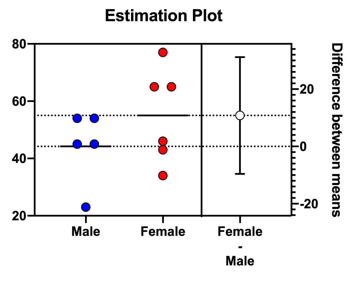
An estimation plot shows:
•Data (left axis). For data with a small sample size (n < 100), Prism presents a scatter graph showing individual points. For a large sample size, Prism presents a violin plot.
•Effect size, the difference between means (right axis). Precision of the calculated effect size as a 95% confidence interval (right axis)
The left axis is scaled to show the data. The right is scaled to show the effect size and its CI, so has the same interval. Y=0 on the right axis is aligned at the position of the mean of the first group plotted on the left axis. Leave the right Y axis set to “Automatically determine the range and interval”. When you change the range or interval of the left Y axis range, the right Y axis will automatically update.
Warning: Prism will determine the necessary range and interval values automatically, and you should not manually change them. If you manually change the range or interval of the right Y axis, the estimation plot will no longer be formatted correctly.
Data for generating estimation plots
To create an estimation plot, Prism creates an additional tab of results (hidden by default). The data displayed on this table will depend on the specific test performed. For unpaired and paired t tests, the first two columns contain the original input data. For unpaired t tests, the third column contains three values: the lower 95% confidence level, the difference between the means of the two groups, and the upper 95% confidence level. For paired t tests, each row of the third column contains the difference between the other two values on that row.