Paired t test or Wilcoxon matched pairs test
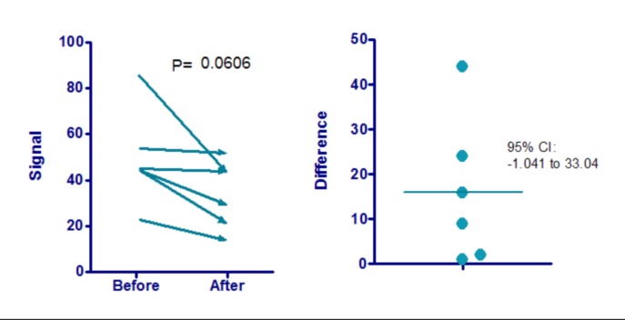
The graph above shows the sample data for a paired t test. Note the following:
•Since the data are paired, the best way to show the data is via a before after graph, as shown on the left. A bar graph showing the average value before and the average value after really doesn't properly display the results from a paired experiment.
•The graph uses arrows to show the sequence from Before to After. You may prefer to just show the lines with no arrowheads. Choose in the Format Graph dialog.
•The P value is copy and pasted from the paired t test analysis.
•The paired t test first computes the difference between pairs. The graph on the right shows these differences. These values can be computed using the Remove Baseline analysis, but there is no need to do so. On the options tab of the analysis dialog, check the option to graph the differences.
•The confidence interval for the difference between means shown on the right graph was copy and pasted from the paired t test results.
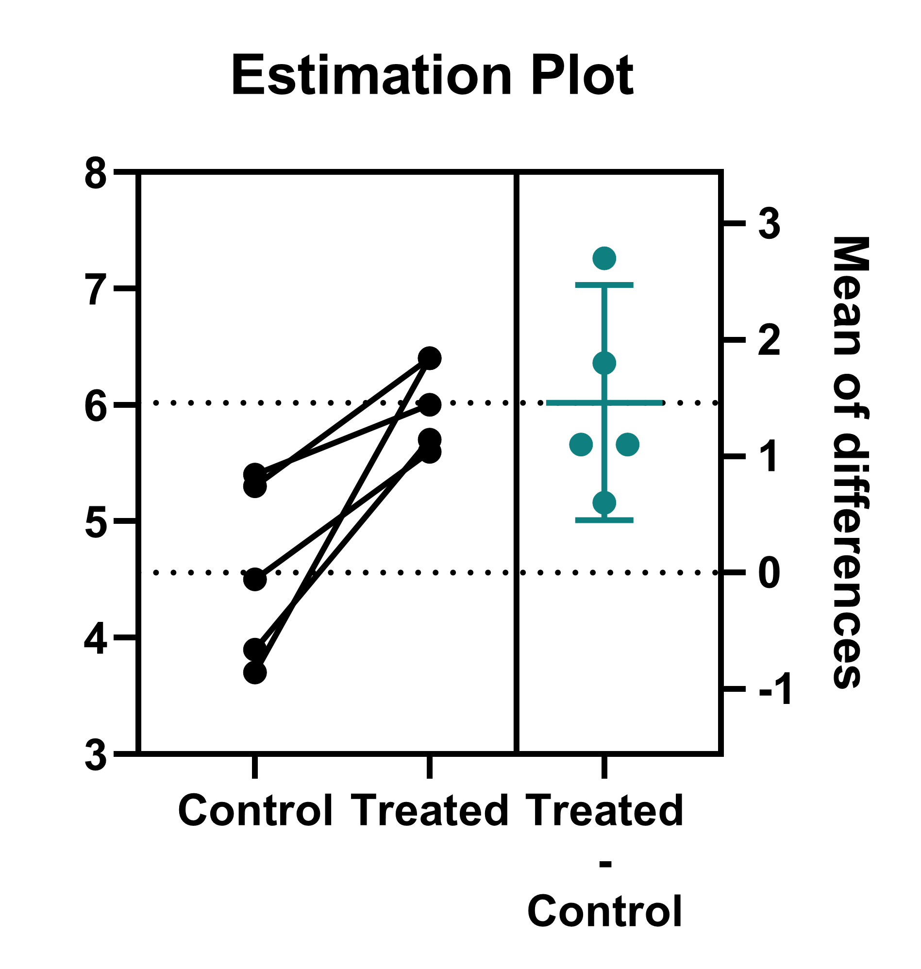
Alternative graphing techniques
1.Use the Pairwise comparisons feature (button in the Draw section of the toolbar on the graph) to automatically add a comparison line and P value summary between the two groups

2.Use the Estimation plot (generated by default for paired t tests) to show the mean difference between the two groups and the 95% confidence interval of this mean