1. Enter data
From the Welcome (or New Table and graph) dialog, choose the Column tab.
Choose to enter and plot error values computed elsewhere.
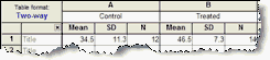
Enter the data all on one row.
2. Choose the unpaired t test
1.From the data table, click  on the toolbar.
2.Choose t tests from the list of column analyses.
3.On the first (Experimental Design) tab of t test dialog, make these choices:
•Experimental design: Unpaired
•Assume Gaussian distribution: Yes.
•Choose test: Unpaired t test. Choose the Welch's correction if you don't want to assume the two sets of data are sampled from populations with equal variances, and you are willing to accept the loss of power that comes with that choice. That choice is used rarely, so don't check it unless you are quite sure.
4. On the options tab, make these choices:
•Choose a one- or two-sided P value. If in doubt, choose a two-tail P value.
•Choose the direction of the differences. This choice only affects the sign of the difference and the confidence interval of the difference, without affecting the P value.
•Choose a confidence level. Leave this set to 95%, unless you have a good reason to change it.
3. Review the results
The t test investigates the likelihood that the difference between the means of the two groups could have been caused by chance. So the most important results are the 95% confidence interval for that difference and the P value.
Learn more about interpreting the results of a t test.
Before accepting the results, review the analysis checklist.
4. Polish the graph
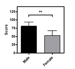
•Be sure to mention on the figure, figure legend or methods section whether the error bars represent SD or SEM (what's the difference?).
•To add the asterisks representing significance level copy from the results table and paste onto the graph. This creates a live link, so if you edit or replace the data, the number of asterisks may change (or change to 'ns'). Use the drawing tool to add the line below the asterisks, then right-click and set the arrow heads to "half tick down'.
•To make your graph simple to understand, we strongly recommend avoiding log axes, starting the Y axis at any value other than zero, or having a discontinuous Y axis.