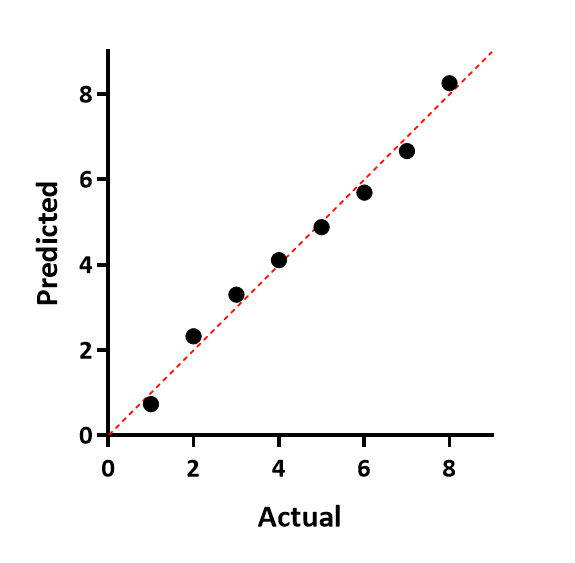
When you run a normality test on column data or on residuals, Prism (new with Prism 8) can plot a QQ plot. There are multiple ways to label the axes of such graphs. Prism plots the actual Y values on the horizontal axis, and the predicted Y values (assuming sampling from a Gaussian distribution) on the Y axis. If the data were sampled from a Gaussian (normal) distribution, you expect the points to follow a straight line that matches the line of identity (which Prism shows).
Example QQ plot: