What is a volcano plot?
When you run multiple t tests, Prism (starting with version 8) automatically creates what is known as a volcano plot.
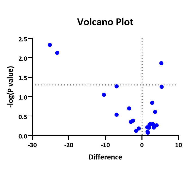
Each dot represents one row in your data table.
The X axis plots the difference between means. A dotted grid line is shown at X=0, no difference.
The value plotted on the Y axis depends on your choices.
•If you chose the statistical significance approach without correcting for multiple comparisons, then the Y value in the volcano plot is minus one times the logarithm of the P value. So if the P value is 0.01, then the logarithm (base 10) is -2, and the value plotted on the Y axis is 2.0.
•If you chose the statistical significance approach with correction for multiple comparisons, the Y axis is the minus logarithm of the multiplicity adjusted P value.
•If you chose the FDR approach, the Y value plots the minus logarithm of the q ratio.
Notes
•All logarithms are base 10.
•Prism automatically draws a grid line at X=0 (no difference) and at Y= -log(alpha) if you used the method of statistical significance and -log(Q) if you chose the method of FDR.
•The Volcano plot is created automatically and Prism does not offer the choice to not create it. But it is easy enough to delete.
•You'll often see volcano plots where X is the ratio between the two means. But the t test looks at differences, not ratios. If you care about ratios, consider transforming all the values to logarithms and then run the multiple t test analysis. This takes advantage of the fact that the difference between two logs is equal to the logarithm of their ratio.
•The Wikipedia article on Volcano plots will teach you more.