Format Graph dialog - Column graphs
Use this dialog to change the look of all the columns in a data set. If you want to change the look of a single column, use the right-click menu. You can also change all the symbols in selected data sets.
Double-click on any graph symbol or bar to open the Format Graph dialog.
To change the settings for one data set:
Select a data set from the list, and choose the bar format and fill, lines, and error bars for that data set. Then select another data set and choose settings for that data set. Click OK to redraw the graph with all the changes. Note that a fitted curve is treated as a separate data set.
To change all or some data sets on the graph (for example to make all symbols larger):
Drop the list of data set names and choose --Change ALL data sets--. Or click the Global button just to the right. Changes you make after that will then apply to all data sets, or to data sets you select from the Global button.
Style
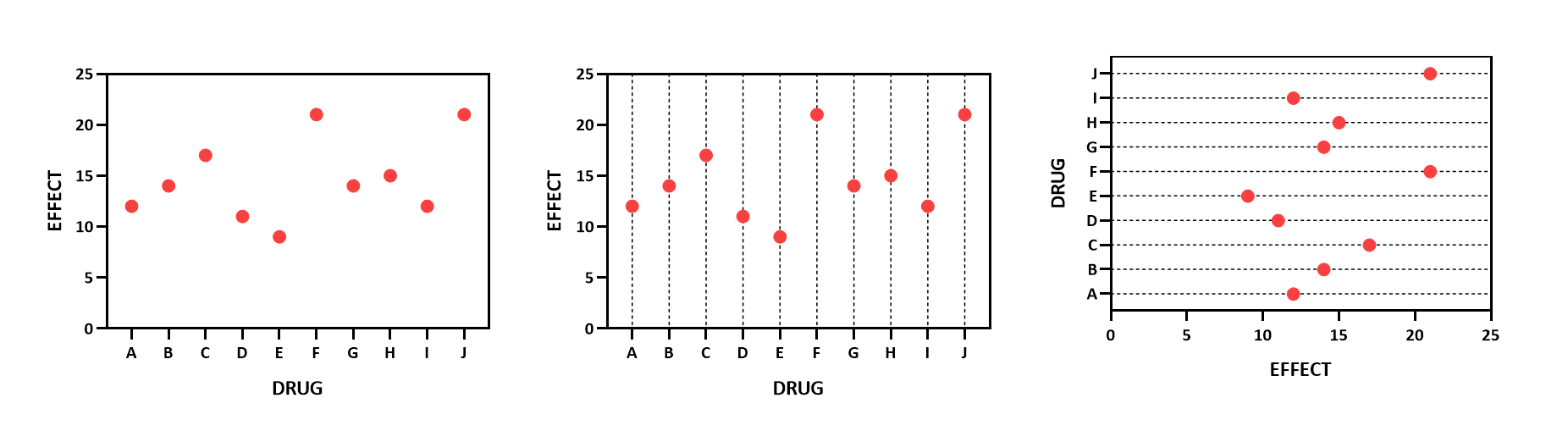
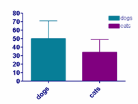
Choose how you want to display your data for each data set. Choose from a simple bar (with or without error bars), a scatter plot, an aligned dot plot, box and whiskers, before and after plot, or floating bars. Also choose how to plot error bars. Select SD, SEM, 95% CI, or range.
Note that your choice applies to only one data set column unless you used the global button to choose all or a subset of columns.
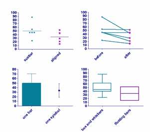
It can also be useful to use different styles for each bar of a graph, as below:
Or connect data sets A and B as before-and-after and data sets C and D, but not B and C.
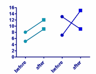
To do this, choose Before-and-after as the style for data sets A and C, and Aligned dot plot as the style for data sets B and D.
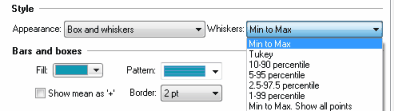
There are seven ways to plot box-and-whisker graphs. Traditional Tukey whiskers go 1.5 times the interquartile distance or to the highest or lowest point, whichever is shorter. Other choices show specified percentiles, which seems more logical. Any data beyond these whiskers are shown as points. Or you can choose to superimpose each individual point on the box and whisker plot. You need to have at least four values in order to create a box-and-whiskers graph.
Because whiskers can be done in various ways, it is essential to mention in a graph's figure legend which way they were made.
You can also plot "Symbol (one symbol per column)" and specify mean or median. This kind of graph looks better if you add a grid line from the first tab of the Format Axis dialog and flip it to be horizontal.
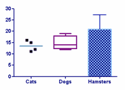
Bars and boxes
Set the format of bars and the box part of box-whisker plots. If you check the option to use a fill pattern, you can then choose the type of fill pattern you want and what color to use.
Symbols
Choice here apply to symbols used for column scatter and before-after graphs, as well as the symbols shown (if any) on box-and-whisker plots.
If you check the option to plot a symbols on a bar graph, every value will be plotted. If you check the option to plot symbols on a box-and-whiskers plot, the number of symbols is chosen in the drop-down in the Whiskers section at the top of the dialog (see above). You can choose to plot all points (last choice in the list) or only to plot "outliers" defined in various ways.
Error bars
Choose the format and color of error bars. Learn more about error bars.
Lines
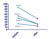
Choose the color and thickness of lines for means on scatter plots and the connecting lines on before and after plot.
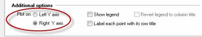
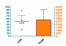
Plot on which Y axis
Specify which axis to use for each data set. This is useful if you want to show different type of data on the same graph. If you choose to plot on the right Y-axis, Prism will create that axis if it doesn’t already exist.
Legend
Select Show legend to create a legend for this data set. You can edit the labels in the legend. Double-click on the legend text and type whatever you like. Use the Revert Legend to Column Titles checkbox in the Legend section of the Format Graph dialog to change the labels back to match the column titles. (This checkbox is only available if you have edited a legend.)
Label each point with its row title
On before and after plots and scatter plots, you can choose to have X labels show on the graph to identify individual data points. Check this box to include X titles on graph near each data point. Select each label on the graph and drag it to move it where you want.