Format Graph dialog - XY graphs
Use this dialog to change the look of all the symbols in a data set. If you want to change the look of a single data point, use the right-click menu. You can also change all the symbols in selected data sets.
Double-click on any graph symbol or bar to open the Format Graph dialog.
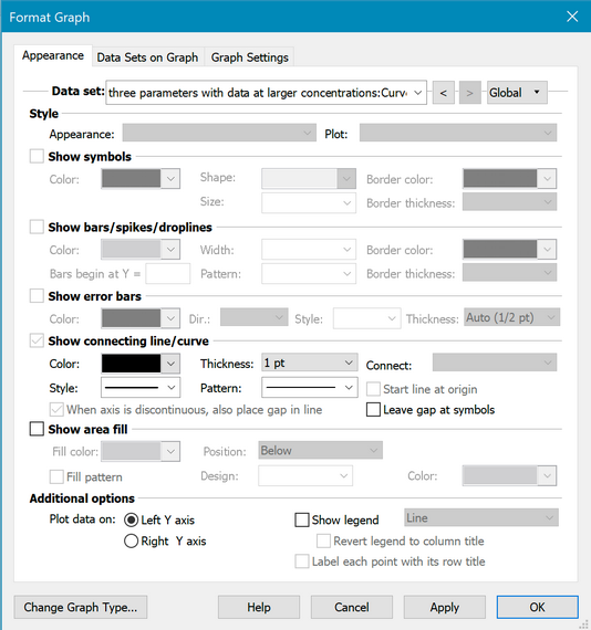
To change the settings for one data set:
Select a data set from the list, and choose the symbols, lines, and error bars for that data set. Then select another data set and choose settings for that data set. Click OK to redraw the graph with all the changes. Note that a fitted curve is treated as a separate data set.
To change all data sets on the graph for example to make all symbols larger:
Click the Global button at the top right of the Format Axis dialog. Then choose to change all data sets, or a subset of data sets. Changes you make after that will then apply to all selected data sets.

There is a shortcut for changing all -- Hold down the control key. (Note the 'globe' cursor since you are making global changes.)
Style
Choose how to plot error bars. Select SD, SEM, 95% CI, or range. If you created a data table with no Y subcolumns, you won't have any choices here. But, if you entered data into subcolumns, the choices here determine how the replicates or error bars will appear. The Appearance drop-down on the left determines the basic look, with further choices in the Plot drop-down to the right (the choices will depend on what you select in Appearance).
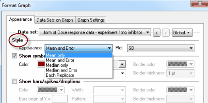
Since it rarely makes sense to choose different error bar (or replicate) choices for different data sets, you will probably want to click Global and then All before changing error bar format.
If you have four or more subcolumns for replicates, Prism will also give you the opportunity (at the bottom of the appearance drop down menu) to plot box-and-whiskers at each X value.
Show symbols
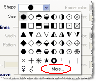
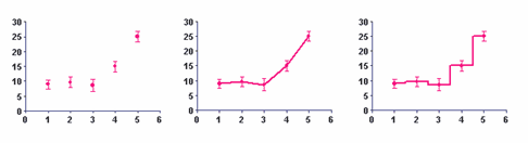
Choose symbol type, size, and color. If you pick an open symbol, also select a border thickness. Check the Clear option if you want point-to-point lines and overlapping points to show through the open symbol. Use the Shape drop-down menu to select one of Prism's symbols. Use the More option on this drop-down to use any character from any font on your computer as a symbol.
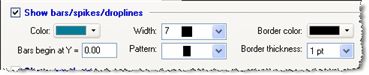
Show bars/spikes/drop lines
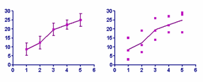
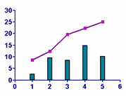
Use this setting if you want to drop vertical bars from your data points. The bar will start at the X-axis or whatever Y value you choose and go up (or down) to the Y position of the point. This is useful when you want to create a bar graph where each bar’s position is determined by its X value. It is also useful when you want to combine points and bars on one graph as shown below. If you pick the narrowest width for the bars, the bars will actually be spikes suitable for graphing mass spectra.
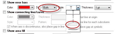
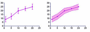
Show error bars
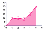
Choose the format and color of error bars. Choose dotted or solid lines to show an error envelope as in the graph on the right below. Use the Show Area Fill button to add fill between the limits of the error envelope.
Connecting line/curve
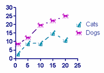
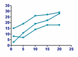
Choose the line's color, style (straight vs. staircase), thickness, and pattern (solid, dotted, dashed, etc.). This section includes choices to have your connecting start either at the first data point or the graph origin, whether to leave gaps in the connecting line next to the symbols, and whether to plot lines connecting each replicate for repeated measures in corresponding data sets as in the graph on the bottom row below.
If you choose arrows as connecting lines, it looks best to not also show symbols.
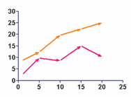
Don't confuse the connecting line – which always goes from point to point – with a best-fit curve or line created by regression. If you have fit a curve through the data, Prism sees the curve as a separate data set. Select the data set for the values, and choose symbols but no connecting line. Then choose the data set for the curve, and choose a connecting line (curve) with no symbols.
Area fill
Fill below (or above) the point-to-point line that connects your points with a fill. Specify fill color and pattern, and background color. You may need to adjust the front-to-back order of the data sets to get the effect you want.
Plot on which Y axis
Specify which axis to use for each data set. If you choose to plot on the right Y-axis, Prism will create that axis if it doesn’t already exist.
Legend
Select Show legend to create a legend for this data set. Select Label each point with its row title to link the legend to the column title entered on the data table. Uncheck this box if you don’t want the legend to change when you edit the column title. You can also edit the labels in the legend. Double-click on the legend text and type whatever you like. Use the checkbox Revert Legend to Column Titles in the Legend to change the labels back to match the column titles. (This checkbox is only available if you have edited a legend.)
Label each point with its row title
Check this box to include row titles on graph near each data point. You can move each label by selecting it and dragging. Even if you move a label, however, it remembers its position relative to the data point -- so when you change your data, or the size and shape of your graph, the labels will adjust accordingly. Click on any label on the graph and use the Text section of the Prism toolbar to change the size, font, and color of all the labels.