The advantage of showing every replicate instead of error bars
When making a XY graph, Column graph or Grouped graph, you don’t have to plot error bars. Instead you can graph each data point (replicate). This is often the best way to display variation, as it shows your data exactly. Don't plot mean or median with error bars too quickly. Stop to think about whether a graph of the actual data would be more informative.With modest amounts of data, it is almost always better to show the data.
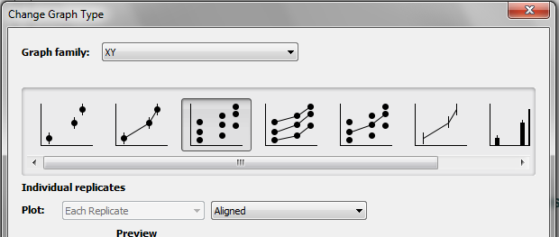
XY graphs
Choose Individual Replicates when you pick the error format for your graph.
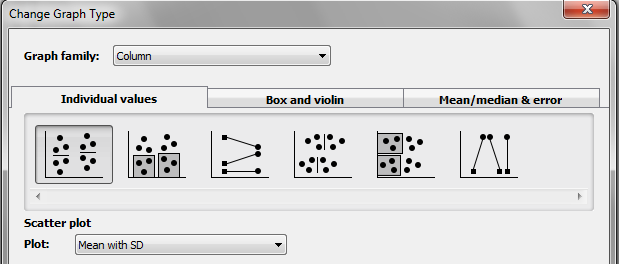
Column graphs
Choose to make a scatter plot.
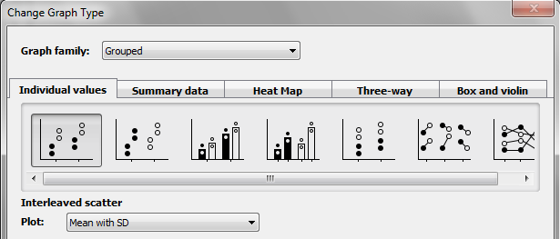
Grouped graphs
Choose the Plot individual values tab. Then choose any of the graph types.
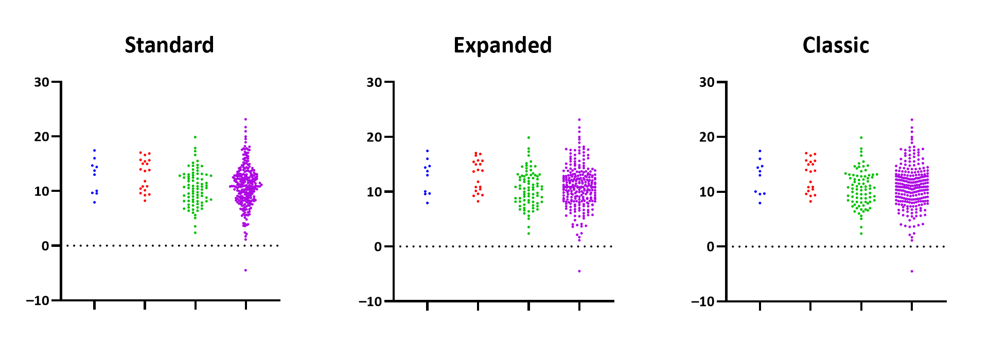
Three ways to plot Column or Grouped scatter plots
Prism 8.2 introduces a choice for how to plot scatter graphs. These choices are in the Graph Settings tab of of the Format Graph dialog. You can choose the default Prism uses when creating graphs in the New Graphs tab of the Preferences dialog.
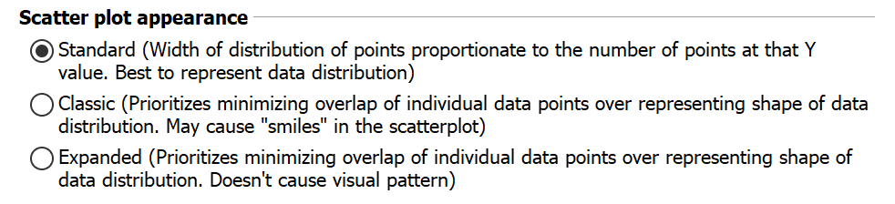
•Standard: With this method, the width of the distribution of data points is proportional to the number of individual points at that Y value. This will create a visualization with your data points arranged similar to the appearance of a violin plot. Sort of like a histogram. This is the best choice if you're wanting to visualize the distribution of your data
•Classic: This method prioritizes minimizing the amount of overlap of individual data points over representing the shape of the distribution. In regions of less data, it will try to spread these points out so you can see individual points better. Additionally, this method may create "smiles" in the scatterplot (similar to the appearance of scatterplots in prior versions of Prism). This is a good option if you want to maintain a consistent look with graphs created using older versions of the software
•Expanded: This method also prioritizes minimizing the amount of overlap of individual points over representing the shape of the distribution. Data points in regions with less data will be spread out, but without generating "smiles" in the data
With a small number of points, the three methods look almost the same. With more points, the differences between the methods becomes more apparent.