Extending a ROC curve.
Background
Prism can analyze a set of lab values from patients and controls to create a ROC curve. This curve shows the tradeoff of sensitivity vs. specificity for various threshold values to define an abnormal test. By changing the threshold value, you can increase sensitivity and decrease specificity. Or you can decrease sensitivity and increase specificity. The ROC curve shows the possibilities.
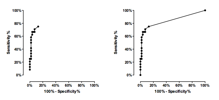
Prism creates the ROC curve by calculating the sensitivity and specificity for every value in the data set. However, Prism does not extend the curve to the extremes. It does not plot a point with 100% specificity and 0% sensitivity, or with 0% specificity and 100% sensitivity. These points are not helpful in deciding where to set the cutoff, but some people like to include them on the graph.
Prism 6
Check the option on the bottom of the Parameters dialog for ROC to extend the line down to 0,0 and up to 100,100.
Prism 5
If you'd like to make a graph that includes those end points, follow the steps below. The basic idea is to create a new table with the extra rows.
- Go to the results page named ROC curve, and copy the entire table.
- Create a new XY data table.
- Paste the values.
- Select the first row, drop the Insert menu, and choose Rows/Columns.
- Enter 100 for X (which is 100% minus specificity%) and 100 for Y (sensitivity%)
- Go to the bottom of the table and enter 0 for X and 0 for Y.
- Polish the graph
The graph on the left shows the data computed by Prism. The graph on the right adds the extra two rows to extend the graph to the two diagonal corners of the graph. Download the Prism file.