This set of graphs shows the importance of designing experiments where pairing or matching is part of the experimental design, and of accounting for that pairing when analyzing the data.
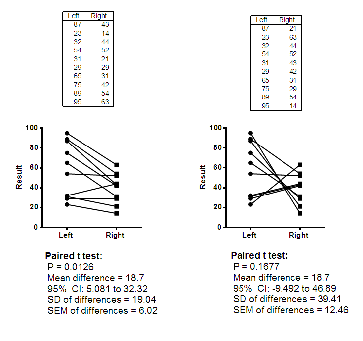
These data compare a result in the left and right eye of the same person. The two data tables show two different sets of results, and the figure below show the data and results.
The data for the left eye is the same in both cases. The data for the right eye differs. Actually, the values are the same values, but the order is different. Since the values are the same, an unpaired t test would look identical results for both experiments. A bar graph showing the mean and SD (or SEM) of each group would also be identical for both groups.
The before-after graph, which shows the pairing, looks very different for the two experiments, and the results of a paired t test are very different. The experiment on the left shows a consistent difference between left and right, with a small P value. The experiment on the right leads to no clear conclusion.
This example makes these points:
•When the experiment had a paired design, it is really important to do a paired test.
•When the experiment has a paired design, it is important to use a before-after graph to show the results. A graph showing only the mean and SD (or SEM) separately for each eye would not really give you a good idea of what's going on.
•It doesn't really help to report the mean and SD (or SEM) of each treatment (left and right in the experiments shown above). These results are identical for the two experiments shown above. Instead, it makes sense to show the mean difference with its SD, SEM or confidence interval.