What are residuals?
Unweighted fits
A residual is the distance of a point from the curve. Least-squares regression works to minimize the sum of the squares of these residuals. A residual is positive when the point is above the curve, and is negative when the point is below the curve. Create a residual plot to see how well your data follow the model you selected. Mild deviations of data from a model are often easier to spot on a residual plot than on the plot of data with curve.
Weighted fits
If you choose to weight your data unequally, Prism adjusts the definition of the residuals accordingly.
The residual that Prism tabulates and plots equals the residual defined in the prior paragraph, divided by the weighting factor. The most common common alternative weighting is "Weight by 1/Y2 (minimize relative distances squared)". In this case, the residual is defined to be the distance of the point from the curve divided by the Y value of the curve. Weighted nonlinear regression minimizes the sum of the square of these residuals. Note the ambiguity in defining weighting. The Prism dialog gives the choice to weight by 1/Y2. This means that the squared residual is divided by Y2. The weighted residual is defined as the residual divided by Y. Weighted nonlinear regression minimizes the sum of the squares of these weighted residuals.
Earlier versions of Prism (up to Prism 4) always plotted basic unweighted residuals, even if you chose to weight the points unequally.
Which kind of residual graph?
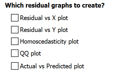
Prism provides five types of graphs that can be used to investigate the residuals of a model fit:
X axis |
Y axis |
|
Residual vs. X plot |
X values of data |
Residual or weighted residual |
Residual vs. Y plot |
Predicted Y value |
Residual or weighted residual |
Homoscedasticity plot |
Predicted Y value |
Absolute value of residual or weighted residual |
QQ plot |
Actual residual |
Predicted residual if residuals are sampled from a Gaussian distribution |
Actual vs Predicted plot |
Actual Y value |
Predicted Y value |
Prism allows you to create as many of these residual graphs from nonlinear regression as you'd like. Simply select the checkboxes next to the name of the residual graphs that you would like to include with the analysis results.
Examples
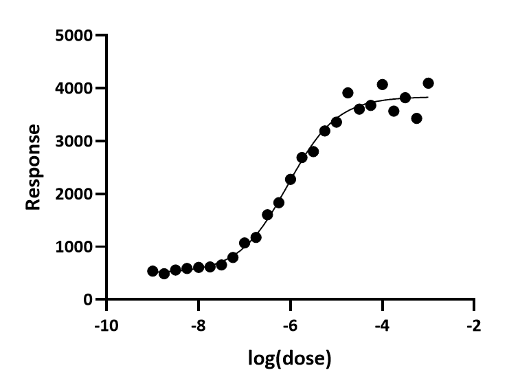
Example fit
Here is a log(dose) vs. response curve with simulated data. The random scatter was chosen so the points with larger Y values have larger average scatter. The fit was done the usual way without weighting. If you look carefully, you can see that the points at the top of the curve have more scatter, but it isn't so obvious.
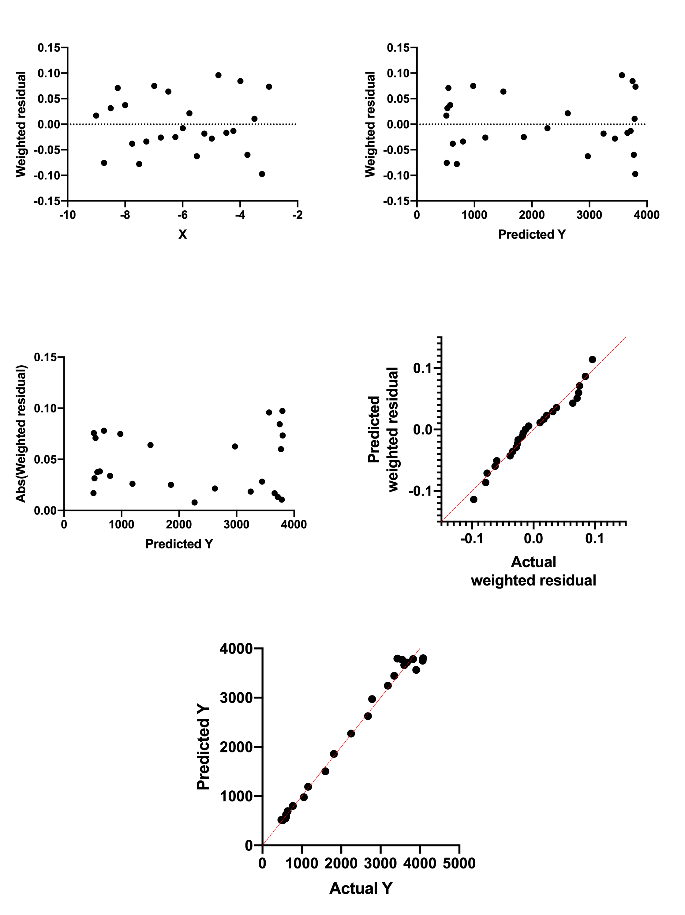
Residual vs. X

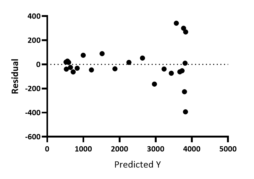
This is the most common residual graph. Prism 7 and earlier only created this kind of residual plot. You can see that the points with large X values have larger residuals (positive and negative).
Residual vs. predicted Y
For each point, Prism calculates the Y value of the curve at that X value, and plots that Y value on the X axis of the residual plot. The Y axis of the residual plot graphs the residuals or weighted residuals. You can see that the points with larger Y values have larger residuals, positive and negative.
In this example the Y values get larger as X values get larger. So this graph doesn't look very different than the residual vs. X plot. But if the curve is biphasic, the two graphs will look more different.
Homoscedasticity plot

This graph is made just like the graph of predicted Y vs. residuals, except here the absolute values of the residuals are shown. Now it is really clear that the residuals get larger as Y gets larger.
QQ plot
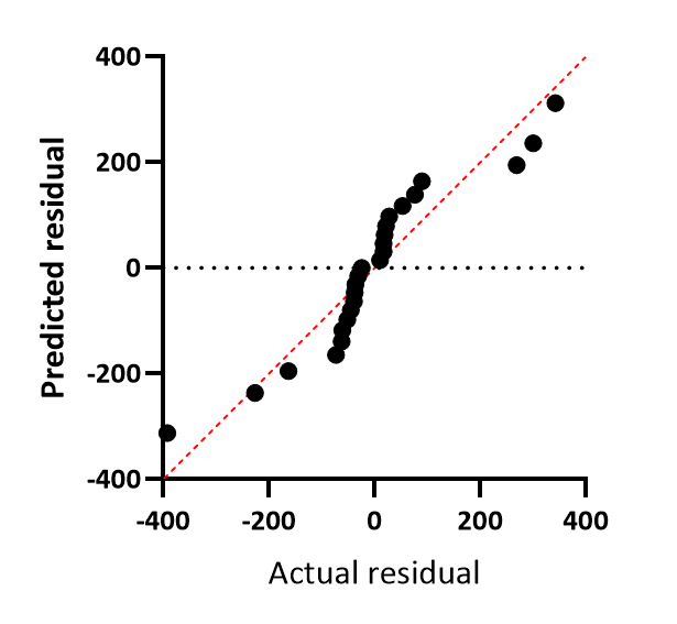
The X axis plots the actual residual or weighted residuals. The Y axis plots the predicted residual (or weighted residual) assuming sampling from a Gaussian distribution. An assumption of regression is that the residuals are sampled from a Gaussian distribution, and this plot lets you assess that assumption. If the assumption is true, the points should all be very close to the line of identity, shown in red on the graph. QQ plots sometimes plots one or both axes as percentiles or quantiles (same as percentiles but as fractions rather than percentages). Prism always plots both axes in the same units as the Y values of the data.
In this example, the data don't follow the line of identity very well. The data are sampled from Gaussian distributions, but the SD of that distribution was larger when the Y values were larger. The residuals were not sampled from a single Gaussian distribution, and this accounts for the systematic discrepancy between the points and the line of identity.
Actual vs Predicted plot
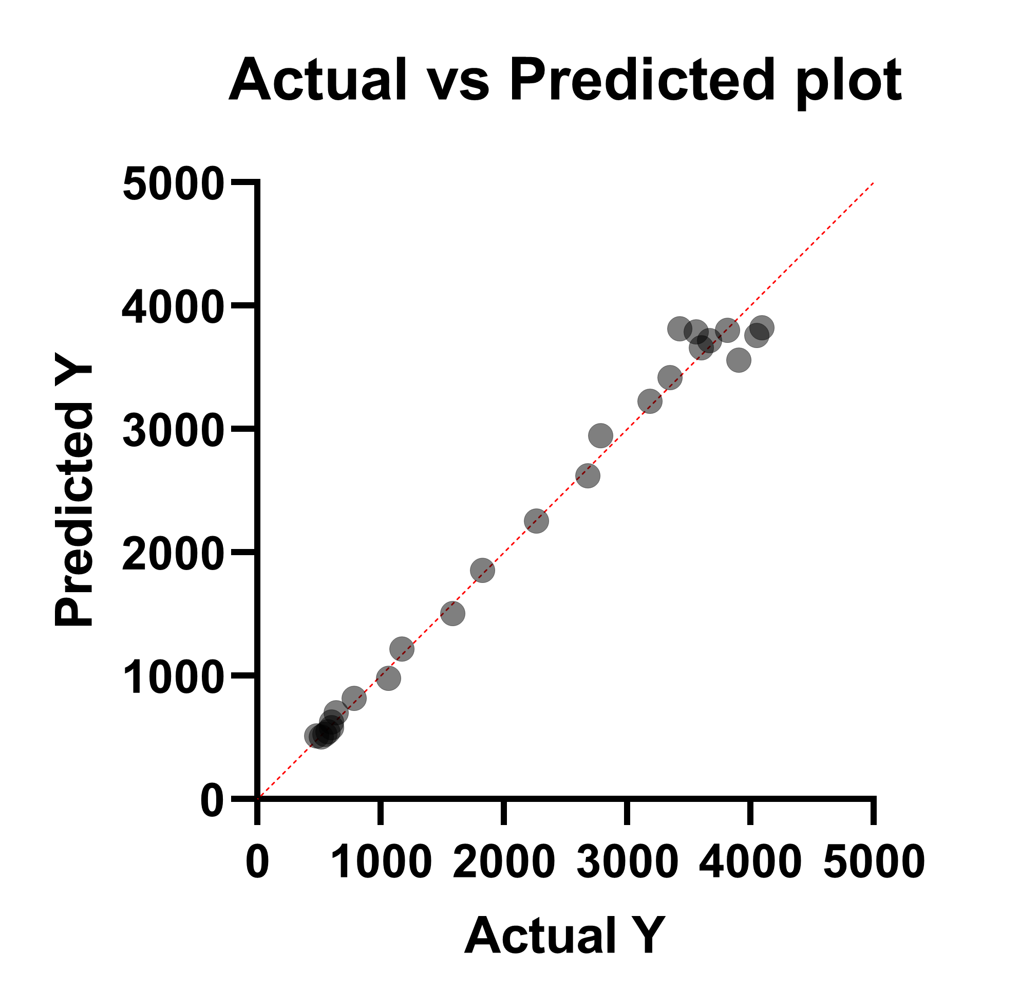
This graph doesn't directly plot the residual of the fit on either axis. Instead, this graph plots the actual Y value (entered in the data table) on the X axis, and the Predicted Y value on the Y axis. This graph is commonly used for assessing the fit of simple linear regression (and Prism also generates this graph for multiple linear regression), but is not common for use in nonlinear regression. In this case, the residual is represented by the vertical distance between the plotted point and the red line of identity (the horizontal distance can also be used as these distances will always be the same for each point).
While use of this graph in nonlinear regression is not standard, this graph can still be used as a means to investigate how well the model predicts the measured outcome (dependent) variable. The graph above shows that at lower Y values, the model does a better job predicting the actual values (points are closer to the line of identity), while at higher Y values, the predictions are farther from the actual values (points farther from the line of identity).
It is critical to note, however, that just because a model predicts the data very well (in other words, the curve passes very close to every point), this does not indicate that the model is correct! With enough terms in nonlinear regression, an arbitrary curve can be generated that passes through every point nearly perfectly. Be sure that the model you're using makes sense scientifically before trying to interpret this plot.
Same example fit with weighted regression
The data were then fit to the same model but with relative weighting. Here are the fivea residual graphs. All show that the data now comply with the assumption of the fit.