Prism automatically graphs the actual Y values (on the X axis) vs. the predicted Y values (from the regression; on the Y axis). If the model is useful, the data should cluster around the line of identity, which is shown. This graph gives you a visual sense for how well the multiple regression model explains your data. These kinds of graphs are not often shown, but they should be!
In this example, some of the predictions of the model are far from the actual data, suggesting that the model fit here is incomplete.
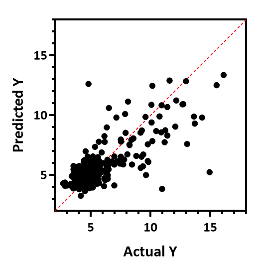
The r2 from linear regression of this graph is the same as the R2 from the multiple regression. (By tradition, a lower case r is used with linear regression and an upper case R with multiple regression).
Prism can also plot residuals in up to four different ways.