The primary objective of PCA is dimensionality reduction. Dimensionality in this case simply means the number of variables required to describe your data. Thus, in simple terms, dimensionality reduction is just a means of reducing the number of variables required to describe your data.
Why would we want to reduce the dimensionality of data?
When dealing with large datasets, it’s often useful to visually inspect the data to find trends or patterns in the data. These patterns could be used for clustering or grouping the observations, or to understand the relationships between different variables in the data. Consider the following dataset:
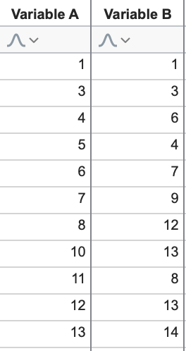
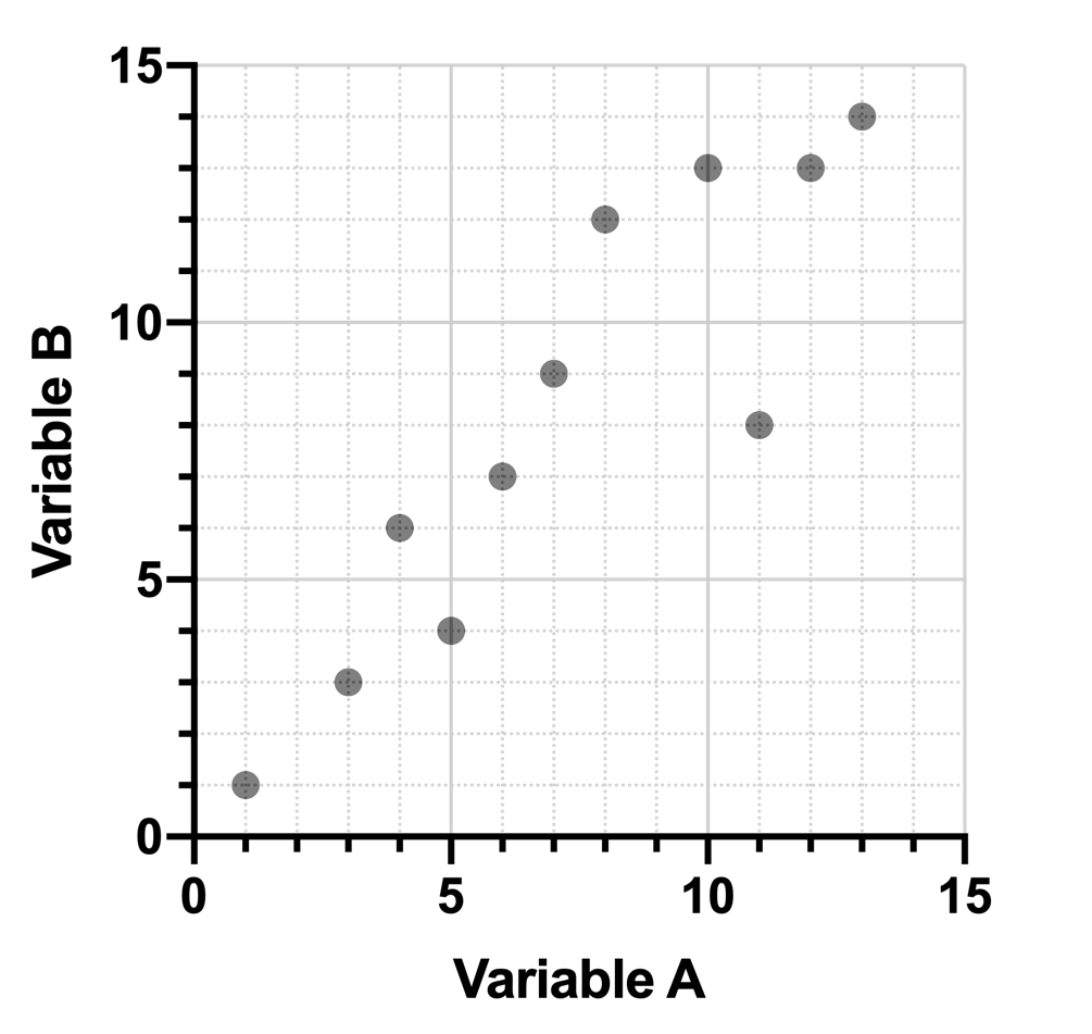
We can easily see that - in general - as Variable A increases, Variable B also increases (a positive correlation). Using these data, we could quickly prepare an XY plot visually showing this relationship. Of course seeing this relationship is easy because there are only two variables!
But as the number of variables in the data increases, identifying the underlying patterns of the data becomes more difficult. Consider the following expanded data:
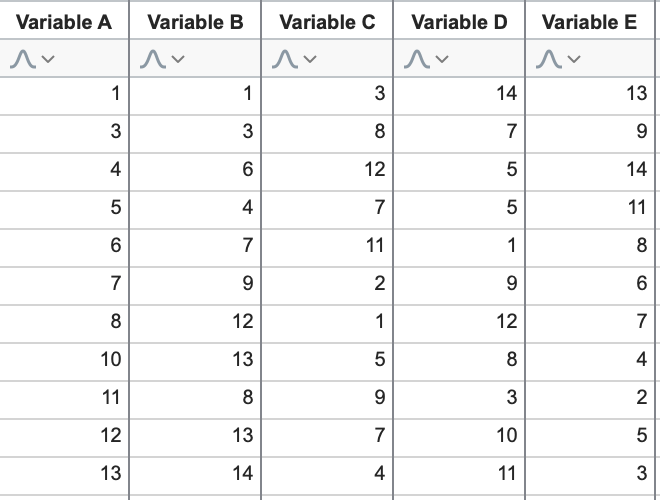
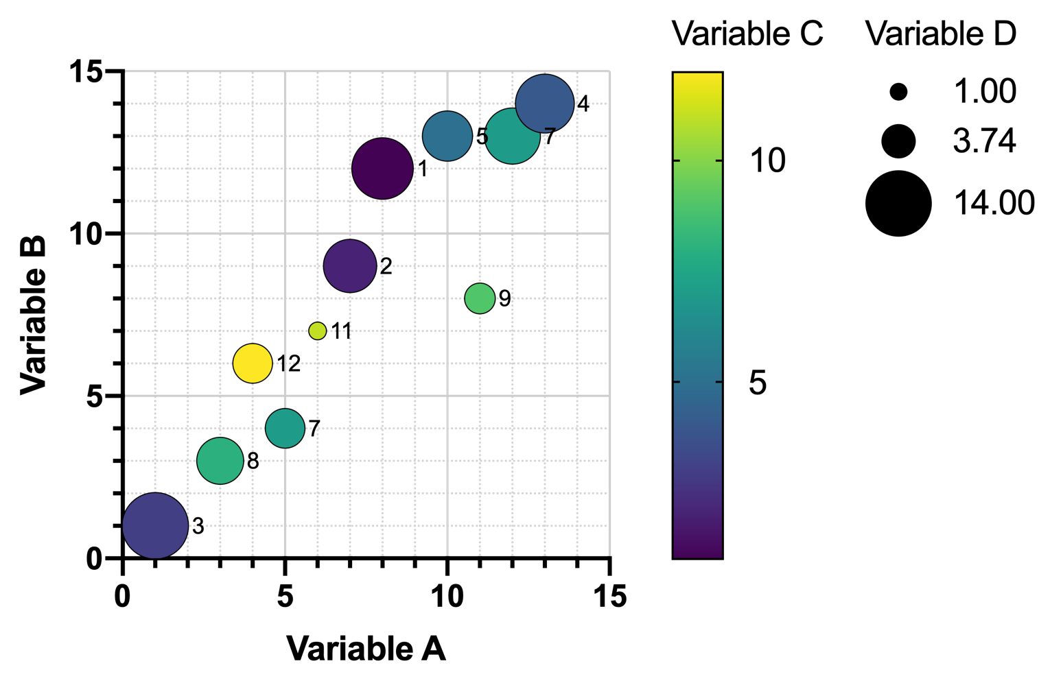
Without plotting the data, the relationships are no longer as easy to spot. Using the first three variables, we could create this graph, where color is determined by the value of Variable C:
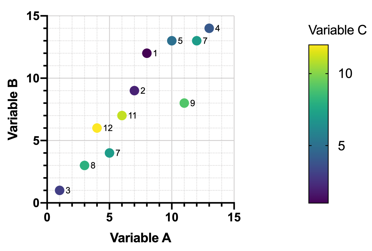
However, even with this plot, any relationship between Variable A and Variable C (as well as Variable B and Variable C) is not apparent. As the values of Variable A (or Variable B) increase, there doesn’t seem to be any predictable pattern in the values of Variable C.
An additional variable could be added to this graph, using its values to determine the symbol size. In the graph (below), symbol size is proportional to the value of Variable D. However, as the number of rows in the data increase, these kinds of graphs become even harder to read, and relationships certainly do not jump out at you.
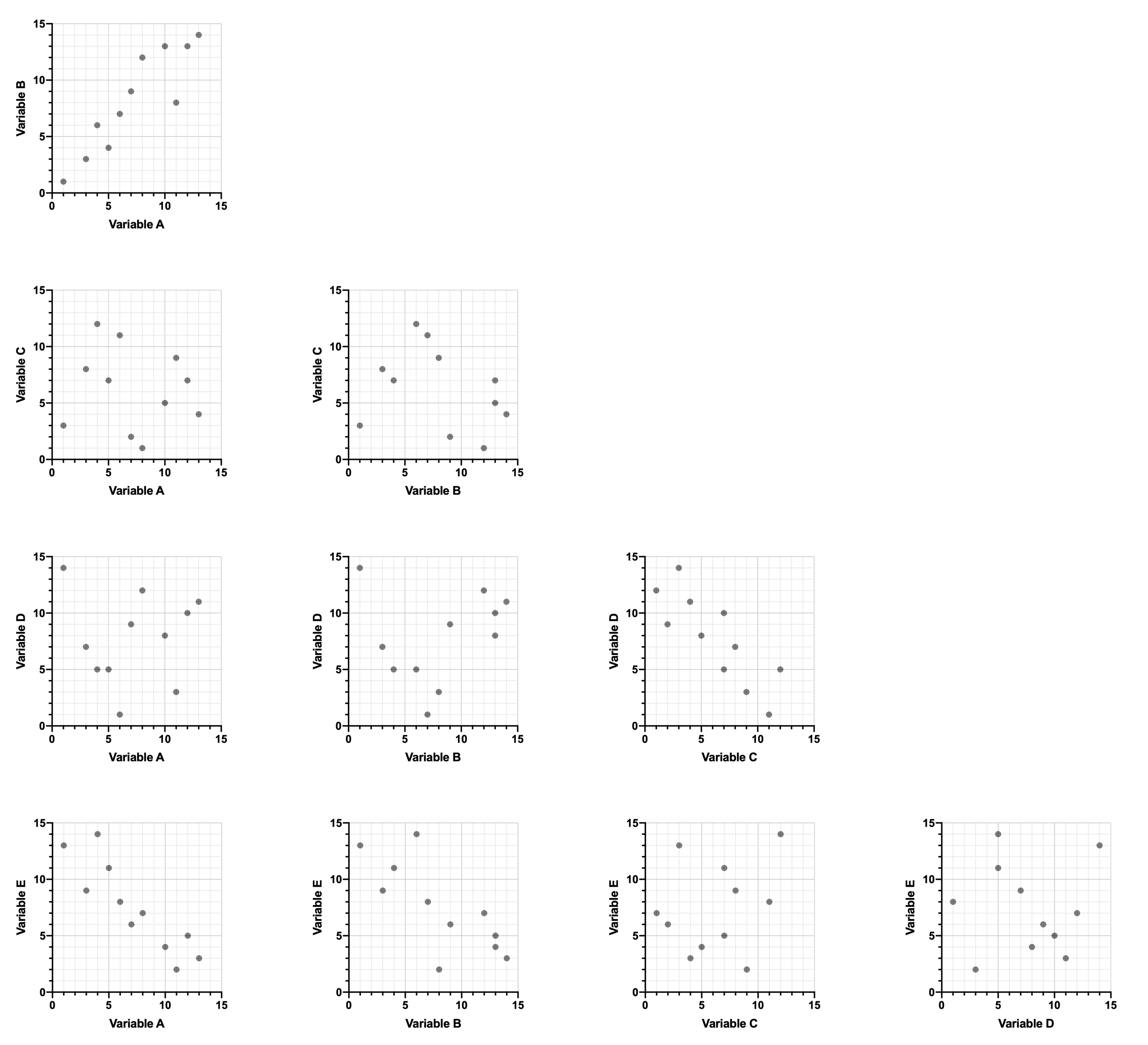
If the dataset includes a large number of variables, it becomes nearly impossible to represent all of the variables on a single graph. Graph matrices can be used to show the relationships between each pair of variables (see below), but these provide very little insight into larger potential relationships involving multiple variables at once.
An alternative approach to visualizing multiple pairs of variables simultaneously might be through the use of graphs with additional perpendicular axes (for example “3D” graphs with a third perpendicular axis representing a third variable or third dimension). However, these graphs have their own inherent limitations. The obvious limitation is that we (humans) only perceive three spatial dimensions (height, width, depth). There is no good way to include more than three axes at once in any way that would make intuitive sense. Thus, this solution would not work for datasets with a large number of separate variables.
There are other (non-visual) problems that arise when working with datasets with a large number of variables. One of the biggest problems is “over-fitting”. We won’t go into the details here, but the short version is that with too many variables (i.e. too many dimensions), any model that we generate to describe our observed data would fit the data too well, and would not be useful for predicting values for future observations.
For these reasons, techniques for reducing the number of dimensions in a dataset without totally eliminating variables have been developed. PCA is one of those techniques, and relies very heavily on the concept of feature extraction (projection of data onto a smaller number of dimensions by means of linear combinations), discussed in the next section.