How to compute the data
These choices are simply matters of preference and very straightforward:
•Plot survival or event occurrence? Plotting survival is more common, and will generate a curve that starts at 100% at time 0, and decrease as time increases. Plotting cumulative probability of the event of interest generates a curve that starts at time 0 and increases as time increases
•Plot fractions or percents? Survival probability can be reported on the graph as values between 100% and 0%, or as fractions between 0 and 1. The choice is entirely up to personal preference
How to graph the data
Graphs without error bars
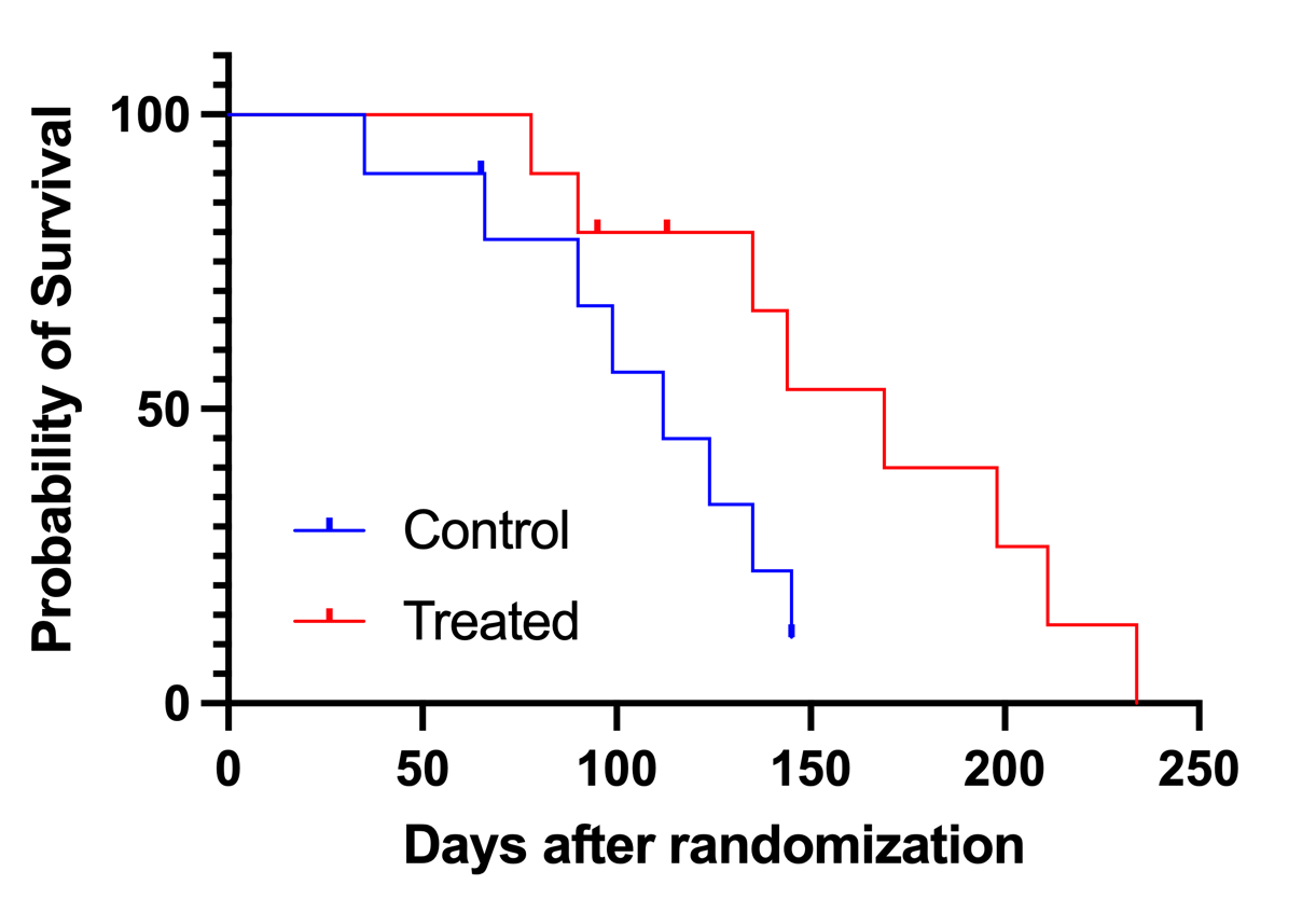
As shown in the examples below, survival curves are usually plotted using connecting lines in a staircase pattern (instead of straight lines connecting each point). Each drop in this staircase represents the occurrence of on (or more) events of interest for this plotted group.
In the left graph below, the elapsed observation time is plotted on the curve as a tick. Symbols for both events and censored observations are plotted, but the ticks for the events are “hidden” by the vertical portions of the curve. Censored observations can be clearly seen as ticks along the horizontal portion of the curve. These data include two observations in the treated group between the times of 100 and 150 days.
The graph on the right plots all of the data (events and censored observations) as circles so that you can see each subject

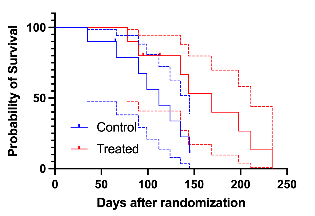
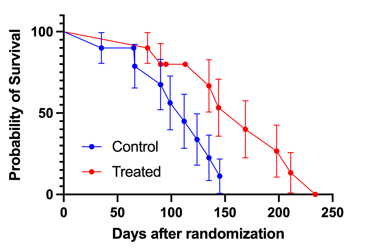
Graphs with error bars
Showing error bars or envelopes arguably make survival curves more informative, but also more cluttered and - sometimes - more difficult to read. The graph on the left below shows the staircase error envelopes that enclose the 95% confidence interval for the probability of survival. This shows the actual survival data very well as a staircase, but the overlapping curves for the survival and error envelope of each group overlap substantially, making it hard to read. The graph on the right shows error bars that provide the standard error of the survival probability at each plotted point. To prevent the error bars from being superimposed on the staircase curve, the points are connected by straight lines rather than by a staircase curve.
How to add a grid line at Y=50% to show median survival
Add a grid line at y=50 (if using fractions instead of percents, add the line at Y=0.5). To do this, double click on the Y axis to bring up the Format Axis dialog. Then at the bottom of the tab, enter the appropriate Y coordinate (50 or 0.5) and check the box for adding a grid line. Click on the details button for more customization choices for the line style, thickness, and color.