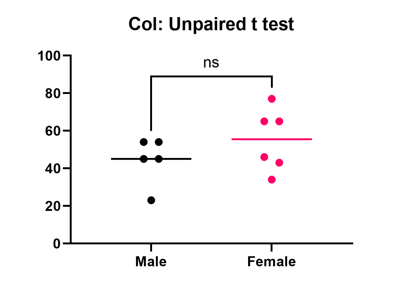
Points or bars?
The graphs above plot the sample data for an unpaired t test. We prefer the graph on the left which shows each individual data point. This shows more detail, and is easier to interpret, than the bar graph on the right.
Graphing tips
•When creating a scatter plot for data from a normal distribution, the horizontal line should be plotted to represent the mean. For data sampled from a lognormal distribution, this horizontal line should represent the geometric mean. If you choose the nonparametric Mann-Whitney test, you'll probably want to plot the median instead (a choice in the Format Graph dialog). Prism lets you turn off the horizontal line altogether.
•Prism's pairwise comparison feature allows you to automatically add the P value results of the analysis to the graph
•Don't forget to state somewhere how the error bars are calculated. We recommend plotting the mean and SD for normal data, the geometric mean and geometric SD for lognormal data, or the median and interquartile range if you use the nonparametric Mann-Whitney test.
•We generally don't recommend using bar graphs. Bar graphs are great for count data when the height of the bars can be directly compared (e.g. a bar that is twice as long as another should represent a value that is twice as large). Bars can be misleading for a variety of reasons and often provide less information than simply displaying the data points directly
•If you believe you have too many points to display individual symbols, we would recommend using a violin plot rather than a bar graph. This allows the viewer to get a sense for the distribution of the data rather than the single value summary that a bar provides.
Including results on the graph
You can copy and paste any results from the results table onto the graph. The resulting embedded table is linked to the results. If you edit the data, Prism will automatically recalculate the results and update the portions pasted on the graph.
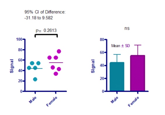
The graph on the left shows the exact P value. The graph on the right just shows the summary of significance ("ns" in this case, but one or more asterisks with different data). I recommend you show the exact P value. This summary can be added automatically by using the Pairwise Comparisons button in the Draw section of the toolbar.
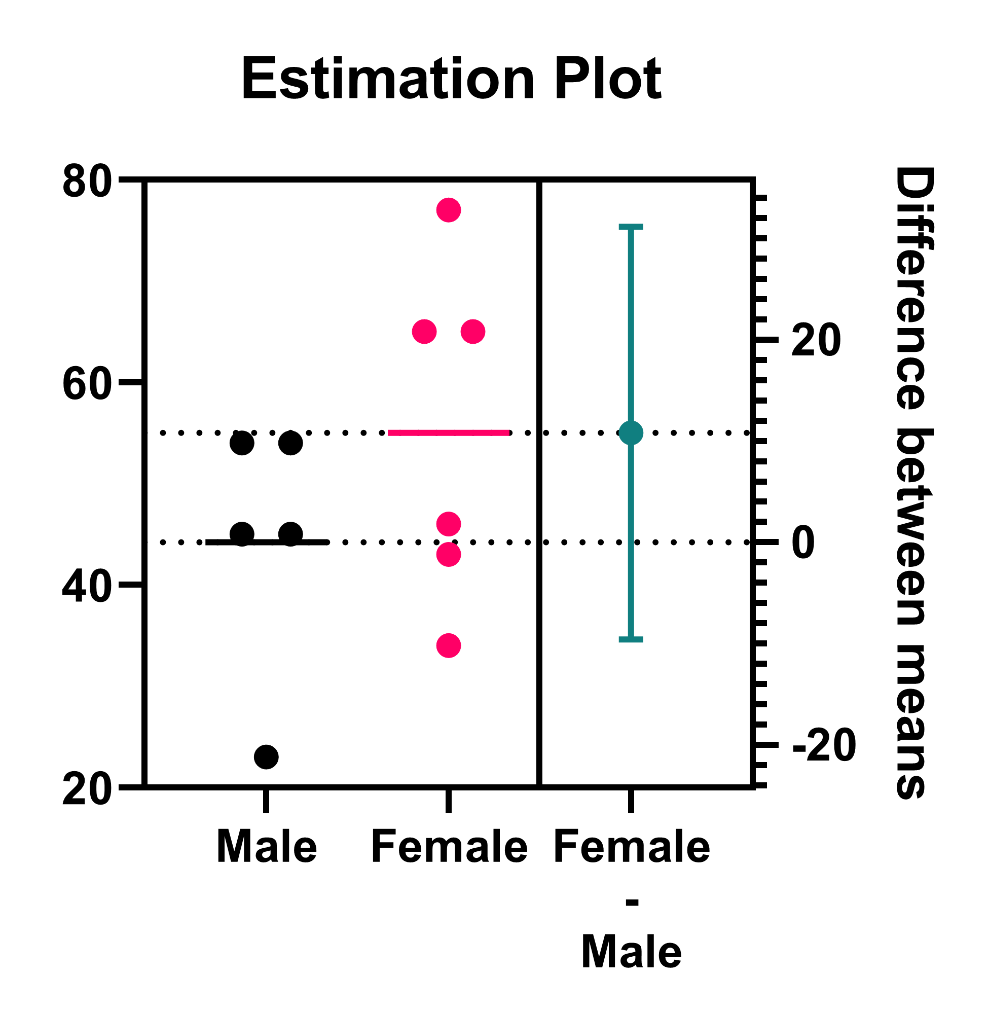
The most useful information from an unpaired t test is the difference between the two means, and the confidence interval for this difference. This confidence interval is pasted onto the graph above on the left. However, using an Estimation plot (created by default for unpaired t tests) is a much more informative way to display this information.