This set of graphs shows the importance of designing experiments where pairing or matching is part of the experimental design, and of accounting for that pairing when analyzing the data.
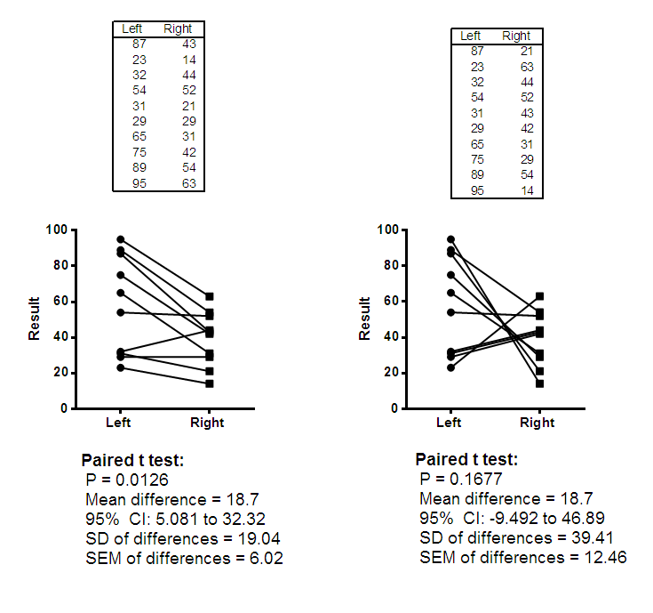
These data compare a result in the left and right eye of the same person, where the right eye was given a treatment and the left eye only was given saline drops as a control. The two data tables show two different sets of results, and the figure below show the data and results.
The data in the left eye column is the same in both cases. The data in the right eye column are the same values in a different order . Since the values are the same, an unpaired t test would produce identical results for both experiments. A bar graph showing the mean and SD (or SEM) of each group would also be identical for both groups.
The before-after graph, which shows the pairing, looks very different for the two experiments, and the results of a paired t test are very different. The experiment on the left shows a consistent difference between left and right, with a small P value. The experiment on the right leads to no clear conclusion.
These statistical results can be easily seen using Estimation plots for both analyses. This page talks more about Estimation plots and their interpretation, while this page provides information on how to generate an Estimation plot from a t test within Prism.


This example makes these points:
•When the experiment had a paired design, it is really important to do a paired test.
•When the experiment has a paired design, it is important to use a before-after graph to show the results. A graph showing only the mean and SD (or SEM) separately for each eye would not really give you a good idea of what's going on.
•It makes sense to show the mean difference with its SD, SEM or confidence interval. An estimation plot shows the raw data and the key result: the mean difference between pairs and its 95% CI.