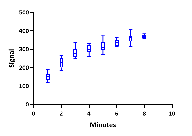
If you have five or more replicate values in side by side subcolumns, you can plot XY data as box-and-whisker plots. Because this is not a choice on the Change Graph Type dialog, you have to first make a different kind of XY graph (scatter, mean and error...) and then change to box and whiskers. To do that,
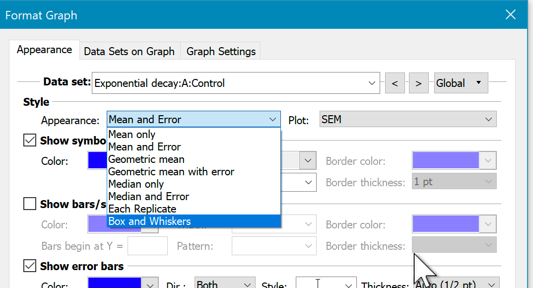
1. Double-click on the main part of the graph to bring up Format Graph dialog
2.Use the Global setting at the upper right to change all data sets at once.
3.Drop the Appearance control and choose Box-and-whiskers.
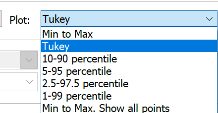
4.Use the Plot control to fine tune.
5.Adjust the size and color of the boxes, and the width and color of the border.