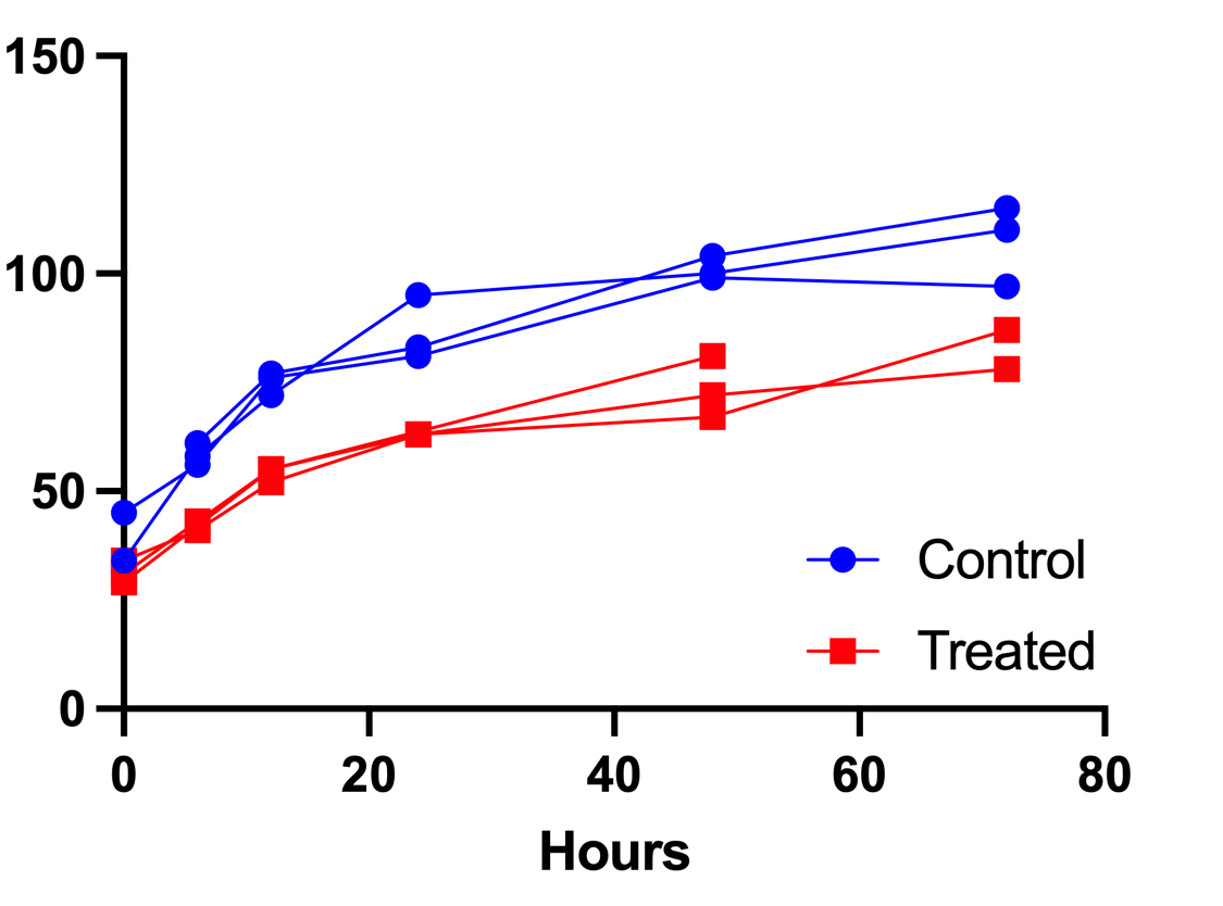
Spaghetti graphs plot longitudinal data, showing individual tracings for each subject (or other experimental unit).
Creating a graph like the one above is easy in Prism. To get started, you'll want to create an XY data table, using the "Y" controls to "Enter replicate values in side-by-side subcolumns". In this case, all of the values for each subject (or other experimental unit) will be entered into a single subcolumn of the table. The values entered into each subcolumn are the values that Prism will connect with the individual tracings on the subsequent graph.
As an example, consider the data below:
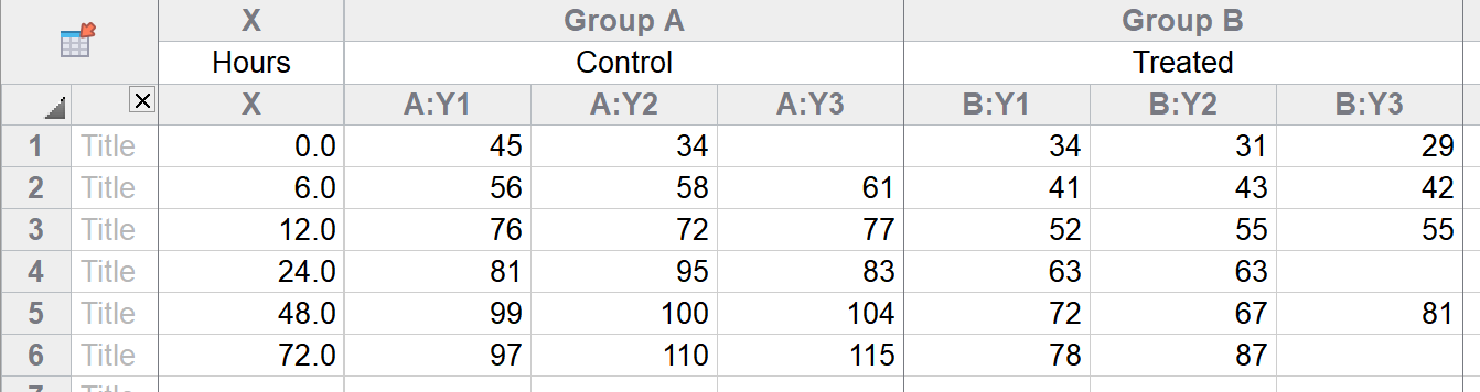
In subcolumn A:Y1, there are six values (45, 56, 76, 81, 99, and 97). These six values will be connected by a single trace in the spaghetti plot. Once the data are entered, simply click on the corresponding graph sheet in the Navigator. If this is the first time viewing the graph, the Change Graph Type dialog will automatically be displayed (if this is not the first time viewing the graph, the Change Graph Type dialog can be accessed using the toolbar button or the Change menu).
On the Change Graph Type dialog, be sure that "XY" is selected in the "Graph family" dropdown menu, and then choose the "Repeated measures with each replicate connected" graph type (see example below).
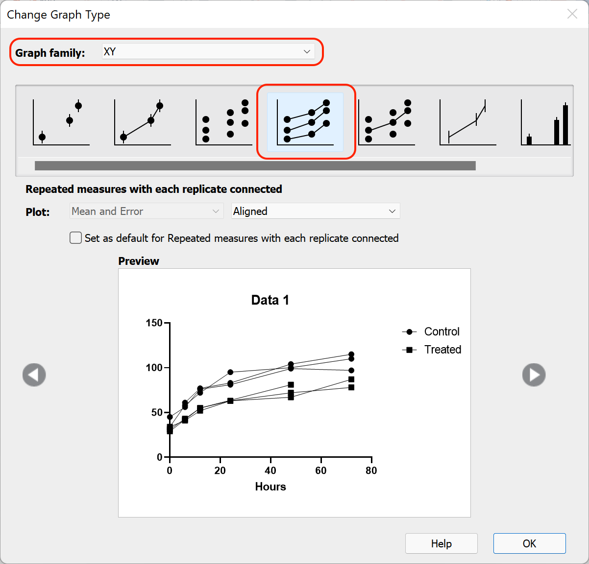
After clicking "OK", the basic structure of the spaghetti plot will be generated automatically.

At this point, all that remains is adding a bit of color to the graph and cleaning up the titles and legends.