The Prism Magic tool makes one (or more) graph look like another. It is a huge time saver.
Start from a graph, or several graphs selected in the Prism Gallery. Click on the Prism Magic tool in the Change section of the Prism toolbar.
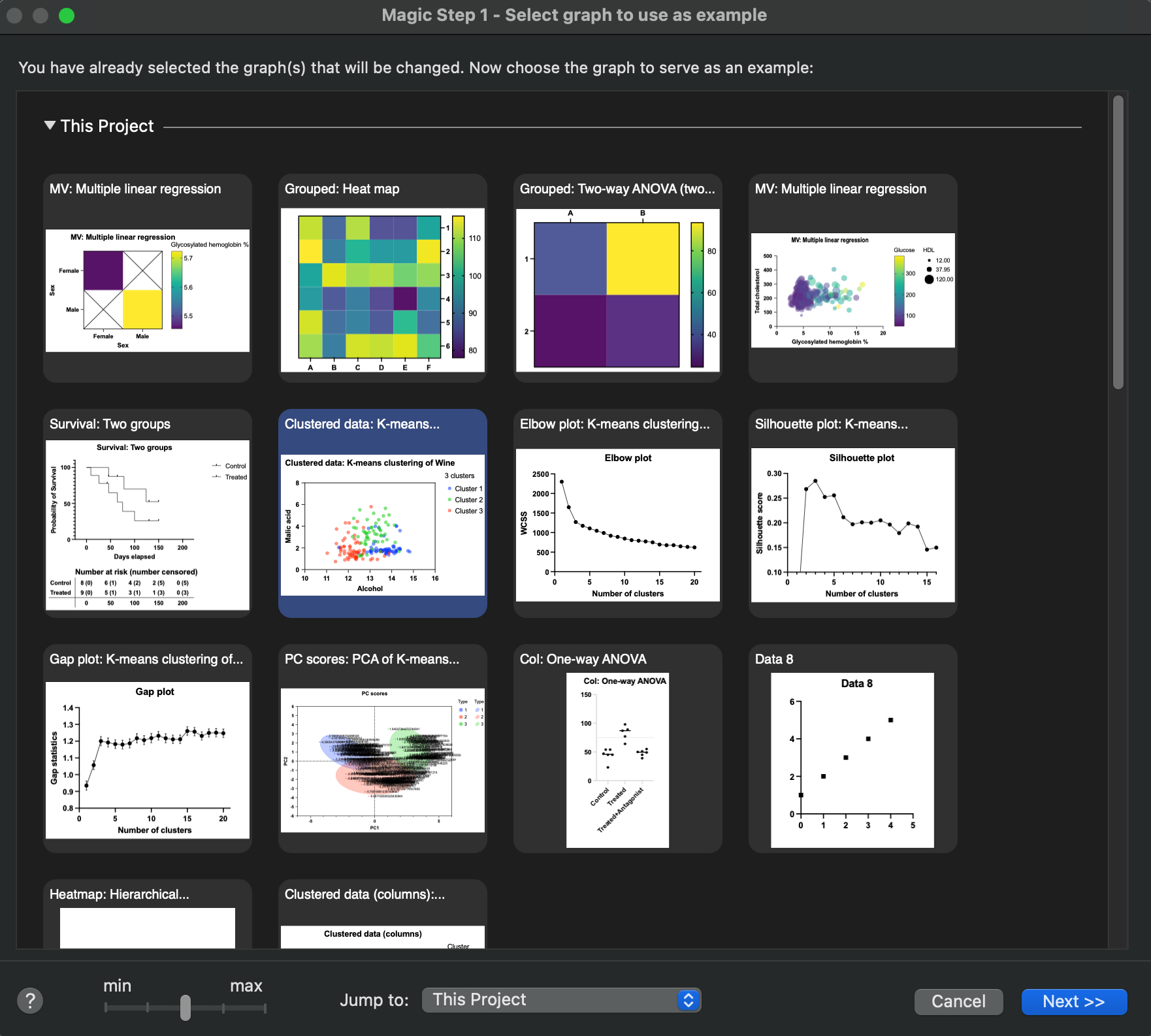
Select the graph whose appearance you'd like to match. You can choose from any graph in the current project or any open project, any graph saved as an example, or any graph recently (two months) printed, exported, copied to clipboard, or used as a Magic example (so long as it had been saved, so the file has a name).
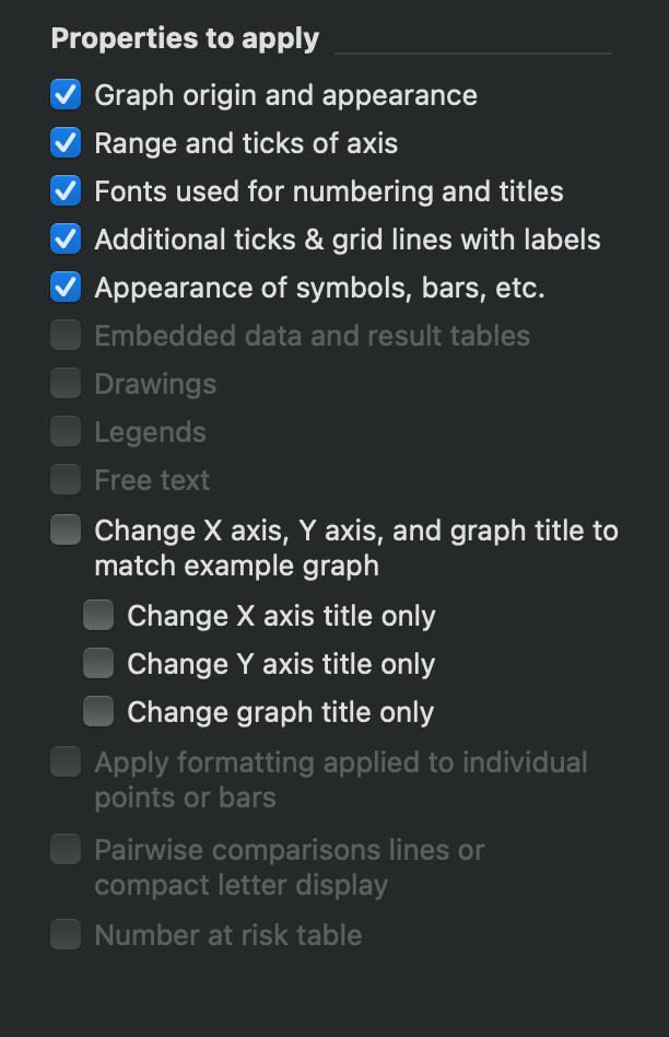
Click Next, and then select the properties of the example graph you would like to apply to your current graph or graphs.
Notes:
•If you check the option "Range and ticks of axis", what Prism does depends on whether you have checked the option to use an automatic range for the axes. If that is checked (on the example graph, then Prism will check that option on the graphs you are changing. Depending on the range of the axes, they may or may not end up with the same range. If that option is not checked on the example graph, then all of the graphs you are changing will be changed to have the range and interval of the example graphs.
•The option "Fonts used for numbering and titles" will not change the values or strings used in these locations, but will only change the font face that is applied.
•The option "Change X axis, Y axis, and graph title to match example graph" (formerly "Change axis and graph titles to match example graph") will change the actual title strings used on the graph
oThis option is available for all Prism license types
oThree additional options are available for Prism Standard licenses allow you to individually select if you would like to change the X axis, Y axis, or Graph titles of the target graph to match the example graph.
•The choice to apply formatting to individually selected points or bars only makes sense when the example and target graphs have the same number of points or bars. If that is not the case, the choice will be gray.