
Why Choose Prism?
Save Time Performing Statistical Analyses
A versatile statistics tool purpose-built for scientists-not statisticians. Get a head start by entering data into tables that are structured for scientific research and guide you to statistical analyses that streamline your research workflow. No coding required.
Start Free Trial Learn more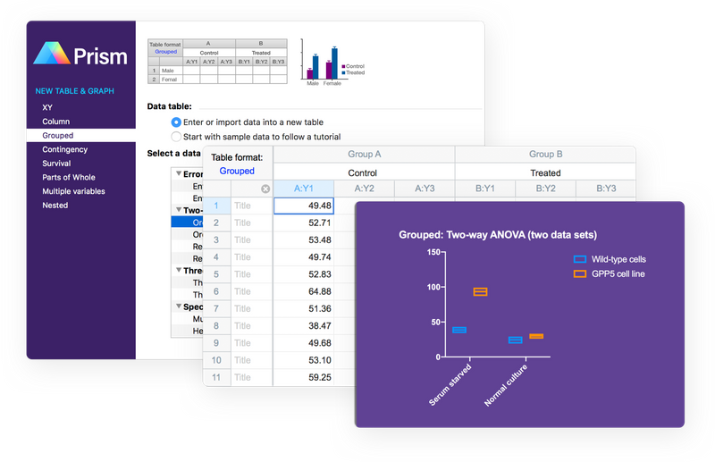
Make More Accurate, More Informed Analysis Choices
Gain insights and guidance at every step so you make the right analysis choices, understand the underlying assumptions, and accurately interpret your data along the way.
Start Free Trial Learn moreTell a Story With Your Data
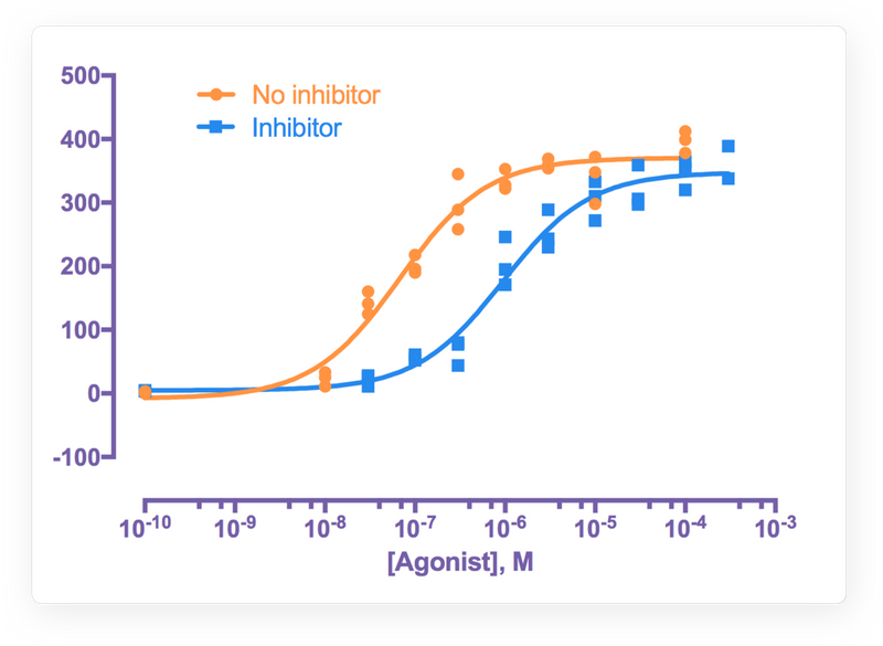
Go from data to elegant, publication-quality graphs-with ease. Prism offers countless ways to customize your graphs, from color schemes to how you organize data. Export into almost any format, send to PowerPoint, or email directly from the application.
Start Free Trial Learn more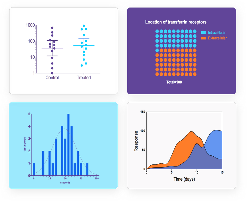
Collaboration. Simplified.
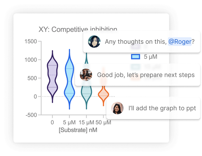
Prism makes it easy to collaborate with colleagues and share your research with the world. Level up your efficiency and use Prism Cloud to avoid those messy email threads. Publish your work to Prism Cloud and invite others to view and provide feedback on your projects. Keep all of your discussions in one place while securely controlling who has access to your work.
Learn moreIntroducing Prism 10
Powerful data analysis. Advanced graph customization. Simplified collaboration.
Learn MoreThe Tool of Choice for the World's Scientists
More than 750,000 scientists in 110 countries rely on Prism to help share their research with the world.
Learn MoreResources
Master the key principles of statistics with GraphPad's hugely popular educational guides and resources.
Avoid Common Statistical Mistakes
Statistics help you understand patterns in the world. But analyzing data incorrectly can result in misleading or false conclusions when interpreting those patterns. This guide will help you avoid common mistakes that many textbooks barely mention.
The Curve Fitting Guide
Many scientists fit curves more often than they use any other statistical technique, yet many don't really understand the principles. This guide provides a concise introduction to fitting curves, especially nonlinear regression.
QuickCalcs
Join the thousands of scientists that use one of our 25+ online calculators to run quick statical tests every day.
Ready to start using Prism for free today? No commitment or credit card required.