Prism 3 -- Creating a column bar graph.
Step-by-Step Examples:
Creating a Column Bar Graph in Prism 3
This example shows how to create and format a column bar graph, so named because each bar depicts the mean of all Y values in a column, or data set. One of three methods for graphing with bars in Prism, this approach is recommended when you have one grouping variable, because the table format is the same as that necessary to do many other analyses, such as t tests, ANOVAs, and column statistics. The primary alternative, an ordinary bar graph, is shown in Creating a bar graph.
Create the Table
When you launch Prism, the Welcome to Prism dialog appears. It lets you create a new project (file) or open an existing one. Choose to Create a new project and to Work independently.
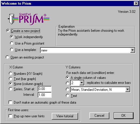
The lower portion of the Welcome dialog presents choices for formatting the first data table. For the X column, select None (column graph). For the Y columns, choose A single column of values. Uncheck the option box at the bottom of the Welcome dialog to Pop up new user hints. Click OK to exit the Welcome dialog. Prism creates and displays the new table.
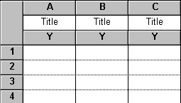
As we requested, the table contains no X column, and for each data set (A, B, C,…), there is a single Y column. With no X values, there is no difference in experimental variables from row to row, and replicate values can now be entered vertically within single columns.
Click on the default table name (drop-down list in the middle row of the toolbar)…
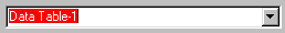
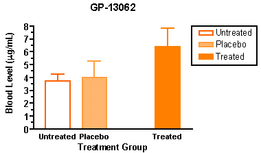
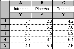
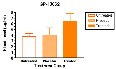
…and rename the table. The name that you choose ("GP-13062" in our example) will be used as the title for your graph.
Enter the Data
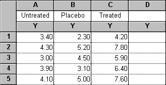
Enter the values show below into your table. Be sure to include column headings.
You can change the number format on a Prism table. Select all of the columns you wish to change, then click Change…Number Format.
View the Graph
As soon as you have entered your data, Prism creates a graph automatically. In the Explorer, click on the graph name, or click on the yellow Graph tab.
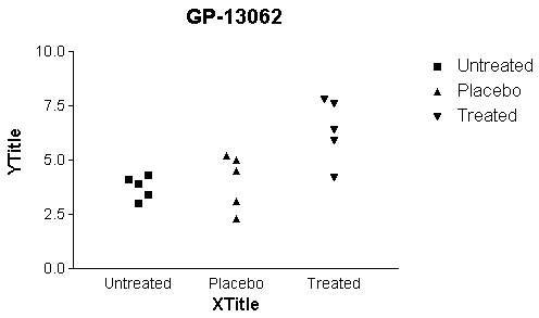
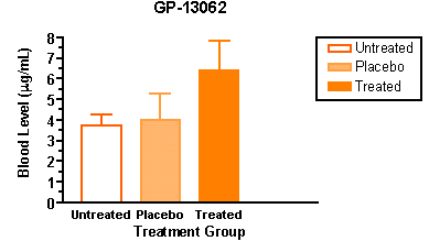
Prism automatically produces a column scatter plot, showing all data points on the table, grouped into columns according to data set. You may easily add or remove data sets from the graph (click Change…Data on Graph…). Labels for the data sets ("Untreated", etc.) are placed beneath the appropriate "columns" on the graph, as well as in the legend.
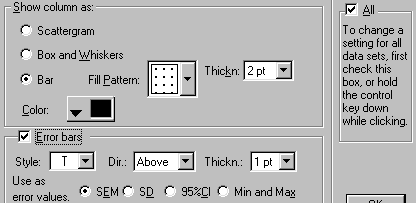
Change the column scatter plot to a bar graph by double-clicking on any of the symbols to open the Format Columns dialog. Since you can change each column individually, check the All box so that you will be switching to bars for all three data sets. Then choose to Show column as: Bar. Check the box for Error Bars.
Format the Graph
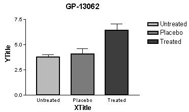
Refer to the illustration of the graph below as you make these format changes:
| To: | Do this: |
| Make the axes thicker | Click on the Change button and choose Thickness of Axes and Frame. Select a thicker setting. |
| Change the bar appearance | Double-click on a bar to bring up the Format Bars dialog. Change fill color, fill pattern, and border thickness. |
| Change the axis numbering | Double-click on the Y axis to bring up the Axes dialog. Click on the box labeled Auto to deselect it. Then change the tick interval and add minor ticks. |
| Thicken the baseline and tick labels | Click on the X or Y axis to select it. Click the Bold button ("B") on the toolbar. |
| Move the legend | Click on the "Pre-treatment" legend to select it. Hold the Shift key and click on the "Post-treatment" legend to select it also. Drag both legends on the graph to move them. |
| Frame the legend | Click the rectangle tool and draw a box around the legends. |
| Edit the Y axis title | Click on the default Y-axis title; the text will flip to horizontal. When done, click anywhere on the graph to flip it back. Use the formatting buttons in the third row of the tool bar to enter Greek letters. Edit the X-axis title in the same way. |
| Convert the error bars from SEM to SD | Double-click on a bar to bring up the Format Columns dialog. Check the All box to make a global change to all data sets on the graph, and click on SD error bars. Increase the thickness of the bars. |
Other Editing Features for Column Bar Graphs
Bar Size, Width, Gaps betweens Bars
These adjustments, which should be self-explanatory, can be made in the Format Columns dialog that you opened before by double-clicking on one of the bars.
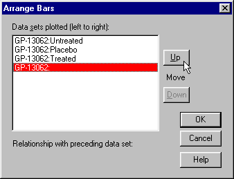
Rearranging Bars
Prism shows bars on a column bar graph in the same order as the corresponding column in the data table. To change that order on the graph only, double-click on one of the bars, then click Order…. Rearrange the bars in the Arrange Bars dialog.
Many users wish to introduce additional spacing into a bar graph to isolate one bar or group of bars in particular – not to be confused with the "gap" offered in the Format Columns dialog, which is placed between all bars. We'll demonstrate this by inserting a space between the second and third bars of our graph. Switch to the table. You must now make an entry in a new column that will cause Prism to recognize that the column has "content", but will not cause anything to be plotted on the graph. One way to do this is to type a blank space as the column heading for the fourth column. This removes the default heading "Title". The table now looks like this:
When you return to the graph, you will see that Prism has made room for the empty column:
If the labels under the bars are run together or some are chopped because of proximity to the others, trying selecting the baseline, then expanding it by dragging the right end.
Now rearrange the bars to produce the gap, i.e., move the "empty" column. Double-click on any of the bars, then choose Order…. Select the last (empty) data set, and promote it in the left-to-right order by clicking Up.
The resulting graph: