Prism 3 -- Combining bars with lines
Step-by-Step Examples:
Combining a Bar Graph with a Line Graph in Prism 3
Occasionally, you may wish to show data using both bars and lines on the same plot, as shown here:
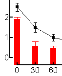
In this example, we'll plot a time course for plasma concentration of an injected drug, using a fitted exponential decay curve, combined with periodic chemical measurements (activity of a tissue enzyme) made after the injection, shown with vertical bars.
Enter the Data
In the Welcome to Prism dialog box, select Create a new project and Work independently. Under the X column category, select Numbers, and under the Y Columns category, select Mean, Standard Deviation. Enter the data as shown below. Include column headings, so that it will be easier to keep your data sets straight as we proceed.
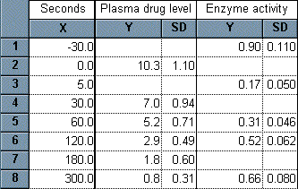
In this table, the X values are the times after drug injection, the first Y column contains plasma drug levels, and the second Y column contains the enzyme activity measurement. The first measurement of enzyme activity is made 30 seconds before drug treatment to establish a control level. There are blank cells, because the measurements in this example don't always coincide. Prism has no problem with that.
Fit the Curve
Click on the Graphs tab to view the plot that Prism creates automatically. The plasma level of drug is plotted using squares. Click the Analyze button on the bottom row of the tool bar. In the Analyze Data dialog box, choose Curves & Regression and Nonlinear regression (curve fit) from the drop-down list. Under Data to analyze, choose Selected data sets, then click the Select button to open the Select Data Sets dialog box. Select Data Table-1:Plasma drug level and deselect Data Table-2:Enzyme activity.

Click OK twice to reach the Parameters: Nonlinear regression dialog. Choose Classic equations and then select One phase exponential decay from the drop-down list. When you click OK to exit this box, Prism adds the fitted curve to your graph.
We won't use the legend in this example, so we can get rid of it. Select the two elements of the legend (click on one element, hold the "Shift" key, and click on the other). Press "Delete".
Adjust the Frame and Axes
The activity data are shown as triangular point symbols. They are barely visible because of the scaling of the Y axis to accommodate the plasma concentrations, which are larger numbers. This is a good place to use dual Y axes, giving the enzyme activity data a separate, right-hand scale. Click Change...Graph Size and Shape to open the Axes dialog. Under Frame & Axes, choose to Plot two Y axes. Just above, select Offset X & Y axes. You can complete the rest of the axes formatting without closing this dialog, but click OK for now to see what's happening to the graph.
Note the new right-hand axis. However, the data points for enzyme activity have not changed position--Prism doesn't yet know that we want to associate that data set with the right-hand axis (these points are still associated with the left-hand axis). Double click on one of the triangles (data points for enzyme activity) to open the Format Symbols and Lines dialog. Under Plot on Y Axis, select Right Y axis. Don't close the dialog yet.
Change Point Symbols to "Bars"
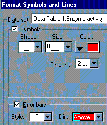
Replacing the triangular point symbols with bars is a simple matter of choosing a different "symbol". With the Format Symbols and Lines dialog still open, make sure the Data set chosen is Data Table-1:Enzyme activity and then choose the fourth shape from the bottom from the Symbols…Shape drop-down list. Adjust the Size to 8 and assign this "bar" a color. A bit lower in this dialog box, adjust the error bar direction (Dir) to Above. Here are the selections:
Finish Formatting the Graph
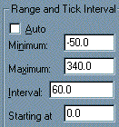
Double-click on the X axis to open the Axes dialog. Adjust the X axis Range and Tick Interval as shown here (be sure to deselect the Auto checkbox):
You can now edit the left-hand and right-hand Y axis labels (double-click and select the text to edit) to read, respectively, "Plasma Concentration (µg/mL)" and "Fractional Enzyme Activity". To give the viewer a visual cue as to which Y axis is which, you can color code the axes labels. Click on, then drag over, the right-hand Y axis title, then choose Format...Text. Assign the text a color that matches the bars on your graph from the drop-down Color menu. Similarly, click once to select the Y axis itself. Choose Format...Text and assign the same color to the numbers labeling the axis. Click OK to apply that change, then with the axis still selected, choose Format...Object. Under Lines and Borders, select the same color to be applied to the axis line.
Now try adjusting the ranges and tick intervals for the the Y axes and adding the last labeling changes so that your graph matches our example:
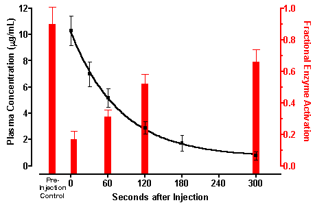
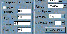
Note that the right-hand Y axis contains a minor (unlabeled) tick. Ranging and tick settings for this axis are shown below (one "minor" tick divides the space between "major" ticks into 2 minor intervals).
The label "Pre-Injection Control" is simply a text object.
To insert Greek symbols, such as the mu in the left-hand Y axis title, click where you want the character, then click on the Greek button:

Choose Insert Greek and double-click on the letter you want.


