
Prism 3 - Using templates
Step-by-Step Examples:
Using a Template in Prism 3
If you use Prism to perform the same task many times, with only the data differing from time to time, you can save a lot of time and effort by using templates. A template is a Prism project file that holds the "framework" for your project. The first time you set up the project, you create the template--formatted data tables, analyses, formatted graphs, layouts--but you store it without the data. From then on, just open the template, add new data, and you're done.
Prism has some other automating and customizing tools that are sometimes confused with templates, methods and user-defined equations. We'll touch on the differences near the end of this example.
In this example, we'll make a template to produce a graph showing a linear fitted curve.
Create the Project
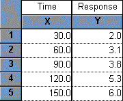
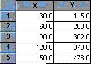
Create a new project formatted for numbers in the X column and a single column of Y values. Enter the column headings and the data shown below. The actual values are not especially important, since they will change each time you use the template, but you need some data to create a graph and to make changes for our example.
Click Analyze. In the Analyze Data dialog, select Curves & Regression and then choose Linear Regression. Click OK, then accept the defaults in the Parameters: Linear Regression dialog box.
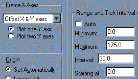
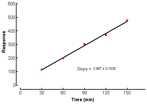
Now we'll format the graph. Click on the Graphs tab (toolbar). Click Change, then Axes: Range and Ticks.... In the Axes dialog, change Frame & Axes and Range and Tick Interval to the options shown below.
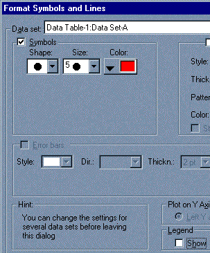
Click OK to return to the graph. Click Change and then Symbols and Lines. Change the square symbol to a circle, size 5, red. Remove the check from the Legend...Show box near the bottom of the dialog. Here are the selections:
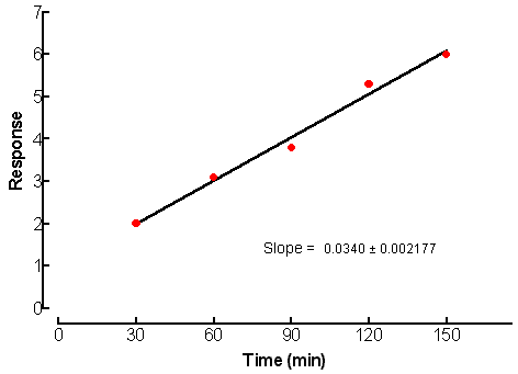
Edit the axis titles, and delete the graph title, so that your graph will look like this:
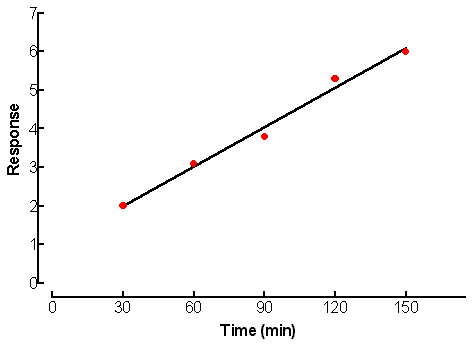
Now we'll add to the graph some information about the regression line, specifically, a message showing the slope:
Slope = 0.0340 ± 0.002177
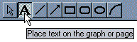
Click on the "Text" button (on the toolbar),
then click on some convenient open space in the plot area. Type "Slope =" and then click elsewhere on the plot area. Move to the Results page, and select the cell showing the slope of the regression line (0.0340 ± 0.002177). Copy the cell (Edit...Copy), switch to the graph, and paste the cell just to the right of "Slope =". The two pieces of text will probably be misaligned with respect to each other. You can do gross aligning by selecting and dragging one of the two halves of the message, then do fine alignment using the arrow keys (with the text object still selected).
Now your graph should look like this:
Create and Save the Template
Now that you have created the graph that you'll use as a template, go to the Data Table, and delete the data. Make sure that you do this with the Delete key; don't use the Delete command on the Edit drop-down menu-you want to maintain the data cells, but without the data.
If you generally have the same X values when you use a particular template, you can leave those values in place.
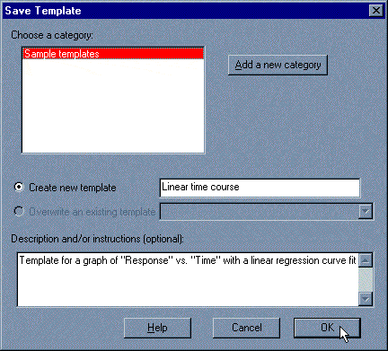
If you see a message that tells you about the data being linked to the graph, disregard it and click OK. Place the cursor in the top cell of the X column. Select File...Save Template. Fill out the dialog box as shown below.
Now close the file, and we'll see how to use the template.
Use the Template
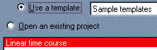
Choose File...New Project to open the "Welcome" dialog. Choose Use a template and select the template that you just created, as shown in the partial view of the box below.
Click OK, and you'll get a new project formatted as your template. If you created a description, you will see it now. When you close the description box, the cursor should be at the top of the X column (note that the column headings are still there, if you didn't delete them before you saved the template.
You can also insert a template into a project that you have open. With any data table in view, click on the New Table button on the toolbar (on the bottom row of the toolbar). Choose Use a template and proceed as described above.
Now enter some new data:
Click on the Graphs tab to view the graph:
Notice that your original formatting has been made automatically. And although the curve looks the same at first glance, it actually has a much different slope and intercept from the one we plotted earlier-Prism has re-scaled the Y axis. The updated slope of the regression line is written on the graph. Click on the Results tab to see the updated regression analysis.
One of the keys to templates is to be sure to document the template format and setup in the description window. Projects can be quite complex, and doing this is a valuable habit to learn.
Templates and Methods
Don't confuse the two. If you apply the same treatment (analyses or graphs, or both) to various data tables, try creating and saving a method file. The difference between methods and templates is in how you use them. You apply a method to an existing data table, but insert a template (which includes an empty data table) into an existing project. You can learn about using methods in the chapter "Analyzing Data" in the Prism manual.
Methods are, in turn, sometimes confused with User-Defined Equations. These are a way of customizing Prism's curve-fitting options. You can fit data to an equation of your choosing when it isn't among the built-in equations. Your equation must fulfill certain criteria. You can learn more from the chapter "Choosing or entering an equation (model)" in the Prism 3 manual.