
I'm using a logarithmic scale for the Y axis of a bar graph. Prism plots numbers greater than 1 properly, but numbers below 1 as inverted bars. What can I do?
Do you really want a bar graph with a log scale?
Before reading how to work around the problem, first consider whether you really want to show a bar graph on a log axis.
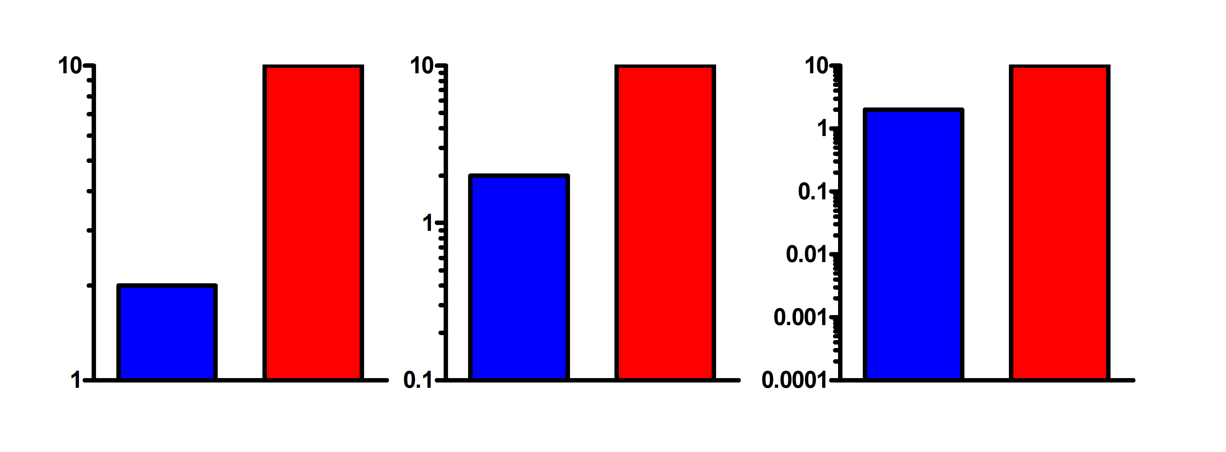
The point of a bar graph is to let people compare heights of the bars. With linear scaling, a bar that is twice as tall represents twice the value. Not so on a log scale, which has no logical starting place (i.e., no zero point). Since zero is never shown on a log axis, you need to decide where to begin the bars. At 1.0, 0.1, 0.01, 0.001? The choice is arbitrary. The relative heights of two or more bars may appear to be almost the same, or very different, depending on the starting place for the bar. This can be seen in the graph below, where ratio of the Y values for each pair of bars is a constant 1:5, but the ratio of bar heights varies considerably.
Log scales can make sense when you are plotting ratios, as then the baseline is set at 1.0. Another situation where log axes make sense is when plotting growth. For example, if you are plotting number of cells, a log scale makes sense because the number of doublings is proportional to the log of cell number.
Why some bars stick up and some stick down on a log axis.
The logarithm of 1.0 is 0. So when you plot a bar graph on a log axis, Prism plots the baseline at 0, which is 1.0 on a log scale. This makes sense because logarithmic axes on bar graphs make most sense when the value is a ratio, so 1.0 makes a logical baseline.
Changing the bar baseline
Prism 5 and later: Double-click on a bar to bring up the Format Graph dialog. Then go to the third "Graph Settings" tab and change the bar baseline to be your lowest Y value. Enter that actual value. In the third graph above, enter '0.0001', not its logarithm -4.
Prism 4: Double-click on a bar to bring up the Format Bars or Format Columns dialog. Then go to the second "Order and Direction" tab and change the bar baseline to be your lowest Y value.n the third graph above, enter '0.0001', not its logarithm -4.
Bypassing the problem with Prism 3
Prism 3 doesn't offer the option of changing the bar baseline. The log of 1 equals zero, which is why Prism 3 always begins the bars at Y=1 when you use a log axis. Even though Prism's bar graph with a log axis doesn't show your data properly, it is possible to get the graph you want. The approach is to transform the data to logs, plot the resulting log values on a bar graph, and then display antilogs as the axis label. Follow these steps:
- From the data table, click Analyze then Transform.
- Choose to transform Y=Log(Y). Be sure to check the option to make a new graph of the transformed values.
- Go to the new graph.
- Double-click on the Y axis to bring up the Axis dialog. Leave the axis set on a linear scale, not logs. (You are plotting values computed from the log of your data, but the graph doesn't "know" this. It simply plots that results table on a linear scale.)
- Under "Range and Tick Interval", clear the "Auto" choice, and enter minimum and maximum Y values that suits your needs. Enter these values as logs (i.e., enter -2, not 0.01)
- In the numbering/labeling frame of the axis dialog, set the format to "powers of ten" or "antilog" (if the "antilog" option is not available, make sure the tick interval [see previous step] is set to an integral number). Consider setting the minor intervals to "Log".