
Graphing curved Scatchard plots
Resist the temptation to separately perform linear regression lines on two halves of the data. Also resist the temptation to draw asymptotes to the first and last part of the Scatchard curve. Those lines would not be meaningful.
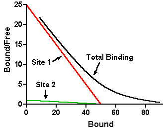
The graph below shows a Scatchard plot (curved black line) for binding to two sites with equal capacities, but separated 25 fold in affinity. The straight red and green lines are accurate Scatchard lines for the individual sites, obtained by connecting the Bmax and Bmax/Kd values. Those lines are not near the total binding Scatchard curve (black). This means that if you determined Bmax and Kd from straight line asymptotes to the first and last parts of that Scatchard curve, or from linear regression on the first and last few data points, your results would be invalid.
Elsewhere at this site, read why you should avoid linear regression of Scatchard-transformed data. While Scatchard plots may be a useful way to display binding data, they are not a useful way to analyze binding data. Instead, you should fit your raw binding data with nonlinear regression, and then construct the Scatchard lines using the Bmax and Kd values determined by nonlinear regression. Learn how to do this for one-site data (easy to extend to two sites) for Prism 5, Prism 4 or Prism 3.
If you're following this method using the instructions in Analyzing Data with GraphPad Prism (version 3) and it's not turning out right, you may have encountered a typographical error in an older printing of that book.