
KNOWLEDGEBASE - ARTICLE #753
Graph tip - Formatting the right and left Y axes differently.
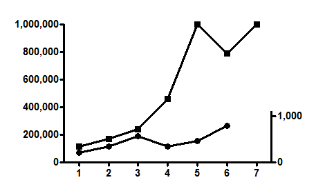
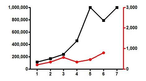
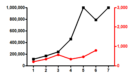
When you create a graph with two Y axes, Prism always creates them with the same length and the same color.
To make the lengths appear different:
- Use the rectangle tool to draw a rectangle over the part of the axis you don't want to see

- Make it white (or whatever your page background is) with a solid fill. Then that axis appears to be shorter.
To give the axes different colors:
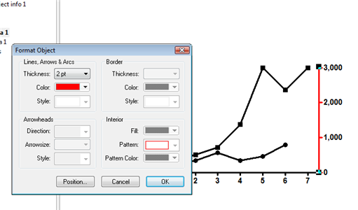
- Click on one of the axes to select.
- Drop the Change menu, and choose Selected Object
- Change the color.
You can also change the data set color assigned to that axis. Double-click on a graph symbol to open the Format Graph dialog.
To give the axis numbering a different color or font:
- Click on one of the axes to select it.
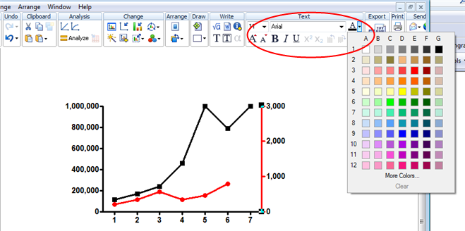
- Use toolbar buttons to change the color or font used to number that axis.
To only have one axis but put in on the right side of the graph:
The first axis created is called the 'left Y axis', but in fact it does not need to be placed on the left side of the graph. It can be anywhere. To put this axis on the right side of a graph:
- Double click on an axis to bring up Format Axis dialog
- Go to the first tab, Frame and Origin.
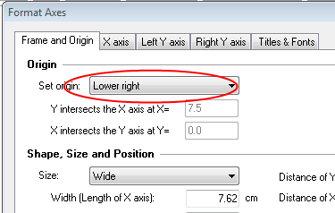
- Set the Origin to the lower right.
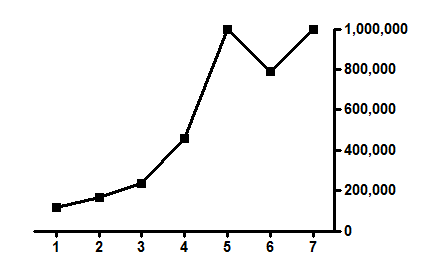
To delete the right Y axis:
- Double-click on it to bring up the Format Axis dialog,
- Make sure you are on the right Y axis tab.
- Drop down the list labeled 'Gaps and direction'.
- Choose: No right Y axis.
Click here to download this file.
Keywords: right axis, right Y-axis, right Y axis, two axes, two Y axes