New Color Schemes that are (hopefully) Visually Appealing
With the release of Prism version 8.1.0, we’re very excited to announce a set of brand new color schemes that can be used to customize your graphs. These color schemes have been designed to be visually appealing, with some tailored specifically for those with color vision deficiencies, and others inspired by great works of art.
Where can I find these new color schemes?
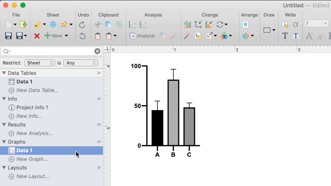
Once you’ve created a graph of your data, you can choose to apply one of Prism’s new color schemes (or one from the original set of default color schemes, or create a color scheme of your own!). All of the new color schemes can be found using the Change Colors toolbar dropdown button. To find this button, make sure you start on the graph sheet for the graph to which you’d like to apply a new color scheme. The Change Colors button will be in the Change section of the toolbar at the top of the window, in the bottom right of this section. Click this dropdown and select your color scheme (or make one of your own!).
Read on to learn more about why color schemes are important (or just click here to see the new color schemes)!
Why do we do research?
This question probably seems like a strange way to start an announcement about new color schemes. What makes this question worse is that it ultimately doesn’t have one single “right” answer. But here’s one potential answer to this question: we do research in order to contribute to the expansion of human knowledge. This answer may sound a bit grand and maybe even slightly pretentious, but fundamentally that’s our goal when conducting research: to learn something that wasn’t previously known.
We do research in order to contribute to the expansion of human knowledge.
The results of our research may provide support or criticism to an existing hypothesis/theory, or they may provide insight into potentially new hypotheses to test. In all of these situations, the goal of our research is to gain new knowledge. But the process doesn’t stop there! After acquiring our new knowledge, we must find ways to share that knowledge with others: members of our research group or lab, members of the broader scientific community, or even the public at large.
Graphing as communication
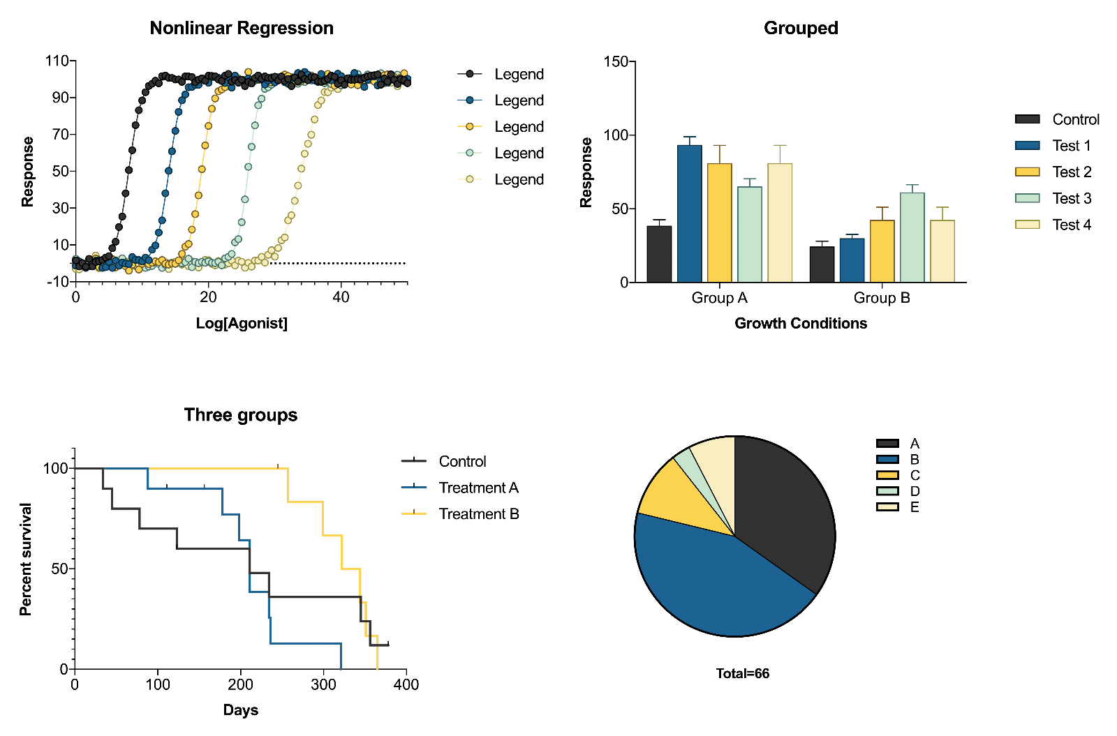
Ultimately, the goal of data visualization (graphing) is to convey the relationships within your data in a way that makes it easier for the viewer to interpret the data, thereby making it easier for them to understand your findings. Often, this process involves ensuring that your graphs not only convey information efficiently, but that they’re also visually appealing. Take, for example, the following graphs:
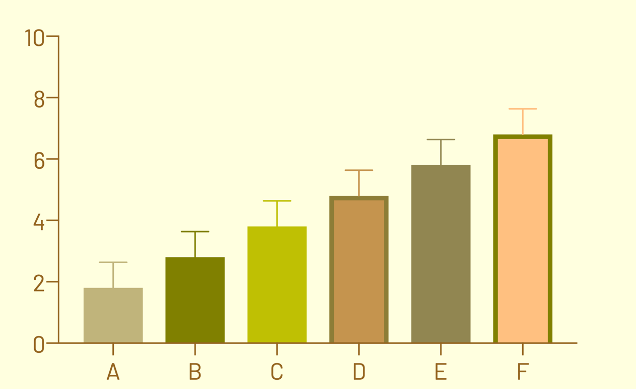
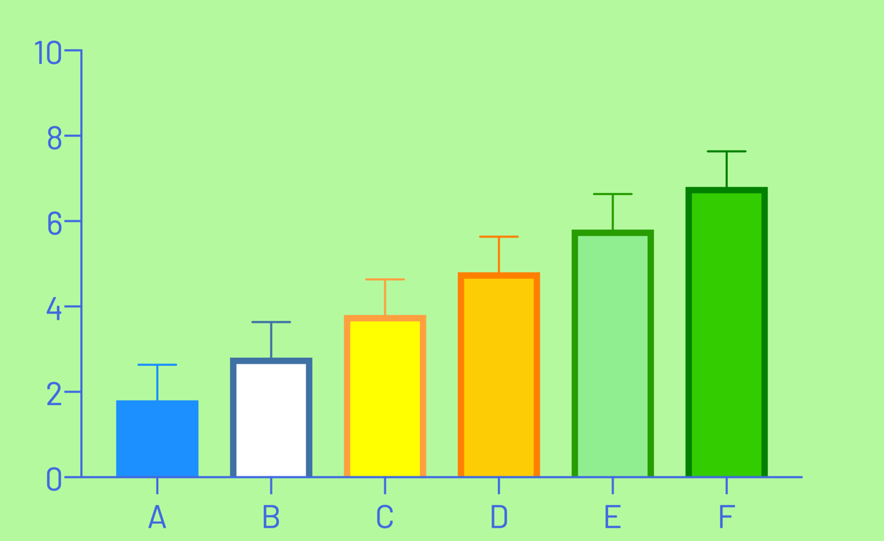
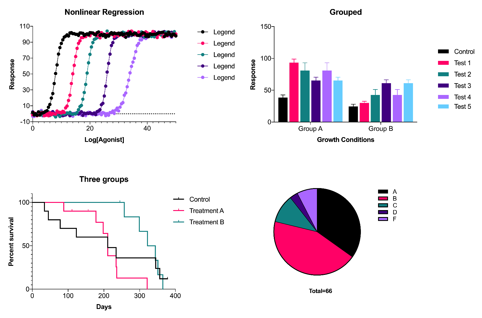
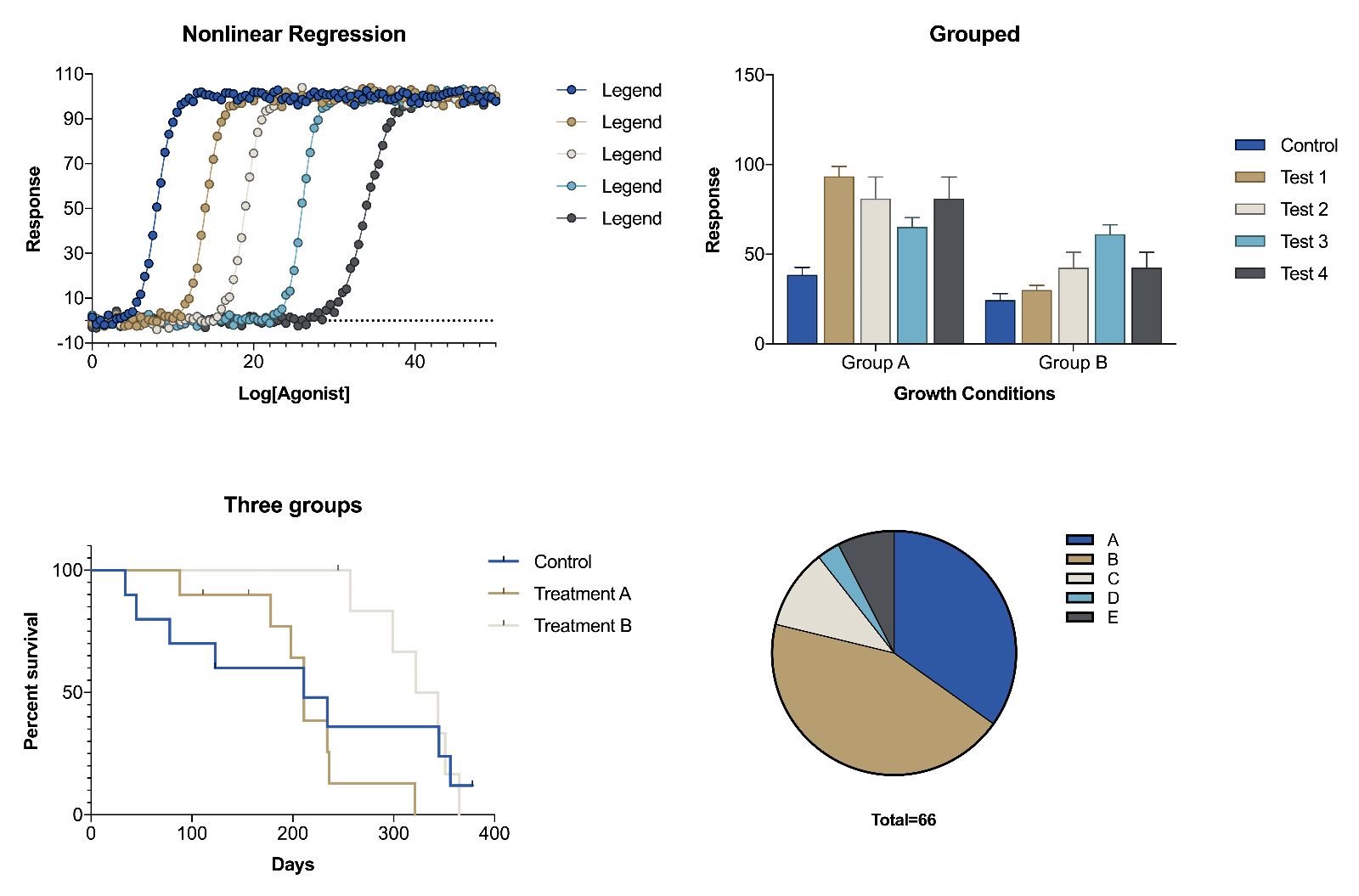
Inherently, there’s nothing “wrong” with either of these graphs, depending on their purpose and audience. Additionally, both show the same data, indicating a clear trend across the groups of data. However, many would (and have) argue that the color schemes of these graphs (two examples of Prism default color schemes) are less than appealing. By offering a few new color schemes, Prism makes it easy to add some color to your data visualizations in a way that's (hopefully) visually appealing!
Prism’s New Color Schemes
Floral
The first of the new color schemes now available, “Floral” was designed as an alternative to basic “Colors” color scheme. This color scheme contains a total of 12 unique color combinations, based on the set of four colors: blue, purple, red, and green. Three variations of these four colors are repeated 3 times to complete the 12 total combinations.
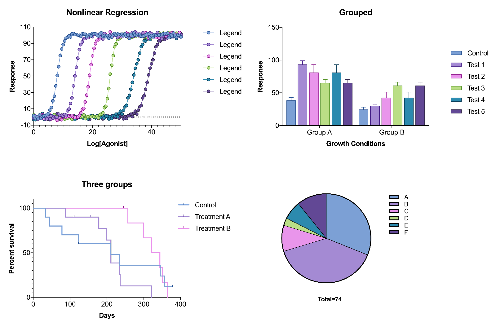
Colorblind Safe
Color vision deficiency affects as much as 8% of males and as much as 0.5% of females worldwide. For these individuals, many color combinations are difficult or impossible to distinguish. As the name implies, the Colorblind Safe color scheme was designed to be interpretable by those with both normal vision, as well as individuals with a number of color vision deficiencies including protanopia, deuteranopia, and tritanopia.
Art-Inspired Color Schemes
Many have argued that the process of developing graphs and other data visualizations is sometimes more akin to art than science. Building on that notion, we have also included a number of color schemes directly inspired by well-known works of art.
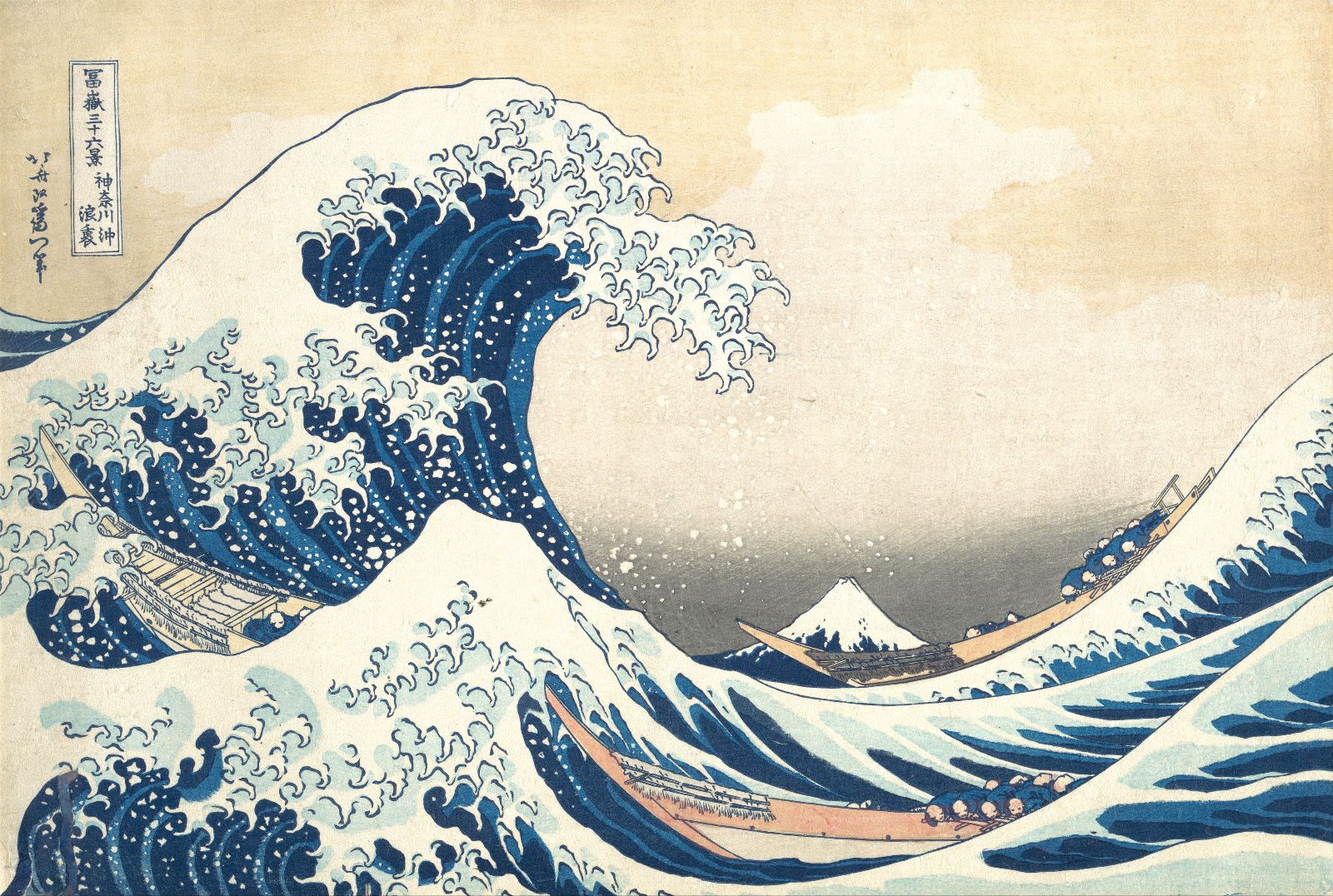
Waves
Inspired by: “The Great Wave off Kanagawa"
Artist: Katsushika Hokusai
Year: c. 1829-1833
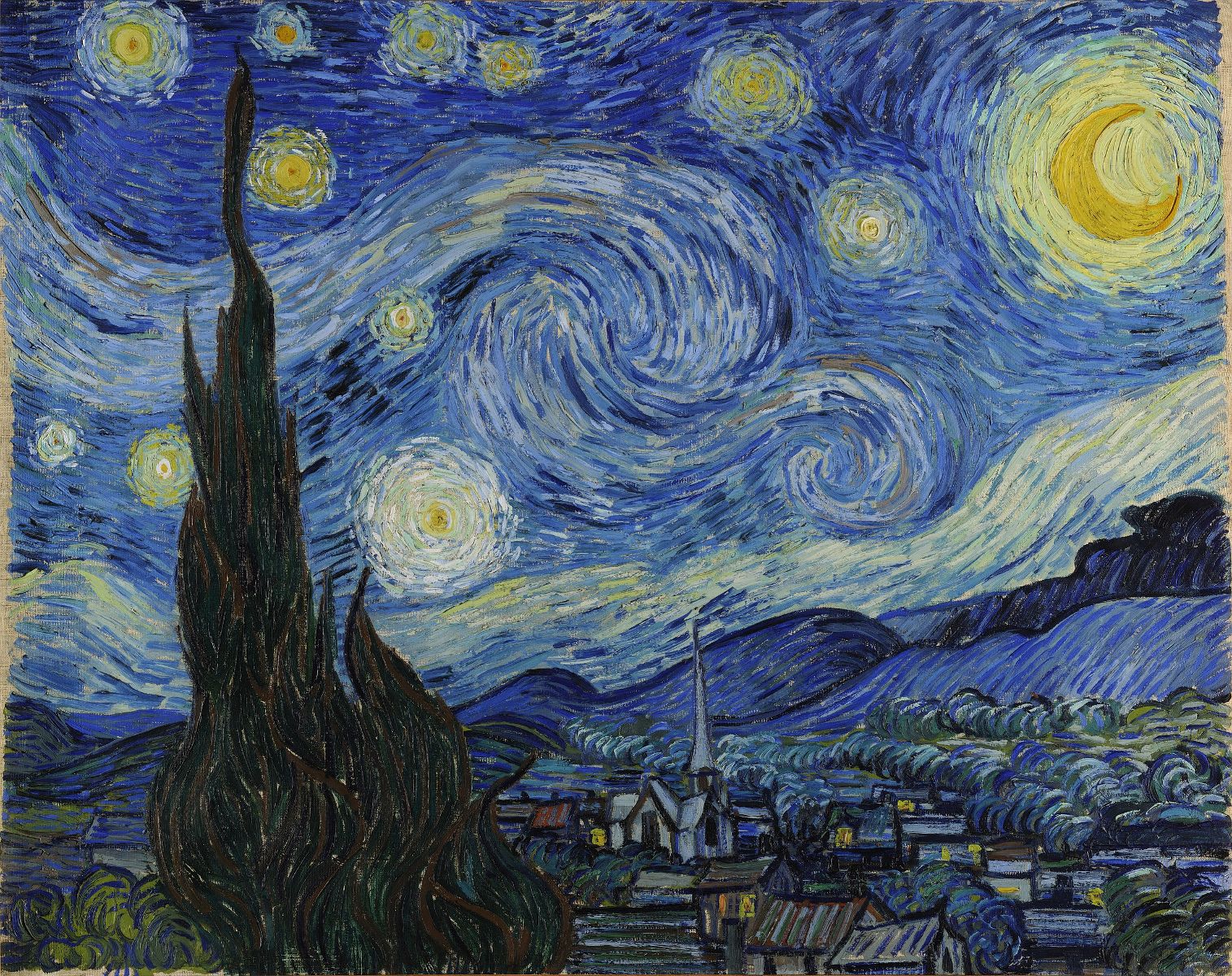
Starry
Inspired by: “The Starry Night”
Artist: Vincent van Gogh
Year: 1889
Pearl
Inspired by: “Girl with a Pearl Earring”
Artist: Johannes Vermeer
Year: c. 1665