
Graph tip - Combining columns and points or a curve fit on an XY graph
Prism offers three ways to combine points and bars on one graph. This page covers the steps necessary to create this visualization as an XY graph using "spikes" or "bars" to plot some data sets. The second approach is to create two graphs and superimpose them on a page layout. The third approach is to make a Grouped graph, but plot some data sets as points.
How to do it:
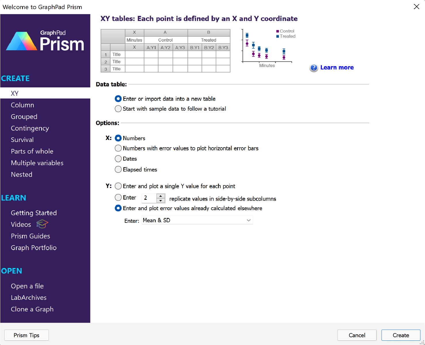
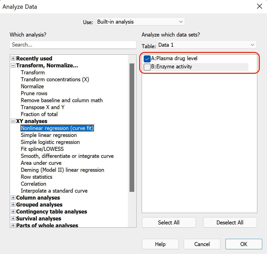
Start by creating an XY data table to enter the data. You can set up your data table with replicates and have Prism calculate your error values, or you can enter your error values directly. For this example, we'll create an XY data table, and choose the option "Enter and plot error values already calculated elsewhere" for "Y" and select "Mean & SD" from the dropdown menu.
After clicking Create, the XY table will be shown and the data can be entered (as shown below)

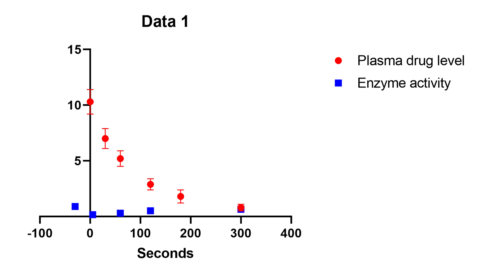
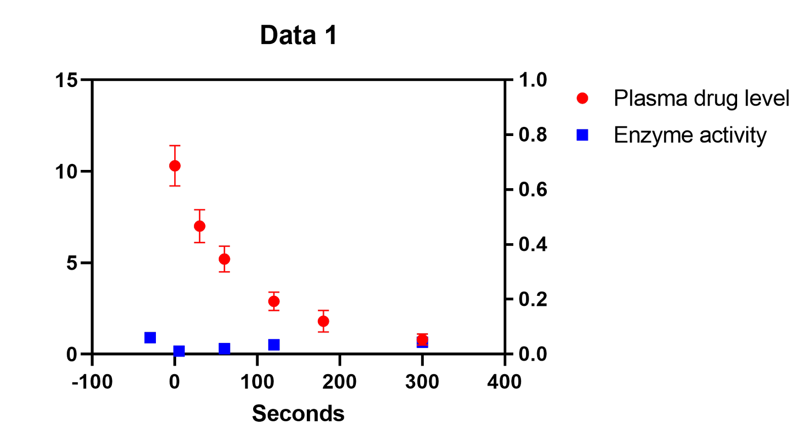
Entering data in this way will create a standard XY graph (shown below with some color customization added)
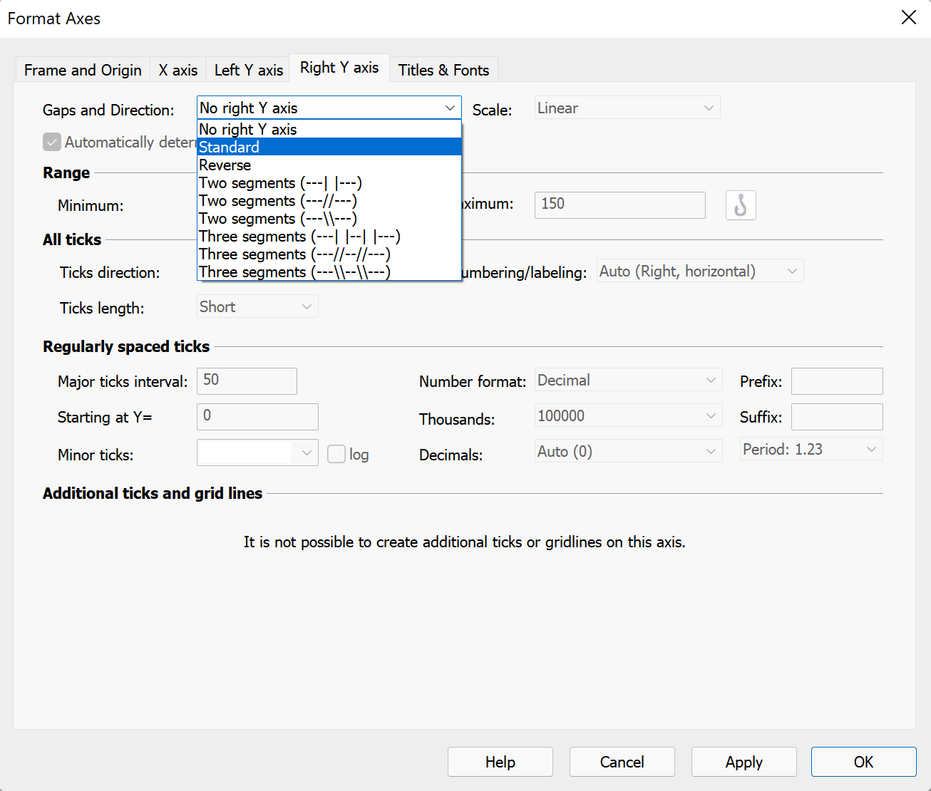
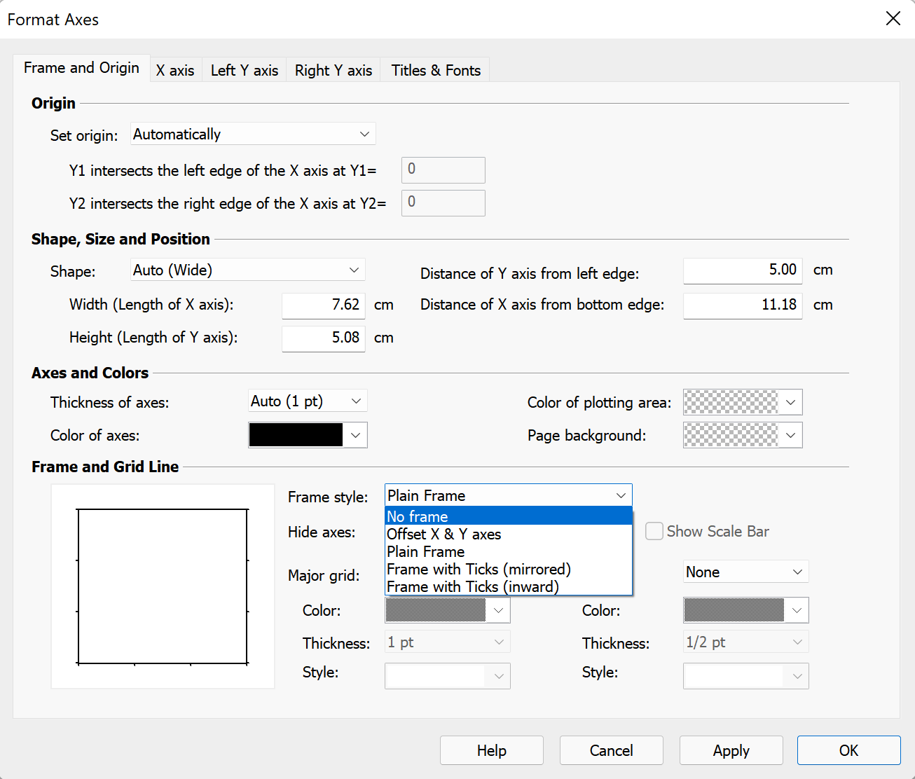
To begin customizing this graph, double click on Y axis to open the Format Axes dialog. Select the "Right Y axis" tab, and in the "Gaps and Direction" dropdown menu, select "Standard". When you click "Apply", this will create a new Y axis on the right side of the graph.
While still on the Format Axes dialog, switch to the Frame and Origin tab. In the bottom section "Frame and Grid line", select "No frame" in the "Frame style" dropdown menu.
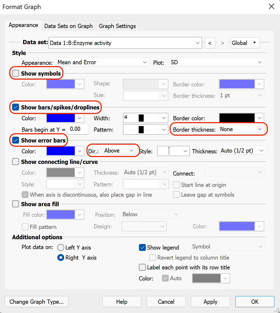
After clicking "OK" to close the Format Axes dialog, double click on the data in the graph that you would like to plot on the new right Y axis. In the case of the example, double click on the "Enzyme activity" data. This will open the Format Graph dialog with options for the selected dataset. At the bottom of the dialog in the "Additional options" section, choose to plot the data on the "Right Y axis". While the Format Graph dialog is open, additional settings for this dataset can also be changed:
- Uncheck the box for "Show symbols"
- Check the box for "Show bars/spikes/droplines" and use the dropdown menu for "Border thickness" to turn off the bar borders (select "None")
- Ensure that the box for "Show error bars" is checked, and select "Above" in the direction dropdown menu for the error bars
Check the option in the Additional Options section to plot a data set on the new Y axis. You can also change the settings in the Show Symbols and Show Bars sections to change the data set to show as bars on your graph instead of points.
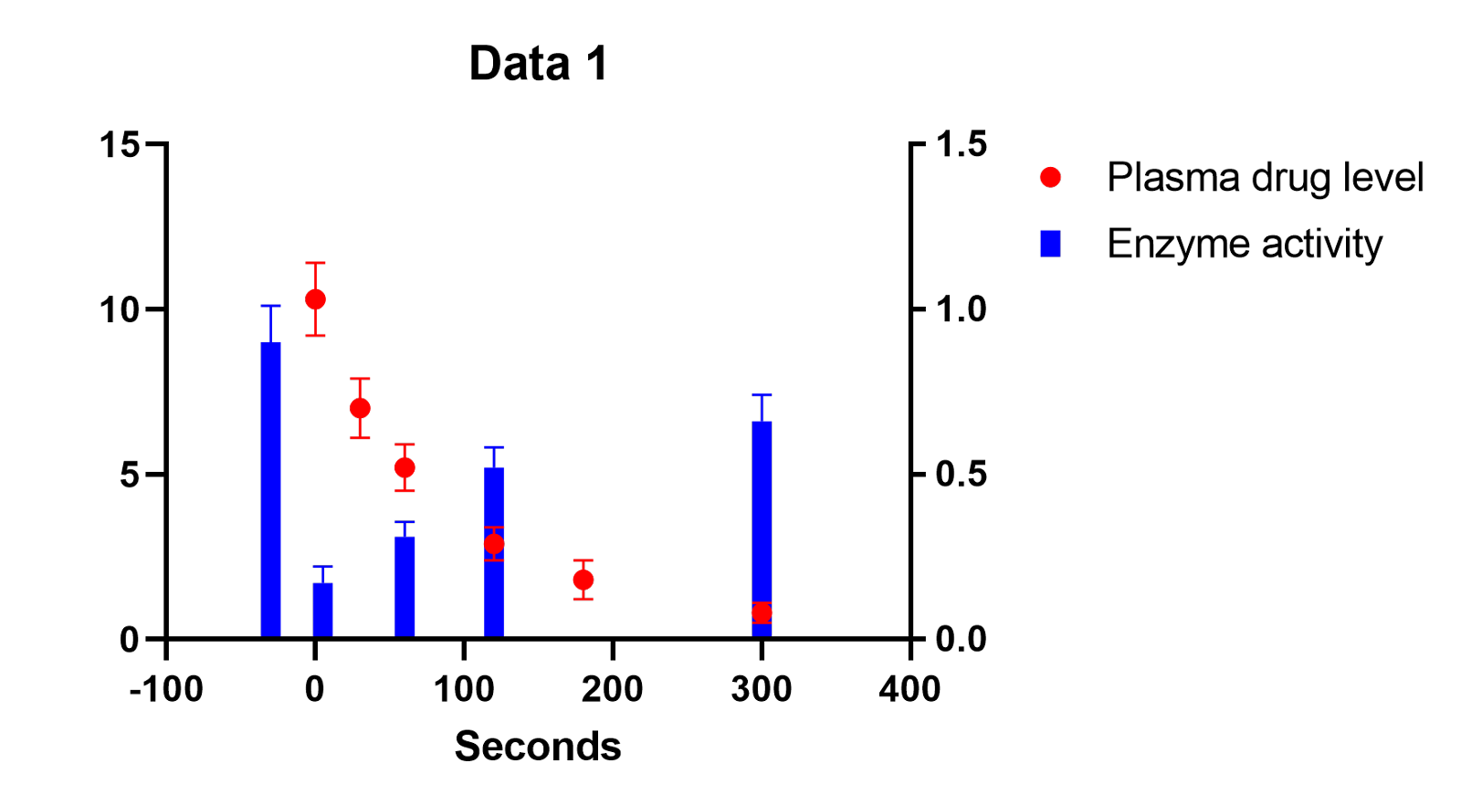
Once all the settings are specified, clicking "OK" will result in a graph that looks like the one below:
To add a curve fit to one dataset, click the "Analyze" button in the toolbar, and then uncheck the other dataset before performing the analysis. For this example, the "One phase decay" model was fit with all of the default nonlinear regression settings.
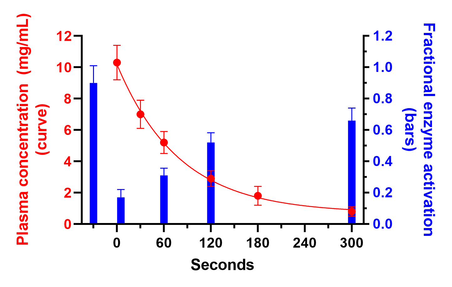
At this point, your graph should contain all of the required elements (bars with error bars, symbols with error bars, a curve fit for one data set, and two different axes), and should look something like the following:
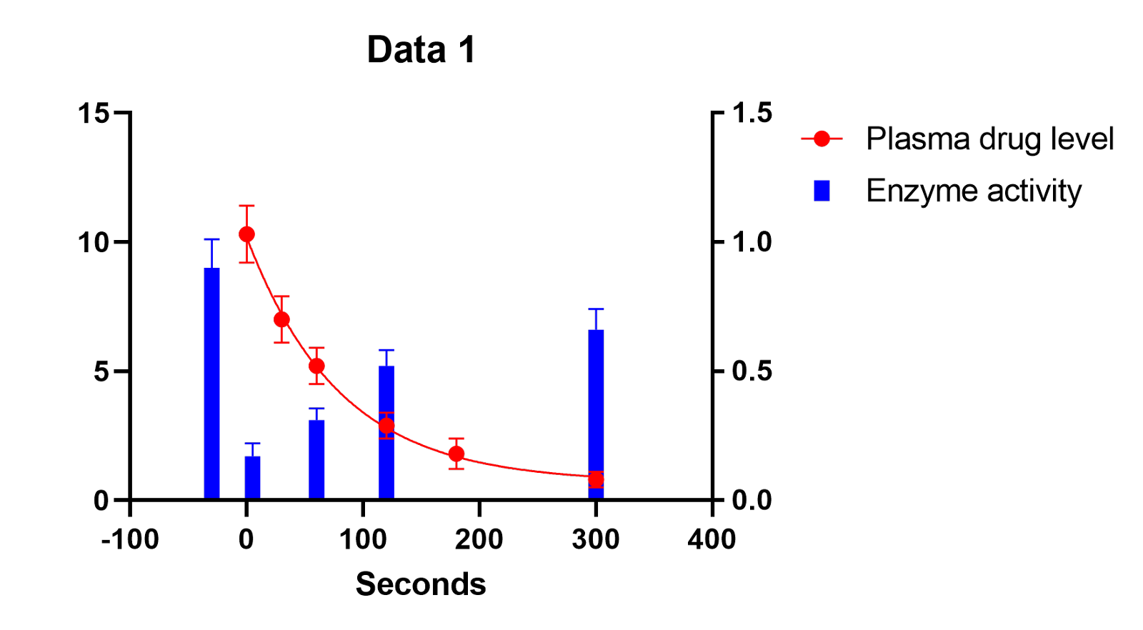
To finish customizing this graph, there are a number of things we can do. For example:
- Delete the graph legends
- Delete the graph title
- Add Y axis titles to the left and right Y axes (And change the font color to match their respective datasets)
- Change the font color of the left and right Y axis labels to match the axis titles
- Change the range and ticks interval of the X, left Y, and right Y axes using the Format Axes dialog
With all of these changes, the final graph might look something like this:
Download this file if you would like to see how this graph was made.
Combining stacked bars with points or a curve fit.
Normally, when you want to make a stacked bar graph with Prism, you would start with a Grouped data table. If you want to combine stacked bars with a curve fit using an XY graph, you can't enter the stacked bar data directly as you do on a grouped graph, but this appearance can be achieved with a bit of fussing. If you have two data sets plotted as spikes with the same x coordinate, they will be superimposed, which looks sort of stacked. Enter one data set as the sum (the top of the stack) and the other as one component, and the resulting bars will appear stacked. It may require some fussing with the order of data sets on the graph (format graph/data sets on graph tab).
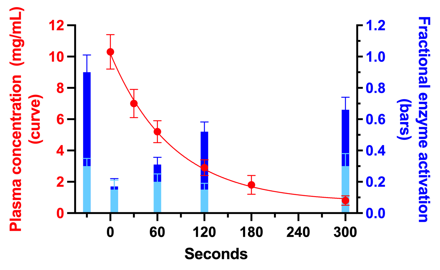
Here is the data table. The second dataset (Enzyme activity) would represent the sum or total of the stacked bars, while the third dataset (Enzyme activity 2) would represent the individual component of the bottom set of bars (light blue bars in the graph above).

Download this file if you would like to see how this graph was made.