A Bland-Altman plot compares two assay methods. It plots the difference between the two measurements on the Y axis, and the average of the two measurements on the X axis.
1. Enter the data
Create a new table. Choose the Column tab. If you don't have data yet, choose the sample data: Bland-Altman method comparison.
Enter the measurements from the first method into column A and for the other method into column B. Each row represents one sample or one subject.
2. Choose the Bland-Altman analysis
From the data table, click  on the toolbar, and then choose Bland-Altman from the list of one-way analyses.
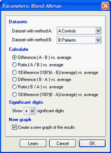
Designate the columns with the data (usually A and B), and choose how to plot the data. You can plot the difference, the ratio, or the percent difference. If the difference between methods is consistent, regardless of the average value, you'll probably want to plot the difference. If the difference gets larger as the average gets larger, it can make more sense to plot the ratio or the percent difference.
3. Inspect the results
The Bland-Altman analysis creates two pages of results. The first page shows the difference and average values, and is used to create the plot. The second results page shows the bias, which is the average of the differences, and the 95% limits of agreement.
If you used the sample data, the two methods have very similar results on average, and the bias (difference between the means) is only 0.24. The 95% limits of agreement are between -13.4 and 13.9.

4. Plot the Bland-Altman graph
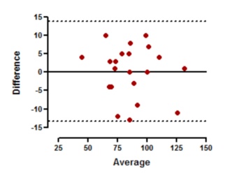
The 95% limits of agreement are shown as two dotted lines. To create these, double click on the Y axis to bring up Format Axis. At the bottom of that dialog, click the "..." button (Windows, shown below) or the gear icon (Mac) to bring up the Format Additional Ticks and Grids dialog. Then click the fish hook icon to 'hook' the Y location of the grid line to an analysis constant created by the Bland-Altman analysis. Repeat for the other grid line.

The origin of the graph was moved to the lower left (and offset) on the first tab of the Format Axes dialog.