1. Enter data
From the Welcome (or New Table and graph) dialog, choose the Column tab.
If you are not ready to enter your own data, choose sample data and choose: t test - Paired.
Enter the data for each group into a separate column, with matched values on the same row. If you leave any missing values, that row will simply be ignored. Optionally, enter row labels to identify the source of the data for each row (i.e. subject's initials).

2. Choose the paired t test
1.From the data table, click  on the toolbar.
2.Choose t tests from the list of column analyses.
3.On the first (Experimental Design) tab of t test dialog, make these choices:
•Experimental design: Paired
•Assume Gaussian distribution: Yes.
•Choose test: Paired t test
4. On the options tab, make these choices:
•Choose a one- or two-sided P value. If in doubt, choose a two-tail P value.
•Choose the direction of the differences. This choice only affects the sign of the difference and the confidence interval of the difference, without affecting the P value.
•Choose a confidence level. Leave this set to 95%, unless you have a good reason to change it.
3. Review the results
The t test investigates the likelihood that the difference between the means of the two groups could have been caused by chance. So the most important results are the 95% confidence interval for that difference and the P value.
Learn more about interpreting the results of a paired t test.
Before accepting the results, review the analysis checklist.
4. Polish the graph
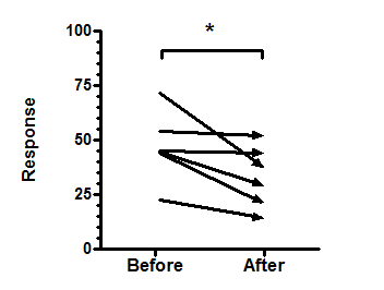
•A before-after graph shows all the data. This example plots each subject as an arrow to clearly show the direction from 'before' to 'after', but you may prefer to plot just lines, or lines with symbols.
•Avoid using a bar graph, since it can only show the mean and SD of each group, and not the individual changes.
•To add the asterisks representing significance level copy from the results table and paste onto the graph. This creates a live link, so if you edit or replace the data, the number of asterisks may change (or change to 'ns'). Use the drawing tool to add the line below the asterisks, then right-click and set the arrow heads to "half tick down'.
•Read more about graphing a paired t test.