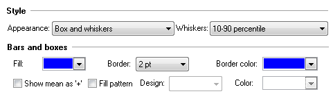
Creating a box and whiskers plot
Prism lets you create box-and-whisker plots from stacks of values entered into a Column table, or side-by-side replicates entered into an XY or Grouped table.
The box
The box always extends from the 25th to 75th percentiles. These limits are sometimes called the hinges of the plot. Surprisingly, there are multiple ways to compute these percentile values. Prism uses a standard method, but a different method than Excel uses.
The line in the middle of the box is plotted at the median. You can not choose a different value, but Prism also lets you put a "+" at the mean.
The location of the whiskers
Prism offers six ways to create whiskers in box-and-whiskers plots:
▪Min to max. The whiskers go down to the smallest value and up to the largest.
▪Tukey. See details below.
▪10 to 90 percentiles. The whiskers are drawn down to the 10th percentile and up to the 90th. Points below and above the whiskers are drawn as individual points.
▪5 and 95 percentiles
▪2.5 and 97.5 percentiles
▪1 and 99 percentiles
▪Min to max, show all points. This method plots whiskers down to the minimum and up to the maximum value, but also plots each individual value as a point superimposed on the graph.
Other options
▪Choose the border color and thickness, and fill the box with color.
▪Plot the mean as a "+".
▪Choose a fill pattern for the box, and choose the design (pattern) and color.
More about box and whisker plots
How the Tukey method plots whiskers and outliers
1.Calculate the inter-quartile distance (the difference between the 25th and 75th percentiles). Call this the IQR.
2.Add the 75th percentile plus 1.5 times IQR. If this value is greater than (or equal to) the largest value in the data set, draw the upper whisker to the largest value. Otherwise stop the upper whisker at the the largest value less than the sum of the 75th percentile plus 1.5IQR, and plot any values that are greater than this as individual points.
3.Calculate the 25th percentile minus 1.5IQR. If this value is less than the smallest value in the data set, draw the lower whisker to the smallest value. Otherwise stop the lower whisker at the lowest value greater than the 25th percentile minues 1.5IQR, and plot any values that are greater than this as individual points.
Notes on Tukey boxplots
▪Why 1.5IQR? There is no statistical rationale; it is simply how Tukey decided to do it, and he invented the idea of box-and-whisker plots.
▪When the Tukey method is used to create the whiskers, the ends of the whiskers are sometimes called the inner fences.
▪The values that are plotted individually are sometimes called outliers, but "outlier" is defined differently by Grubbs test or some other outlier test. The chance of finding one or more "outlier" by Tukey's rule in data sampled from a Gaussian distribution depends on sample size.
▪If you only enter three values per group (n=3), Prism will plot the median and range. It will not plot the percentiles and will ignore your choice for how to plot the whiskers.
▪With Tukey's method, the whiskers always end at a value matching one of the values in the sample. So the two whiskers are often not the same length.
▪The terms boxplot and box-and-whiskers plot are often used interchangeably, although originally the boxplot was used to describe a plot with Tukey whiskers (fences) and the box-and-whisker plot was used to describe a plot where the whiskers extend down to the minimum value and up to the maximum value.
Five number summary
The term five-number summary is used to describe a list of five values: the minimum, the 25th percentile, the median, the 75th percentile, and the maximum. These are the same values plotted in a box-and-whiskers plot when the whiskers extend to the minimum and maximum.
The term outlier
The term outlier has many definitions. The individual points that are plotted beyond the whiskers of a box-and-whiskers plot are sometimes called outliers, but this definition does not match the definition used by the Grubbs' or other outlier tests.
How to create a box-and-whiskers graph by entering the minimum, maximum, median and 25th and 75th percentiles rather than entering the raw data
Usually, Prism creates a box-and-whiskers graph from raw data. You enter a stack of values, and Prism computes the range and percentiles to make the box-and-whiskers graph.
You need to be just a tiny bit sneaky if you want to enter the minimum, 25th percentile, median, 75th percentile, and maximum values directly. Prism won't know that you entered those values, but will make the graph as if you entered raw data. If you just enter those five values, Prism will correctly compute the minimum, maximum, and median, but the 25th and 75th percentile values Prism computes will be incorrect.
Here is a trick: Enter the median value three times, rather than once, and also enter the minimum, maximum, and 25th and 7th percentile values. For each group, enter seven values on separate rows of one column (the order doesn't matter. )
▪Minimum
▪25th percentile
▪Median
▪Median
▪Median
▪75th percentile
▪Maximum
You can't "tell" Prism that these values are not the raw data, so it "thinks" they are raw data and so computes the minimum, maximum, median and quartiles from those seven values, and plots those computed values, which exactly match the values you entered.