You can copy data (or results), and paste link the data to the same or different data table. You can either use the Paste...Link command on the Edit menu (and the right-click shortcut menu), or choose to link in the dialog that comes up when you choose Paste Special.
The pasted results are linked, which means if the original data are edited or replaced, the linked values will update too.
Example 1
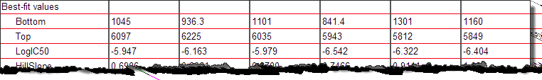
You use nonlinear regression to fit a dose response curve to six data sets. The first three (A-C) are for one drug; the other three are for another (D-F). The logIC50 values are all on one row. You know tha the first three are for one drug, and the next three for another. But Prism doesn't "know" this. The results look like this:
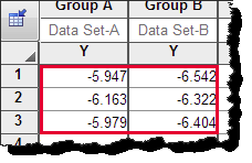
You want to put the logIC50 values into a new data table. The first three should go into column A, and the next three into column B. Follow these steps:
1. Select the six values.
2. Copy them to the clipboard.
3. Use New...Data table and graph to make a new Column table.
4. Put the insertion point into Column A and Row 1 of that new table.
5. Choose Paste Special from the Edit (or right-click shortcut) menu.
6. On the first (Source) tab of the Import and Paste Special dialog, choose to insert and maintain link.
7. On the fourth (Placement) tab of that dialog, choose to paste by columns, stacking 3 values in each column. That way the six values that you copied as one row, will paste into two columns.
8. Click OK.
9. Note that the values pasted into the data table are surrounded by a red box. You cannot edit these values on the data table. If you double click within that box, you'll return to the Import and Paste Special dialog (where you can unlink the values, if you want to).
10. Prove to yourself that the values are linked. Change the data being analyzed, and notice that the summary values that you paste-linked automatically update.
11. Create a graph of these values using New...Graph of existing data.
12. Compare the groups of values with a test.
13. Download the Prism file.
Example 2
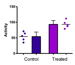
You have two sets of column data that you wish to plot both as a bar graph showing the mean and SD, and also has a scatter graph showing individual values.
One approach is to superimpose the bars and individual symbols. Prism 6 makes this simple, as it offers this as one of the choices for column graphs. This can look good if you omit the error bar, but looks cluttered when you include error bars. I used light colors for the symbols in the graph below, which helped a bit.

Another approach is to put the bars and symbols side by side. Follow these steps.
1.Enter the two columns of data into columns B and C.
2.Select the values in Column B and copy to the clipboard.
3.Put the insertion point at the top of column A, and choose Paste...Link from the Edit menu (or the right-click shortcut menu).
4.Select the values in Column C and copy to the clipboard.
5.Put the insertion point at the top of Column D, and choose Paste..Link from the Edit menu.
6.Note that the pasted values in Columns A and D are surrounded by a box and cannot be edited.

7.Edit a value in Column B or C. Note that Column A and D are instantly updated when you move the insertion point.
8.Polish the graph by double clicking on it, and choosing graphing options for each data set.