A logarithmic axis changes the scale of an axis
The two graphs below show the same two data sets, plotted on different axes.
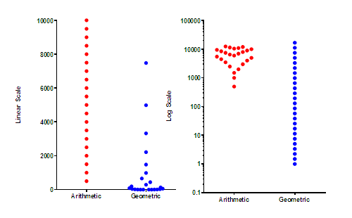
The graph on the left has a linear (ordinary) axis. The difference between every pair of ticks is consistent (2000 in this example).
The graph on the right has a logarithmic axis. The difference between every pair of ticks is not consistent. From the bottom tick (0.1) to the next tick is a difference of 0.9. From the top tick (100,000) down to the next highest tick (10,000) is a difference of 90,000). What is consistent is the ratio. Each axis tick represents a value ten fold higher than the previous tick.
The red dots plot a data set with equally spaced values. Each dot represents a value with a Y value 500 higher than the dot below. The dots are equally spaced on the graph on the left, but far from equally spaced on the graph on the right. To prevent overlap, the points are jittered to the right and left so they don't overlap. The horizontal position of the red dots has no other meaning.
The blue dots represent a data set where each value represents a Y value 1.5 times higher than the one below. On the graph on the left, the lower values are almost superimposed, making it very hard to see the distribution of values (even with horizontal jittering). On the graph on the right with a logarithmic axis, the points appear equally spaced.
Why “logarithmic”?
In the example above, the ticks at 1, 10, 100, 1000 are equally spaced on the graph. The logarithms of 1, 10, 100 and 1000 are 0, 1, 2, 3, which are equally spaced values. Since values that are equally spaced on the graph have logarithms that are equally spaced numerically, this kind of axis is called a “logarithmic axis”.
Interpolating between log ticks
What value is halfway between the tick for 10 and the one for 100 on a logarithmic axis? Your first guess might be the average of those two values, 55. But that is wrong. Values are not equally spaced on a logarithmic axis. The logarithm of 10 is 1.0, and the logarithm of 100 is 2.0, so the logarithm of the midpoint is 1.5. What value has a logarithm of 1.5? The answer is 101.5, which is 31.62. So the value half way between 10 and 100 on a logarithmic axis is 31.62. Similarly, the value halfway between 100 and 1000 on a logarithmic axis is 316.2.
Lingo
The term semilog is used to refer to a graph where one axis is logarithmic and the other isn’t. When both axes are logarithmic, the graph is called a log-log plot.
Advantages of a logarithmic axis
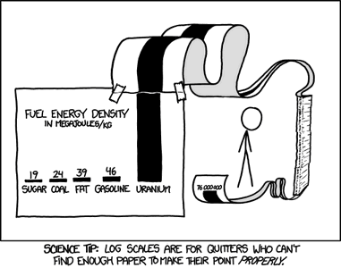
One advantage, as shown above, is that a lognormal distribution is easier to see on a logarithmic axis. Another reason to prefer a logarithmic axis is when the values span a large (many orders of magnitude) range of values and otherwise wouldn't really fit on a linear graph. At least not without a lot of creativity (from xkcd)!