Before analyzing your data with linear regression, stop and ask yourself whether it might make more sense to fit your data with nonlinear regression. If you have transformed nonlinear data to create a linear relationship, you will almost certainly be better off fitting your original data using nonlinear regression.
Before nonlinear regression was readily available, the best way to analyze nonlinear data was to transform the data to create a linear graph, and then analyze the transformed data with linear regression. Examples include Lineweaver-Burke plots of enzyme kinetic data, Scatchard plots of binding data, and logarithmic plots of kinetic data.
These methods are outdated, and should not be used to analyze data
The problem with these methods is that the transformation distorts the experimental error. Linear regression assumes that the scatter of points around the line follows a Gaussian distribution and that the standard deviation is the same at every value of X. These assumptions are rarely true after transforming data. Furthermore, some transformations alter the relationship between X and Y. For example, in a Scatchard plot the value of X (bound) is used to calculate Y (bound/free), and this violates the assumption of linear regression that all uncertainty is in Y while X is known precisely. It doesn't make sense to minimize the sum of squares of the vertical distances of points from the line, if the same experimental error appears in both X and Y directions.
Since the assumptions of linear regression are violated, the values derived from the slope and intercept of the regression line are not the most accurate determinations of the variables in the model. Considering all the time and effort you put into collecting data, you want to use the best possible technique for analyzing your data. Nonlinear regression produces the most accurate results.
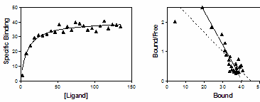
The figure below shows the problem of transforming data. The left panel shows data that follows a rectangular hyperbola (binding isotherm). The right panel is a Scatchard plot of the same data. The solid curve on the left was determined by nonlinear regression. The solid line on the right shows how that same curve would look after a Scatchard transformation. The dotted line shows the linear regression fit of the transformed data. Scatchard plots can be used to determine the receptor number (Bmax, determined as the X-intercept of the linear regression line) and dissociation constant (Kd, determined as the negative reciprocal of the slope). Since the Scatchard transformation amplified and distorted the scatter, the linear regression fit does not yield the most accurate values for Bmax and Kd.
Don't use linear regression just to avoid using nonlinear regression. Fitting curves with nonlinear regression is not difficult.
Although it is usually inappropriate to analyze transformed data, it is often helpful to display data after a linear transformation. Many people find it easier to visually interpret transformed data. This makes sense because the human eye and brain evolved to detect edges (lines) — not to detect rectangular hyperbolas or exponential decay curves. Even if you analyze your data with nonlinear regression, it may make sense to display the results of a linear transformation.