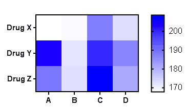
Heat maps are a new way to plot grouped data. The plotting area is divided into squares. The columns corresponds to different data sets in your table, and the rows in the graph correspond to different rows in the data table. Each square in the graph is color coded to denote the value entered into that cell of the table. Features:
•Reverse the direction of either axis, or transpose the X and Y axes.
•Color scales can encode continuous data with one scale, continuous data with two scales (perhaps one for positive numbers and another for negative numbers) or discrete categories (1=blue, 2=red, ...). Monochrome or color.
•Specify special colors for values that are "off the map" or for excluded values. Optionally put "X" through those cells.
•If you entered replicate values, base the heat map on the mean, median or geometric mean of the replicates. Or base it on the SD, SEM or CV among replicates to make a heat map of variation.
•Introduce more structure to the graph by inserting gaps to the right of any column or below any row.