Choosing a log scale changes the way the graph looks, but does not change the data values. Linear or nonlinear regression fit an equation to your data. Your choice of axis scaling does not affect any calculations. The three graphs shown below represent the same data by linear regression. The graph below has linear X and Y axes, so the linear regression line appears straight.
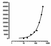
The graph below has a logarithmic X axis. The curve you see is the results of linear regression. It is the best fit to the equation Y=intercept + slope*X. The X values used by the linear regression are the X values you entered. Graphing this linear regression line on a log axis results in a curve.
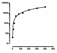
The graph below has a logarithmic Y axis. Again, the best-fit linear regression line appears curved when plotted on a logarithmic axis.
|