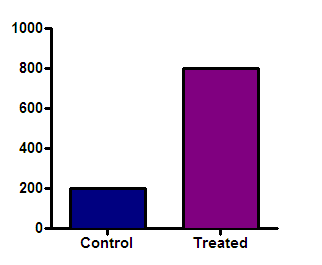
Prism can create bar graphs with a logarithmic Y axis, but think twice before deciding to make this kind of graph. The point of a bar graph is to let people compare heights or areas of the bars. In most cases, you should try to avoid using a log axis when creating a bar graph. The treated bar in the graph below (with a linear axis) is four times as tall (and has four times the area) as the control bar. This tells you that the treatment increased the response fourfold. This is very straightforward since the Y axis is linear.
Beware of bar graphs with a logarithmic axis. Since zero can’t be shown on a log axis, you need to decide where to begin the axis. A log scale has no logical starting place, so the choice is arbitrary. The graphs below show the same data as the graph above, but with the Y axis beginning at 0.001, 10 or 100.
The relative height of the bars appears to be almost the same in the graph on the right and very different on the graph on the left. The relative heights (or areas) of the bars on a log scale is not informative. If the goal is to create propaganda, a bar graph using a logarithmic axis is a great tool, as it lets you either exaggerate differences between groups or minimize them. All you have to do is carefully choose the range of your axis to give the impression you want to project. If your goal is to honestly show the data, don’t create bar graphs using a logarithmic axis The only case that I know of where it makes sense to plot bars on a logarithmic axis is when the Y axis is plotting the fold change in something. Then the baseline of 1.0 is logical (no change), as is a logarithmic scale. |