
Graph tip -- How to make an XY graph with a time-scale on the X axis?
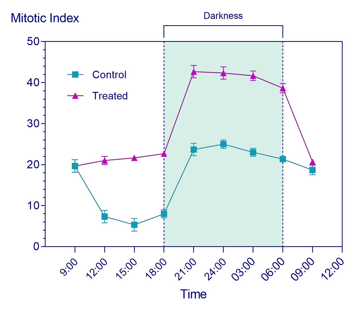
This example shows several tips: how to use time (or anything non-numerical) as axis labels, how to create custom ticks, how to shade portions of a graph, and how to add a line with custom centered text on a graph.
How to do it:
To create this graph, we're going to start by creating an XY data table into which we can enter time values. When creating an XY data table (and graph), Prism allows the entry of date/time information either in the form of total elapsed time (hh:mm:ss.ssss) or as calendar dates (DD-Mon-YYYY). For this example, we're going to choose to create an XY data table, and select the following options:
- "Elapsed times" for the "X" options
- "Enter 3 replicate values in side-by-side subcolumns" for the "Y" options

After clicking Create, the XY table will be shown and the data can be entered (as shown below):

Once the data for this graph have been entered, click on the corresponding graph sheet in the Navigator. Since this is the first time you've viewed the graph, the Change Graph Type dialog will appear so that you can specify the type of graph you'd like to create. For this example, we'll choose the "Points & connecting line with error bars" graph type from the "XY" graph family. On this dialog, also ensure that "Mean and Error" and "SD" are selected in the "Plot" dropdown menus.

Clicking "OK", we're shown a graph that already has the general structure that we're looking for:

However, there are many ways that we can improve the appearance of this graph. First, we're going to improve the numbering and presentation of X axis. To do this, we'll either double-click on the X axis directly, or click on the "Format Axes" button in the toolbar. This will open the "Format Axes" dialog. On the "X axis" tab of this dialog, we're going to make a number of changes:
- First, uncheck the box at the top of this tab beside "Automatically determine the range and interval"
- In the "Range" section, change the "Minimum" value to 6 (or 6:00:00.000), and the "Maximum" value to 36 (or 36:00:00.000)
- In the "All ticks" section of the dialog, select "Below, angled" in the "Location of numbering/labeling" dropdown menu
- In the "Regularly spaced ticks section of the dialog:
- Change the value for "Major ticks interval" to 3
- Change the value for "Starting at X=" to 9 (or 9:00:00.000)
- Change the "Number format" to "2:25 (h:mm)" using the dropdown menu

These changes will update the format of the X axis labeling and the range of values displayed. However, we also want to specifically change some of the values on the X axis to display clock time instead of elapsed time. To do this, we'll use the "Additional ticks and grid lines" section of the dialog. Enter the following values for "At X=" and "Text":
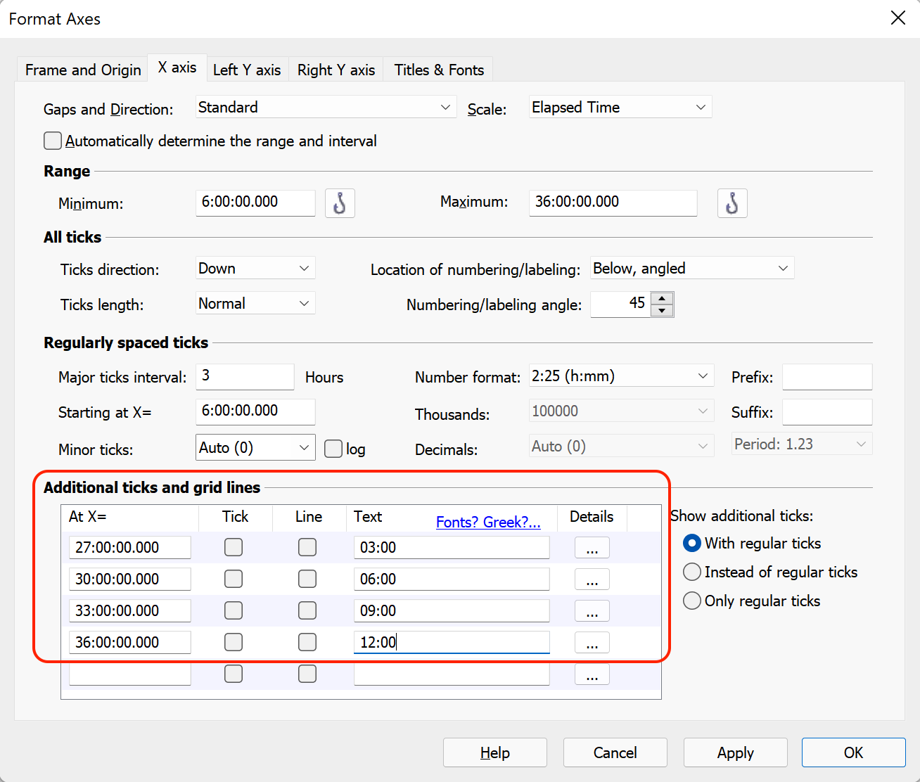
Finally, we can use this same tab to add two vertical lines to our graph to indicate hours of darkness (between 18:00 and 06:00 on the X axis). For the first line, we can simply check the box for "Line" on the row containing the value of 30 (or 30:00:00.000) and the text of "06:00" since we've already added this row. For the second line, we'll add a new value for "At X=" of 18 (or 18:00:00.000) and check the box for "Line" (note, this additional tick doesn't need any custom text to replace the default text on the graph like the other labels we added).

When we click "OK", we'll see that the graph has been updated to include the new custom X axis labels and additional grid lines, and should look something like the following:

To continue customizing this graph, there are a number of improvements that can be made using the Format Axes dialog again. Start by opening this dialog and switching to the "Frame and Origin" tab. On this tab, in the "Axes and Colors" section of the dialog, use the "Thickness of axes" dropdown menu to set the axes thickness to 1/2 pt, and the "Color of axes to a dark blue color. In the "Frame and Grid Line" section, use the "Frame style" dropdown menu to select "Plain Frame" to add a simple frame (with no ticks) around the outside of the graph.

Now, switch to the "Left Y axis" tab. In the "Regularly spaced ticks" section of this tab, open the "Minor ticks" dropdown menu and select 5.

Finally, switch to the "Titles & Fonts" tab. In the "Axes titles" section of this tab, use the "Location" dropdown menu for the Left Y axis and select "Above, Centered",

Now, when we click "OK", the graph is starting to take shape, and should look similar to the graph below:

There are a number of other small improvements that we can make to this graph, such as:
- Deleting the graph title
- Adding the Y axis title "Mitotic Index"
- Selecting the Y axis and X axis titles, Y axis labels, X axis labels, and legend text to un-bold the font, decrease the font size, and set the font color to dark blue
- Using the Format Graph dialog to change the color of the points, connecting lines, and error bars for each data set
- Moving the legend text into the graphing area to save space

Our graph is now very nearly complete. However, there are two final additions to make. First, we're going to add a bracket with centered text to indicate the hours of "Darkness" on the graph. Using the "Select a drawing tool" dropdown in the toolbar, select to draw an "n zig-zag line with text". Then, draw the line in the desired location. Editable text will automatically be added to the line, and you can write "Darkness" in this space. Use the Text controls in the toolbar to change the size and color of the text, while double clicking on the line will allow you to change the line weight (1/2 pt) and color (dark blue) of the added line.
Finally, to customize the vertical lines added to the graph, and to shade the area between them, we'll open the Format Axes dialog one last time. On the "X axis" tab, in the "Additional ticks and grid lines" section, click on the "Details" (...) button for either row with the "Line" box checked. This will open the "Format Additional Ticks and Grids" dialog. On this dialog, the "Style", "Thickness", and "Color" dropdown menus can be used to change the appearance of the vertical lines on the graph. After selecting one of the additional values with an associated line, check the box beside "Fill (shade) between this tick and X =" and be sure that the correct value is chosen (the shading should be added between 18 and 30 for this graph). Specify a desired fill color, and click "OK" on both dialogs.

And you're done! The final graph should look similar to the one below:
Download this file to see how this graph was made