
Graph tip - How do I format my data to make a box-and-whiskers graph?
This example shows how to enter data and make a box and whiskers graph from raw data.
How to do it:
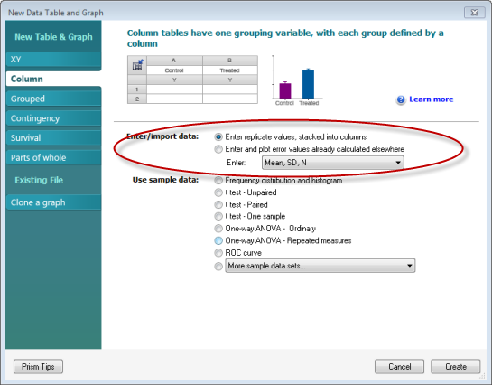
Creating box-and-whiskers graphs with from raw data is very easy. Prism does all the work for you. From the Welcome screen, choose to enter your replicate date in columns.
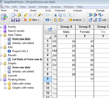
Simply enter your raw data in columns -- put all the values for each data set in a separate column.
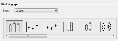
Then click the thumbnail for how you want your graph to look.
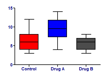
Prism then creates a box showing the median, and the 25th and 75th percentiles. The whiskers of the graph show the largest and smallest values.
Download this file if you would like to see how the graph was made
If you've already calculated your 25th and 75th percentiles and want to make a graph showing these values instead of letting Prism calculate them, you can make a similar graph this way.
Keywords: box and whiskers percentiles