
Graph tip - How to create a box-and-whiskers graph by entering the minimum, maximum, median and 25th and 75th percentiles rather than entering the raw data?

The example on this page shows how to create a box-and-whiskers graph in Prism when you've already calculated the minimum, mean, max and 25th and 75th percentiles. It's easier to create box-and-whiskers graph in Prism if you've got the raw data (and this page will show you how).
How to create a box-and-whisker graph with summary values
In order to create a box-and-whisker graph, five values are needed:
- Minimum
- 25th percentile (first quartile)
- Median (50th percentile or second quartile)
- 75th percentile (third quartile)
- Maximum

These values are sometimes collectively referred to as the five-number summary of the data. If you enter the raw data, Prism will calculate these values for you to generate the graph. However, if for some reason all you have is the five-number summary, you can still use them to create a box-and-whisker graph in Prism. But you have to be a bit sneaky. Start by creating a Column data table as you would for a box-and-whisker graph from raw data. Now you need to enter the data. Regardless of what you enter, Prism will use the entered values to calculate a five-number summary. If you only enter the five values that you have, the calculated five-number summary (for these five values) will include the correct minimum, median, and maximum. But the calculated 25th and 75th percentiles will be different than the values that you entered. Here's the trick to get the results you want:
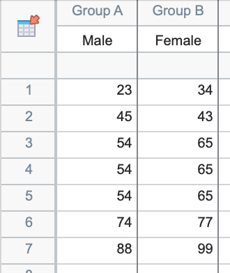
Enter the median value three times, so that the data look like the following (you can actually enter the seven values in a single column in any order, but this arrangement makes it easier to keep track of what you're doing):
- Minimum
- 25th percentile
- Median
- Median
- Median
- 75th percentile
- Maximum
Let's work through an example using the following five-number summary:
| Minimum | 23 |
| 25th percentile | 45 |
| Median | 54 |
| 75th percentile | 74 |
| Maximum | 88 |
From the Welcome dialog, choose to create a Column table, and choose to "Enter replicate values, stacked into columns", then click "Create". In the data table, enter the values into seven rows as shown above:

Switch to the graph sheet. This will automatically bring up the "Change Graph Type" dialog. In this dialog, be sure that "Column" is selected in the Graph family dropdown menu. Click on the "Box and violin" tab of graphs, and then select the "Box & whiskers" graph type. Be sure that "Min to Max" is selected in the Plot dropdown menu. Once you click "OK", you'll be able to customize the appearance of your graph.
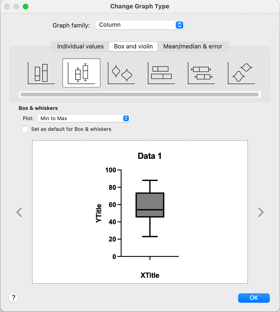
You can also use additional columns to create more box-and-whisker plots on the graph using additional five-number summaries (or with raw data!). For example, the table and graph below shows how a second box-and-whisker plot can be added to the graph. However, you should always be very careful with how this data is used (for example in any analyses) since this is really just a visual "trick" to get Prism to display the graph you want using the summary values instead of the raw data. You should also be aware that if you use this "trick" to create a box-and-whisker plot from the five-number summary, you won't be able to plot the mean value as a "+" symbol. Prism will try to compute the mean value from the seven values that you entered, which is unlikely to be equal to the mean of the actual (raw) data.
Download this file if you would like to see how the graph was made
If you want to make a box and whiskers graph from raw data, you can read how here.
Keywords: boxplot, quartiles,