
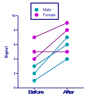
Before-after graphs with different colors for different subjects.
When you enter data on a column table and choose a before-after graph, Prism plots all the symbols the same way. You can choose different colors or shapes for "before" than for "after" (which is not helpful). And you can right click on each symbol and change its color (and that of the connecting line). But this approach would be very tedious. .
Prism 5 can, in fact, create before-after graphs with multiple colors for different subjects. The trick is to enter the data enter the data on a Grouped table. Follow these steps or examine this Prism file.
1. Create a Grouped table.
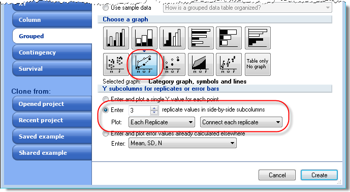
Choose the appropriate number of "replicates" (subjects) for your data. Be sure to choose to plot each replicate, and to connect each replicate.
2. Enter the data.
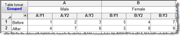
Note that the arrangement of data is different than with a column table. The before-after pairs are stacked into subcolumns.
This table has two rows, because it plots just before and after. If you had more time points, add more rows.
This table has two data sets, male and female, because we want symbols with two different appearances. Use as many data sets as you want. If you want each subject to have its own appearance, create a table with no subcolumns, and enter each subject into its own data set.
3. Polish the graph.
Also see this related example for creating column scatter graphs with multiple symbol colors.
Keywords: repeated measures, category graph, Grouped data table, rainbow before after