
Graph tip - Showing both bars and individual points by overlaying two graphs.
Prism offers three ways to combine points and bars on one graph. This example shows how to do so by creating two graphs and superimposing on a page layout. The other approaches are to make an XY graph and plot some data sets as spikes or bars. The third approach is to make a Grouped graph, but plot some data sets as points.
Click here to see how to make a graph that displays error bars next to your before-after data.
How do do it:
Prism doesn't let you show both bars and individual data points for the same data set overlayed on one graph. The way to do it is to create two graphs, and combine them in a layout.
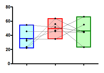
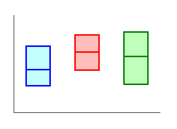
Start by making a regular column, scatter, or before-and-after graph.
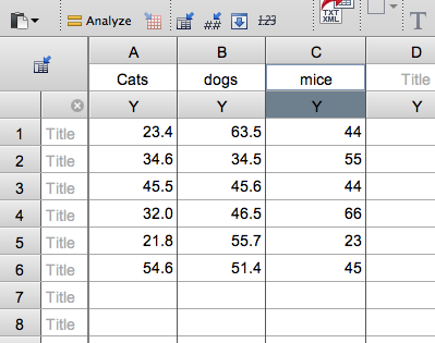
and enter your data.
to create this graph.
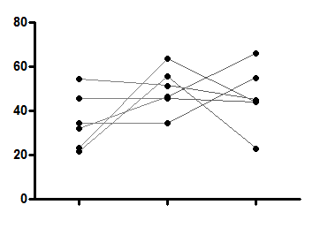
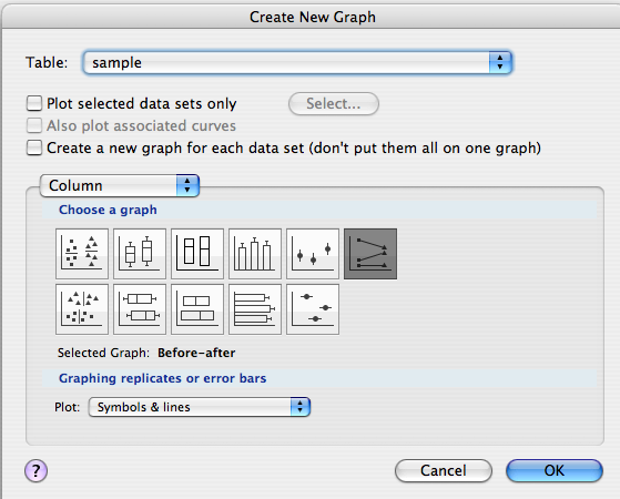
Next, click the new button and choose to make a new graph of the same data set. This time chose a different graph format. In this case we'll choose floating bars.
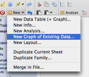
to make this graph.
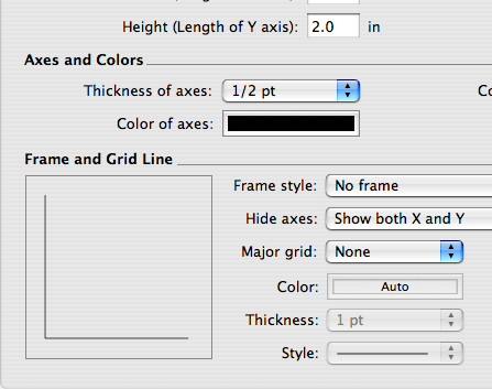
To make it easier to overlay the two on a layout, remove the axis labels and titles, and make the axes thinner on one graph so they won't show when overlaid. You can change the axis thickness by double-clicking on either axis and going to the Frame and Origin tab.
Create a new layout and add both graphs.
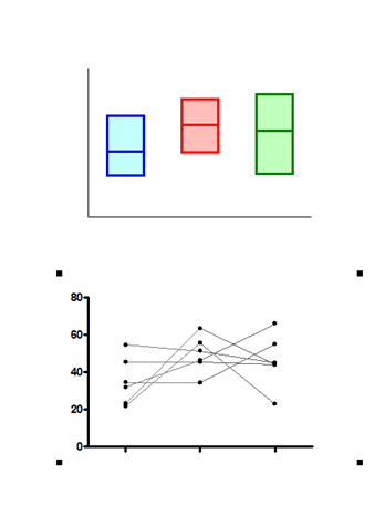
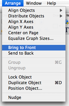
Then drag one on top of the other. You may need to send one forward or back to make it look right. You can do this in the Arrange menu.
Download this file to see how this graph was made.