
Graph tip - Combining bars and points on a grouped graph
Prism offers three ways to combine points and bars on one graph. This page shows how to make a Grouped graph, while plotting some data as bars and others as points with connecting lines. The second approach is to to make an XY graph and plot some data sets as spikes or bars. The third approach is to create two graphs and superimpose them on a page layout.
How to do it:
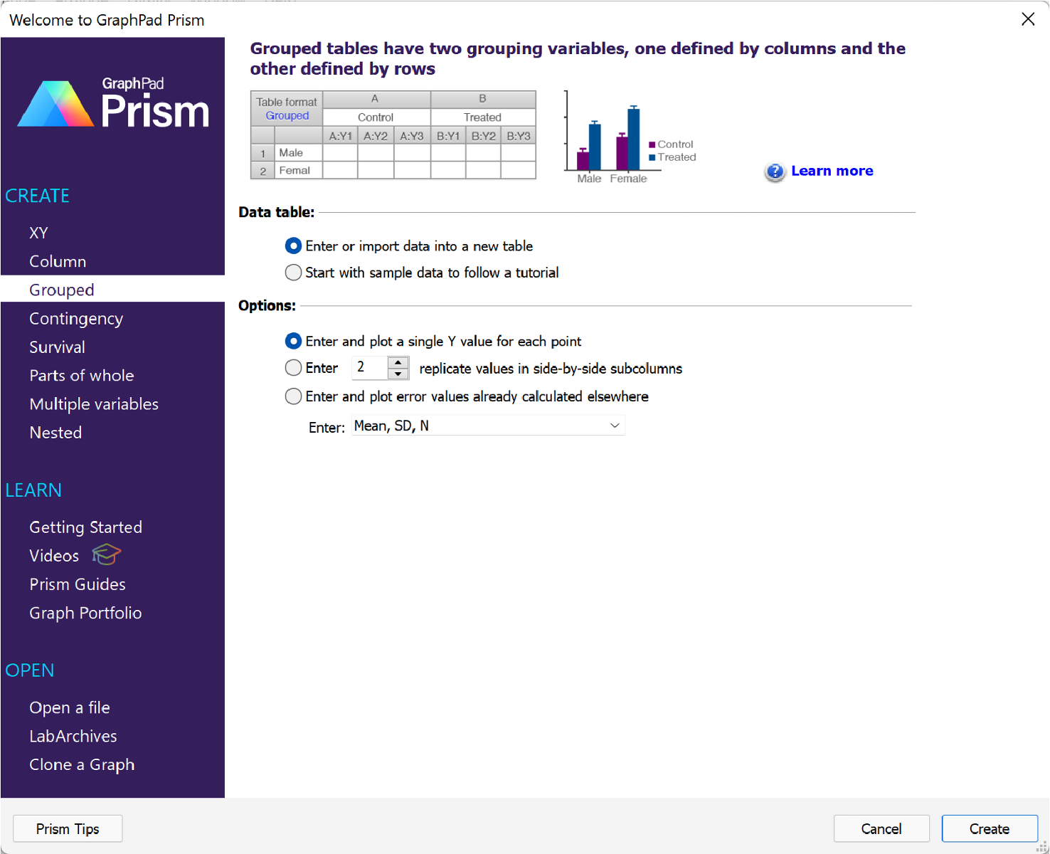
To create this graph, we're going to start by creating Grouped data table to enter the data. For this example, we won't have any replicates, so we're going to choose the option "Enter and plot a single Y value for each point" in the "Y" options.
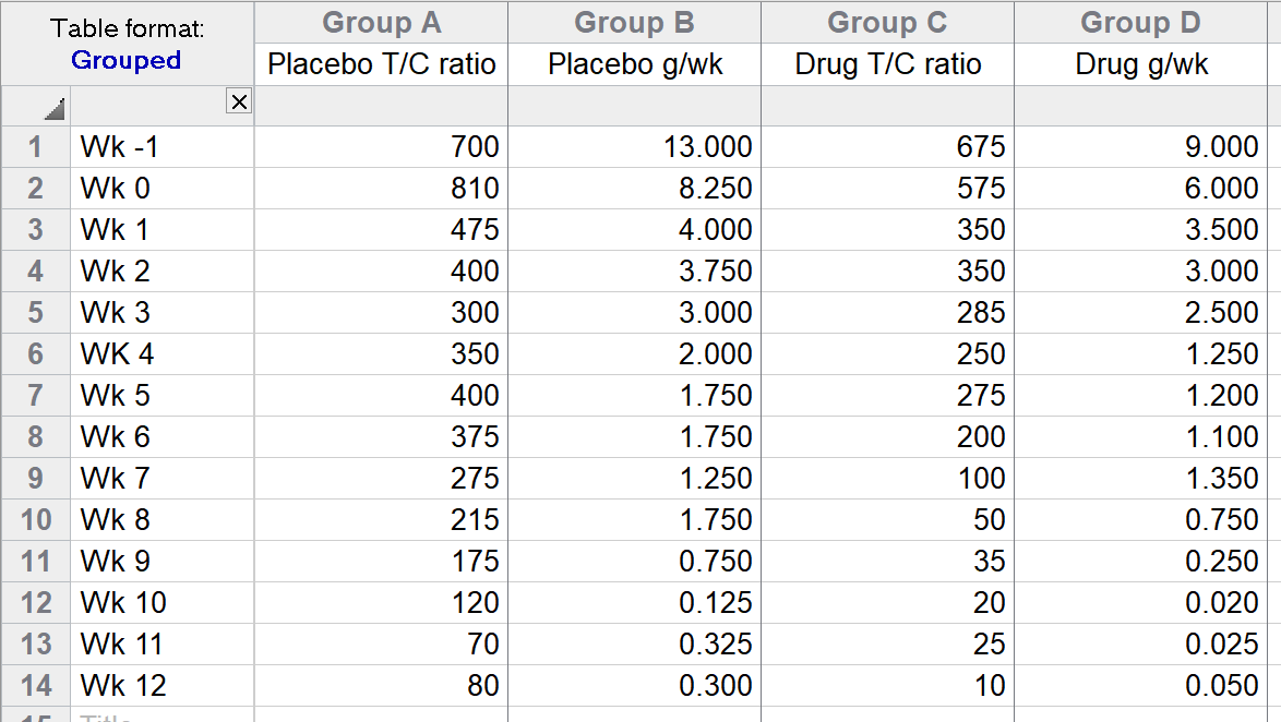
After clicking Create, the XY table will be shown and the data can be entered (as shown below):
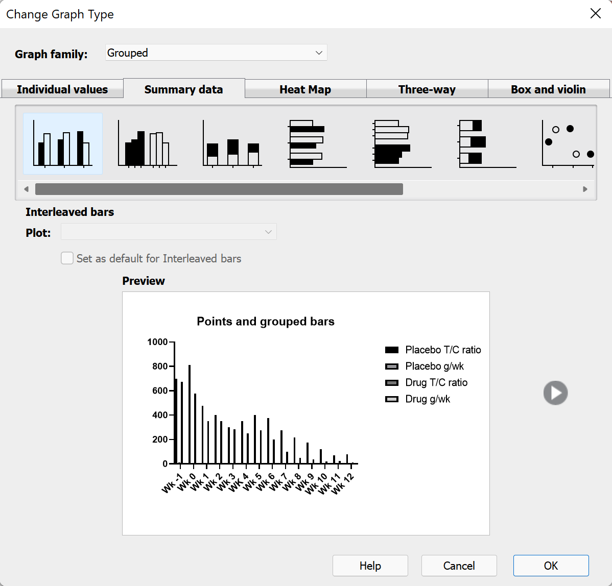
Once the data for this graph have been entered, click on the corresponding graph sheet in the Navigator. Since this is the first time you've viewed the graph, the Change Graph Type dialog will appear so that you can specify the type of graph you'd like to create. For this example, we'll choose the "Interleaved bars" graph type from the "Summary data" tab of the "Grouped" graph family.
Clicking "OK", we get a graph that may be a bit hard to read (but that's ok, we'll clean it up in the next steps). This graph should look something like this:

The first thing we'll want to do is to set some of the groups on this graph to be represented by points with connecting lines, while the others we want to leave as bars. To do this, we'll need to open the "Format Graph" dialog by either double clicking on the graph or by clicking the "Format Graph" button in the toolbar.
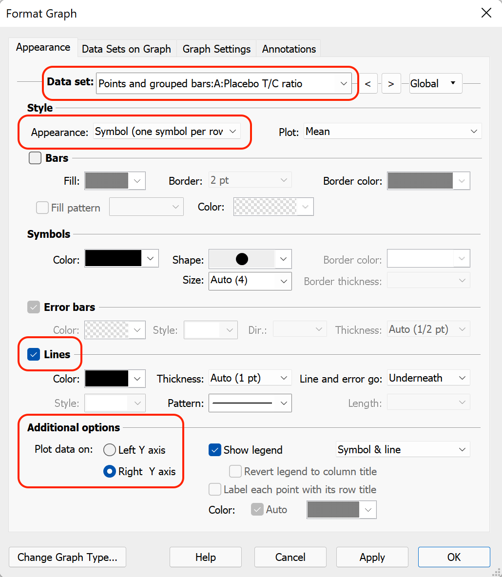
On the "Appearance" tab of the "Format Graph" dialog, we're going to use the "Data set" dropdown menu near the top of the dialog to select the first data set ("Placebo T/C ratio"). Once this selected, we're going to change the following settings:
- Use the "Appearance" dropdown menu in the "Style" section of the dialog to select "Symbol (one symbol per row)"
- Check the "Lines" box to enable connecting lines between the symbols
- In the "Additional options" section of the dialog, select to plot this data on the "Right Y axis"
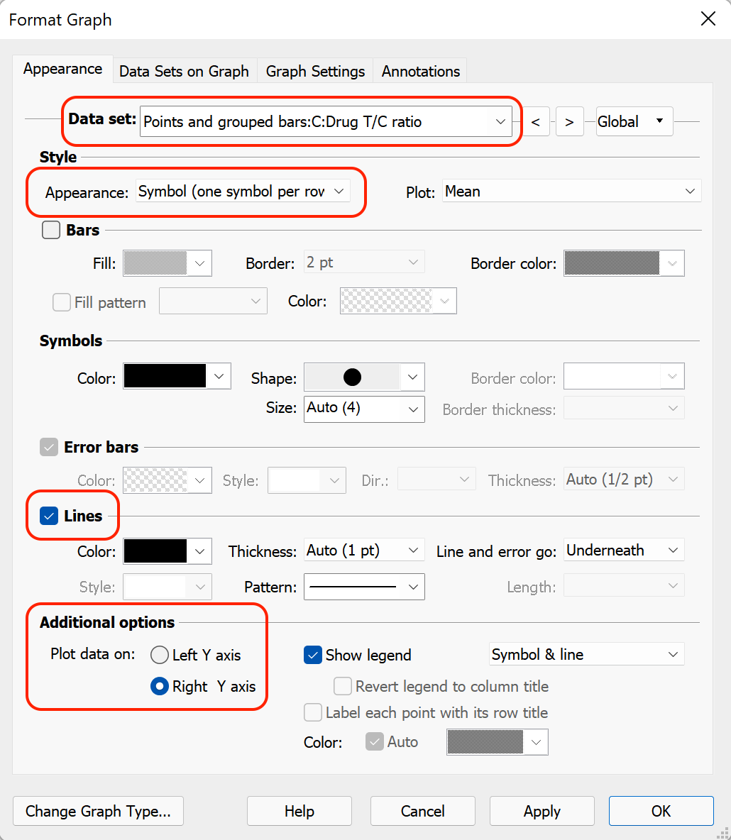
Now, again using the "Data set" dropdown menu near the top of the dialog, we'll select the third data set ("Drug T/C ratio") and apply the same settings to this data set as we did to the second data set above.
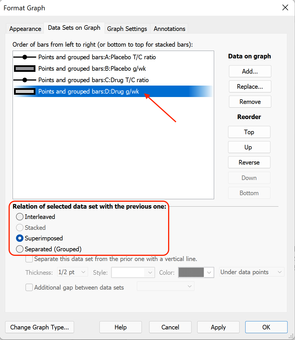
Next, we want to change the graph so that the connecting lines for the Placebo group are superimposed on the bars for the Placebo group, and the connecting lines for the Drug group are superimposed on the bars for the Drug group. To do this, we'll switch to the "Data Sets on Graph" tab of the "Format Graph" dialog. In the box near the top of the dialog, select the second data set ("Placebo g/wk"). Then, in the section "Relation of selected data set with the previous one", select the option "Superimposed".
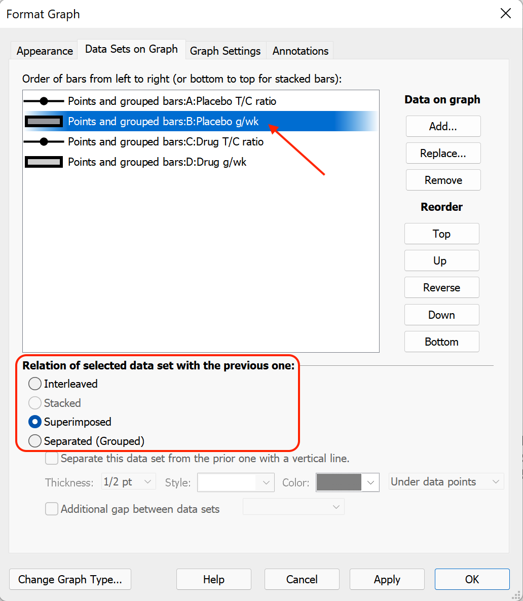
Repeat these steps for the last data set ("Drug g/wk").
Finally, we can click "OK" on this dialog, and the graph should be updated to look something like the following:

At this point, the basic structure of the graph is complete. To improve the general appearance of the graph, there are a number of different things we can do. For example:
- Delete both Y axis titles and the X axis title
- Delete the graph title
- Select the axis labels and un-bold the font
- Use the format graph dialog (Appearance tab) to change the:
- Color of the bars
- Thickness and color of bar borders
- Shape, color, and size of the symbols
- Color and thickness of connecting lines
- Arrange the legends of the graph inside the graph borders, and reduce the font size of the legends to save space
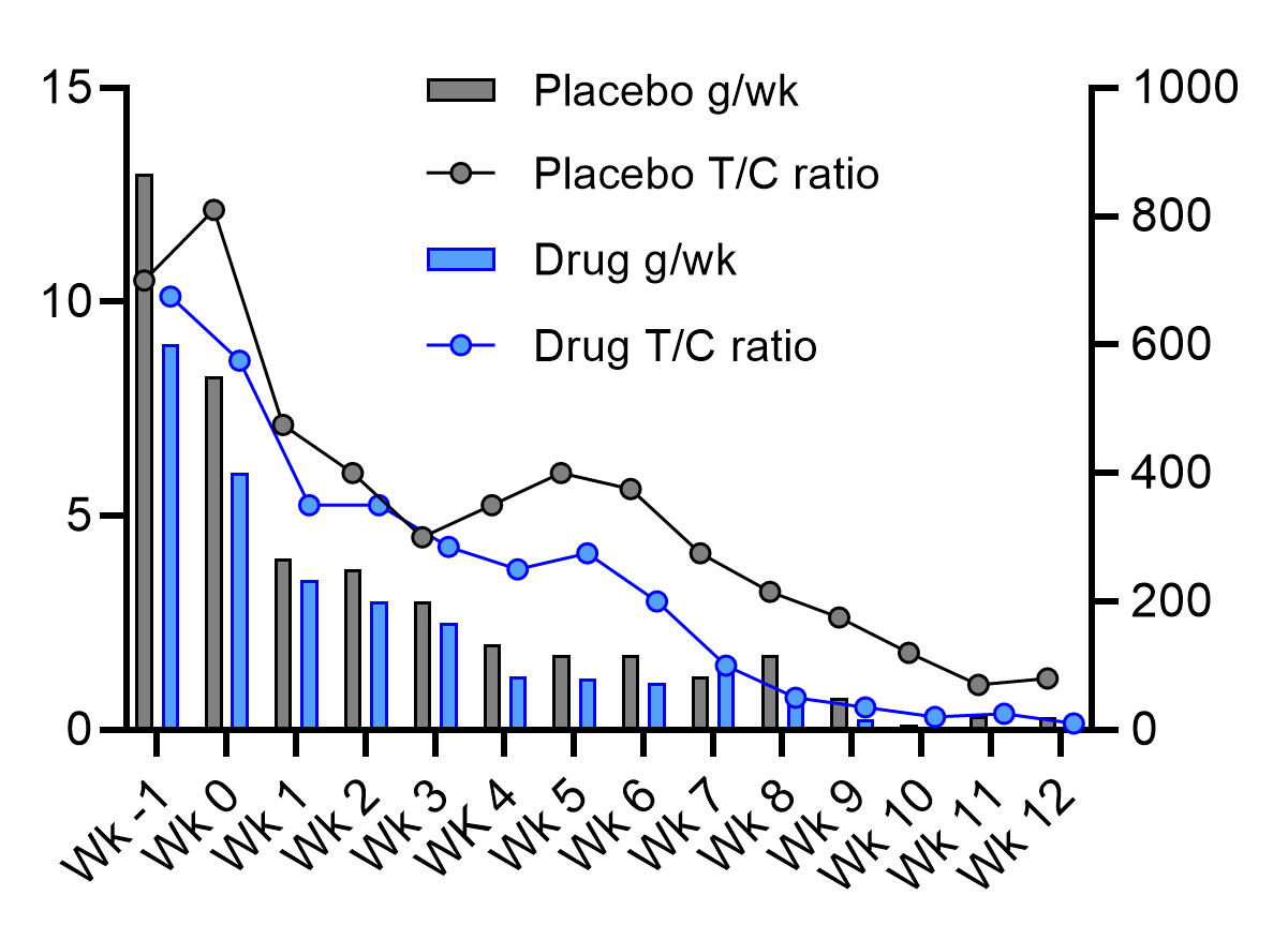
With all of these changes, an example of the graph that can be created is shown below:
Download this file to see how this graph was made.