Why fit a Gaussian distribution to your data?
Does you data follow a Gaussian distribution? One way to answer that question is to perform a normality test on the raw data. Another approach is to examine the frequency distribution or the cumulative frequency distribution.
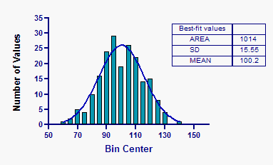
Fitting a Gaussian distribution
Prism can superimpose a frequency distribution over the histogram.
Follow these steps:
1.In the frequency distribution dialog, choose to create the frequency distribution (not a cumulative distribution). Also choose to plot the data as an XY graph of histogram spikes.

2.Go to the new graph.
3.Click Analyze, and choose nonlinear regression. On the first tab of the model, choose the Gaussian family of equations and then the Gaussian equation. All the other choices on the nonlinear regression dialog can be left to their default settings.
The results depend to some degree on which value you picked for bin width, so we recommend fitting the cumulative distribution as explained below.
Fitting a cumulative Gaussian distribution
Prism can superimpose a cumulative Gaussian distribution over a graph of the cumulative distribution of the data. The cumulative Gaussian distribution has a sigmoidal shape.

Follow these steps.
1.In the frequency distribution dialog, choose to create the cumulative frequency distribution. Also choose to plot the data as an XY graph of points.

2.Go to the new graph.
3.Click Analyze, choose nonlinear regression, and choose the one of the cumulative Gaussian models from the selection of Gaussian models. Prism offers separate models to use for data expressed as percentages, fractions or number of observations. With the last choice, you should constrain N to a constant value equal to the number of values. You can leave all other choices set to their default values.
The graph shown above the cumulative distribution of the sample data (in percents) fit to the cumulative Gaussian curve. The observed distribution is plotted with red circles and the fit distribution is a blue curve. The two are superimposed, so hard to distinguish.
Plotting on a probability axis
Below, the same graph is plotted using a probability Y axis. To do this, double-click on the Y axis to bring up the Format Axis dialog, drop down the choices for scale in the upper right corner, and choose "Probability (0..100%). The cumulative Gaussian distribution is linear when plotted on probability axes. At the top right of the graph, the cumulative distribution is a bit higher than predicted by a Gaussian distribution. This discrepancy is greatly exaggerated when you plot on a probability axis.
